Designing a portable cash register
ExpressPay is a native iOS designed for both iPad and iPhone that enables store workers to quickly check out shoppers without the need for lines or cash registers. The app was designed similarly to an “Express Checkout” in major department stores aiming to get customers with 10 items or less quickly checked out and on their way.
THE CHALLENGE
Creatin a mobile cash register
Lines can get long and unwieldy in rush hour at busy retail stores and supermarkets. ExpressPay aimed to help alleviate stress on cashiers and speed up checkout for customers who had 10 or fewer items. With ExpressPay, retail associates were able to complete transactions from anywhere in a store.
ExpressPay is able to check out customers with any type of item including weighable groceries such as produce, accept loyalty card numbers and coupon codes, as well as verifying the customer's age for purchases such as alcohol or medication, which enabled retail associates to complete any sort of transaction without the need of a secondary point-of-sales system or cash register.
My role
I led the design of ExpressPay from concept to completion, focusing on ideation, flow, wireframing, and interaction design. Visual elements were co-owned by myself and a visual designer on the project, but I was in charge of finalizing the assets and handing off the final design to development.
REQUIREMENTS GATHERING
Optimizing for a complete checkout experience
To kick off the project, I met with the SME of retail experiences to gather initial requirements. During this initial meeting, I was able to align with the SME on what the core experience would contain. The app would let retail associates checkout customers from anywhere in the store using the iPhone's camera as a scanner, but there were a few edge cases to consider. These included:
- Accepting a Customer's Loyalty / Rewards Card
- Searching for an item by name or PLU, UPC, or SKU codes
- Weighing items such as fruits and vegetables
- Verifying the Customer's Age for purchases such as alcohol or spray paint
- Collecting a Customer's Signature and Providing a Receipt
With these requirements in mind, I began sketching out the core flows for the app.
EARLY SKETCHES

IDEATION
Rapid Iteration
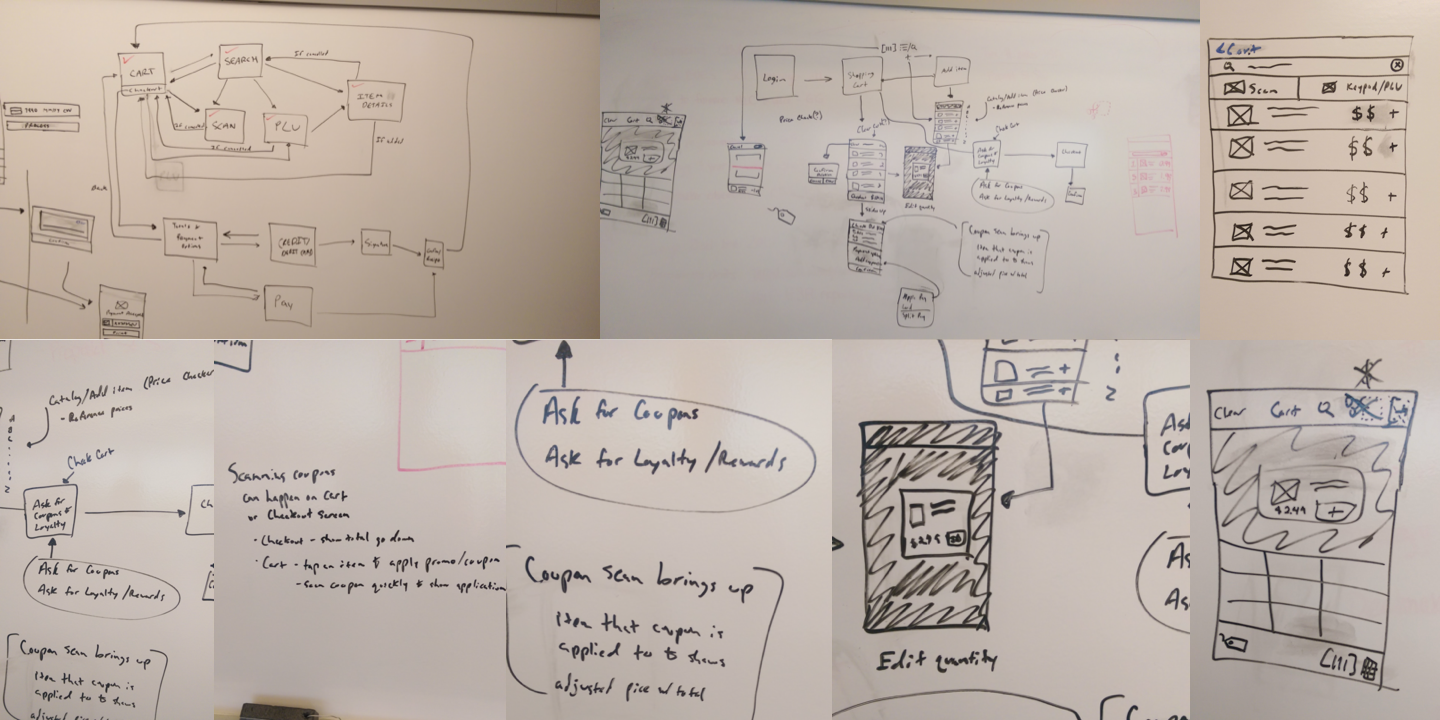
Through a series of rapid brainstorming sessions with the SME on a whiteboard, I was able to iterate through the core app experience and edge cases, building trust and alignment between myself, the SME, and our engineering partners. This time was incredibly valuable as me and the SME were able to explore multiple concepts quickly on the whiteboard and find solutions to some of the larger challenges such as coupon & loyalty card input, PLU lookup, and age verification.
Additionally, involving engineering at this early stage made it very easy for us to gauge feasibility and sped up development significantly. A fully functional development-led prototype was created by the end of the third week of the project that was pixel-perfect to the design, including interactions and transitions.
Through the whiteboard sessions, I was able to finalize the flow and architecture of the app and was able to digitize the flow and wireframes within a few days.
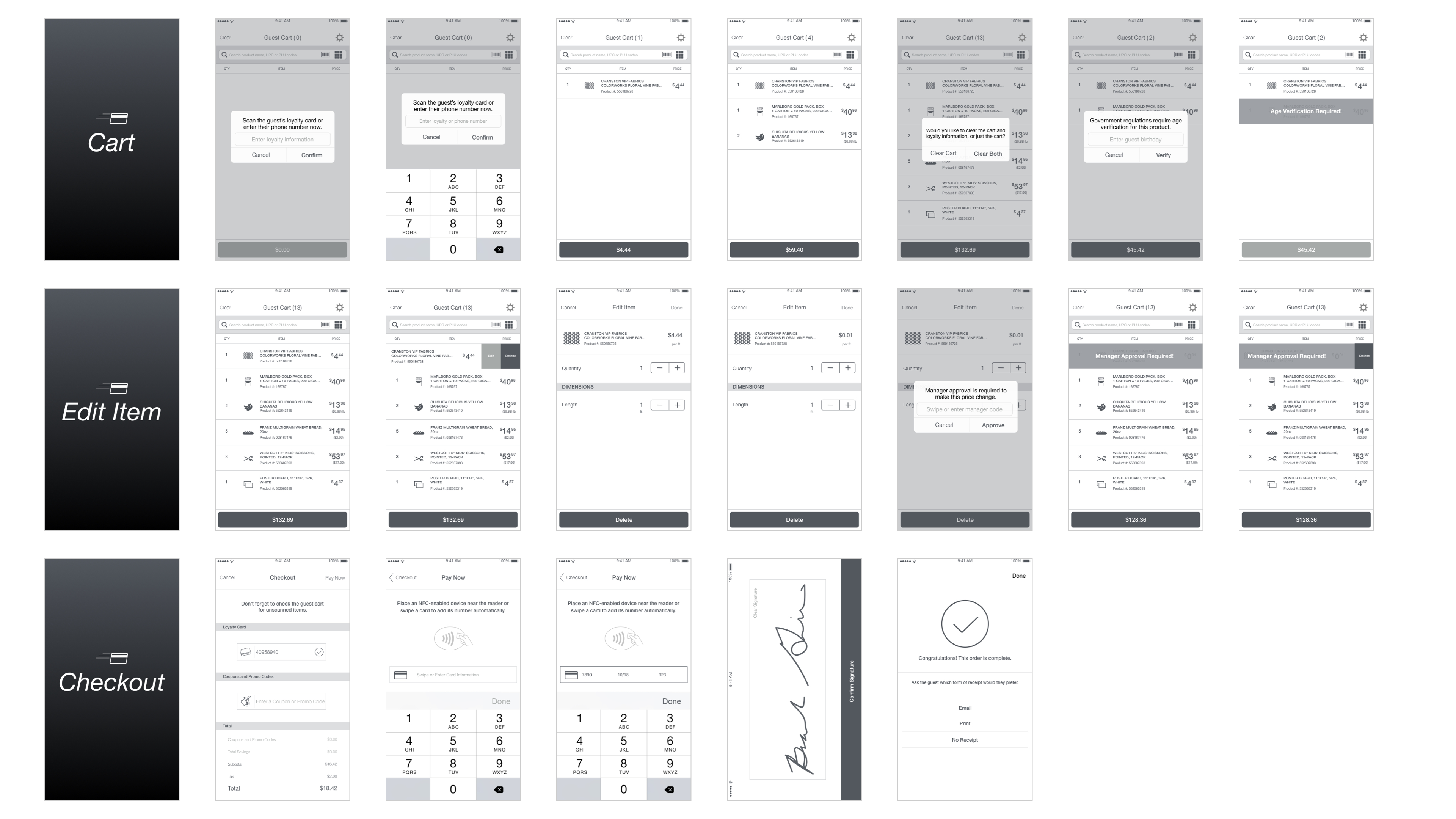
ExpressPay Wireframes
The wireframes below are a subset of the final wireframes.

FINAL TOUCHES & HANDOFF
Interaction Design & Annotated Wireframes
As the project progressed, I worked in polishing the interactions and animations on and between views to help the user have a clearer understanding of what was going on in the app. I created a series of fully animated design artifacts, screen flows, and annotated wireframes to deliver to the development team for reference when building the app.
I also created accessibility guidelines for VoiceOver that the development team used to optimize the experience for visually impaired users. I ran multiple internal and external tests on the VoiceOver feature and primary ExpressPay workflows with retail store associates that provided validation for the design direction and helped with a few refinements later in the project.
OUTCOMES
Reflections & Impact
The ExpressPay iPhone app took just under 2 months to design, develop, and deploy a first functional MVP of the iPhone version of the app. I partnered with the sales team on the IBM side of the project to land our first sale of a mobile app to a client by demoing the wireframes and interactions for clients.
With the first sale came a series of customizations for different clients that I worked to develop interface and customization guidelines for. The project was used as a reference for future projects within the organization and my process of focusing on foundational research and low-fidelity wireframing and sketching became standard across the team.
© 2025 Cam Luck. All rights reserved.