High fashion, low prices
After a successful launch in 2011, MyHabit had begun losing traction due to a turn in the market and fizzling out of the flash sales industry. Though over 12 million users were registered for the site, only 10% were active and the business itself was dealing with an identity crisis as the market turned and customer behaviors changed.
In 2015, I was part of a redesign and pivot of the MyHabit experience to bring it into a new market and new age of design.
THE CHALLENGE
Re-discovering the "flash" in flash sales
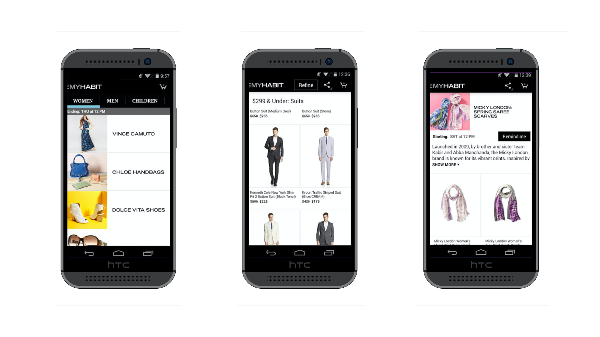
MyHabit had launched with a splash approximately 4 years prior, but with a combination of an economic downturn which affected the entire flash sales market, MyHabit's loss of focus on high-end fashion for affordable prices, and the app and website's bloated feature set due to years of experimentation, MyHabit fell onto hard times.
Through experimentation on the existing web and app experiences, it was clear that features such as Browse and targeted products were converting much higher than MyHabit's core feature: Event-based sales. Additionally, it became clear that high-end fashion products weren't the top sellers. Instead, products such as linens, FitBits, food, and other goods were selling through more due to promotional events from influencers. Customers were still interested in buying from MyHabit and had a fond connection with the brand, but had a hard time finding products they were interested in.
My role
I started as the design lead on the MyHabit Android app and was one of two designers leading the redesign of the web and iOS apps. Over the course of the project, I became the lead designer for the entire experience across all platforms. I led design and research efforts to update the app to a more modular, flexible design system and addressed customer pain points with a focus on the browse, discovery, and purchasing paths.
I worked alongside a researcher, product manager, and a small team of developers to rapidly prototype and build features for the new experience while also managing a team of 2 other senior UX designers guiding the strategic direction of the entire redesign while they focused on execution of the redesign on specific platforms (web & iOS).
EXISTING APP
GETTING STARTED
Understanding our Customers
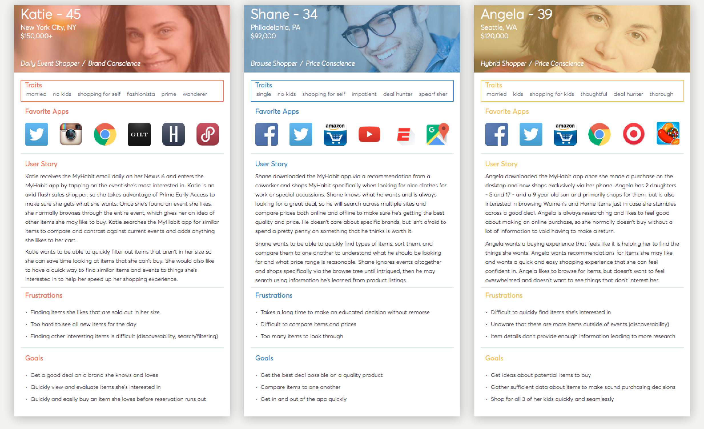
I began my time on MyHabit partnering with a local research firm to conduct a benchmark study on MyHabit. I also conducted my own desk research, diving deep into quantitative and qualitative data that was available from Amazon's internal tools. Through diving through the data and interviewing current customers, I was able to gain a much clearer picture of who the MyHabit customer was.
To my surprise, the customer was not who I had originally been told and fell into 3 clear shopper types, with few of them focusing on high-end fashion. Our average customer was 40-60 years old and had very different information and navigational needs than someone like myself, my team members, or tech-savvy Amazon employees. Through the benchmark study of ~20 participants, I was able to observe clear pain points for each customer type and form a solid set of data-backed personas to rally the team around. The personas were presented to my immediate team and key stakeholders, which became a beacon of empathy for the team due to the fact that the entire immediate team had witnessed the benchmark study and could easily pin pieces of each persona’s story back to a user they observed in the lab.
CUSTOMER PERSONAS
TOP FOUNDATIONAL RESEARCH FINDINGS
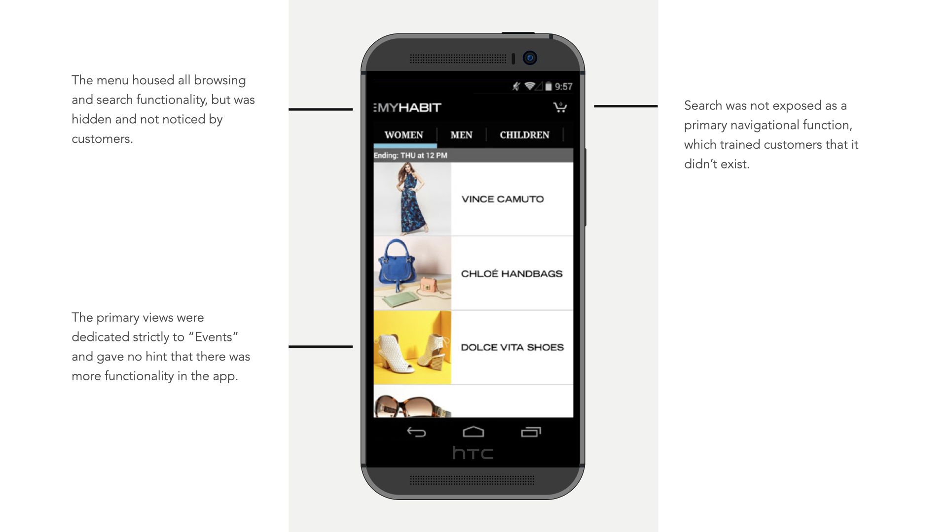
- Customers browsed only the Events that were "new" to them in a "zig-zag" fashion, diving into an Event, then out of it once they had seen all of the items. Once the customer had seen all of the new or relevant events to them, they'd leave the app as they didn't expect it could do more.
- Customers wanted to purchase the products shown in the Event image and were disappointed when it wasn't available in the Event.
- Searching for items was difficult due to the inability to find the feature and when found, unpredictable and limited filtering options.
- Limited interest in the event-based model of browsing, users found it hard to navigate to items they found appropriate.
- Users did not want to check out on their mobile devices because they feared their credit card information would be stolen.
- Users experienced real stress due to a countdown timer in the cart that made them feel like they needed to purchase immediately.
Many of these issues, we had surface-level knowledge of, but armed with real customer data and quotes, I was now ready to begin designing a new experience for the Android app.
INCREMENTAL CHANGES
Quick, impactful fixes
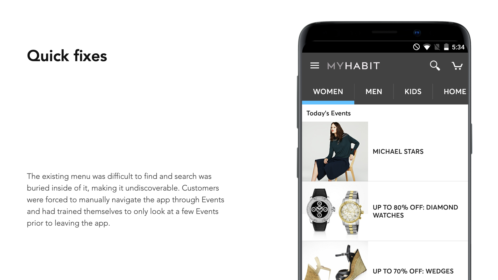
Before making changes, I mapped out the entire mobile experience using basic sitemaps and screen flows to have a clear inventory and audit of all screens, states, and views within the apps. From the benchmark study and other early findings, I was able to partner with my PM and a small dev team to implement some quick iterative fixes directly into the Android app for testing, that was then rolled out into the iOS app as well. These changes helped solve some of the surface-level problems around discoverability and we saw a small uptick in customers using the "Search" feature over purely using Events, but overall, the majority of customer behavior stayed the same.
Once these fixes were handed off to dev, I started focusing on deeper problems to help solve the larger challenges around browse and conversion rates.
DISCOVERY
Concept Generation & Testing
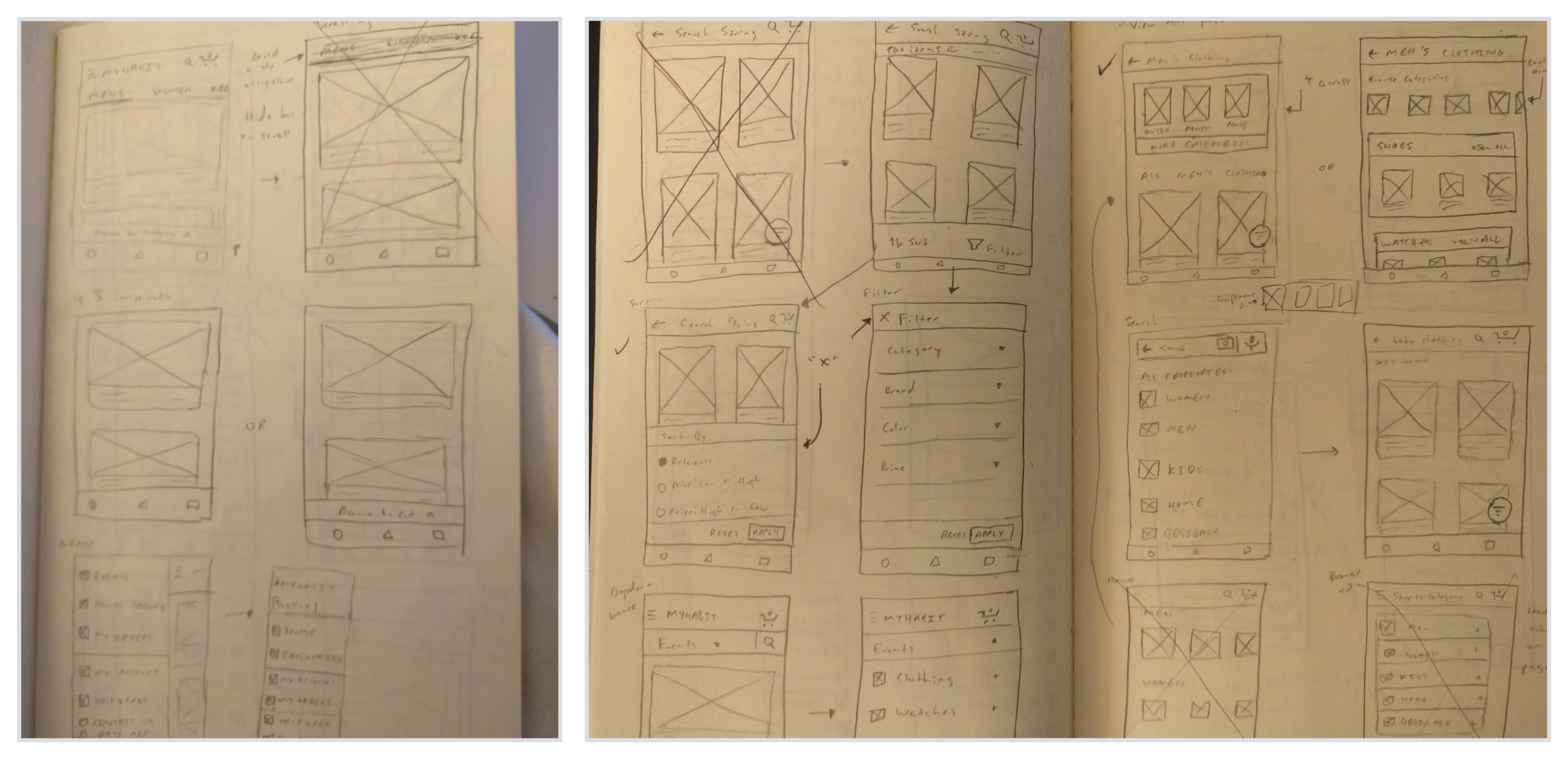
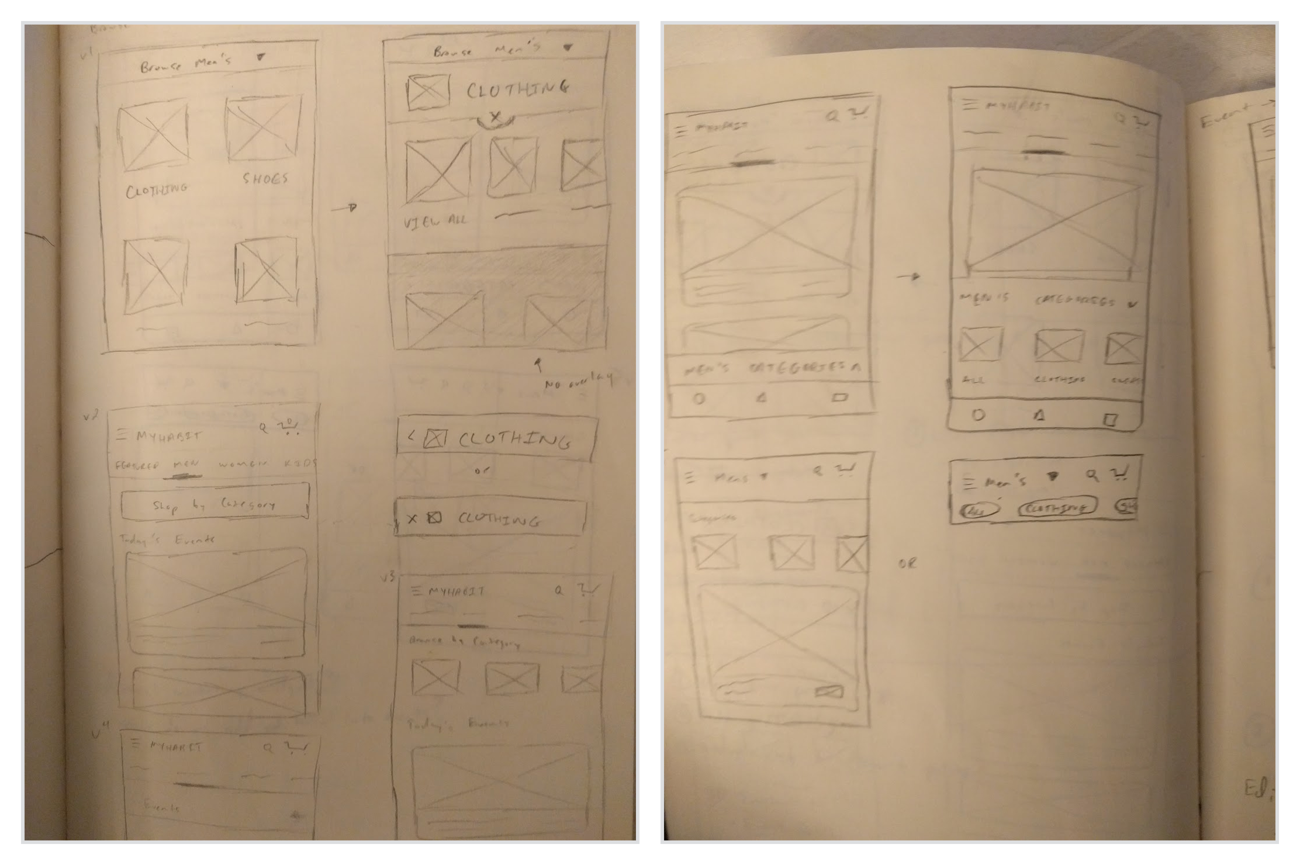
I started discovery for a complete app redesign with a few quick design workshops and a series of sketches that I shared with our PM and development partners. I started a daily design stand-up where I brainstormed new ideas with my PM and dev lead every morning for 30 minutes. This helped us get alignment very early on what we were looking to achieve and we aligned on many design elements and their feasibility on whiteboards during these sessions.
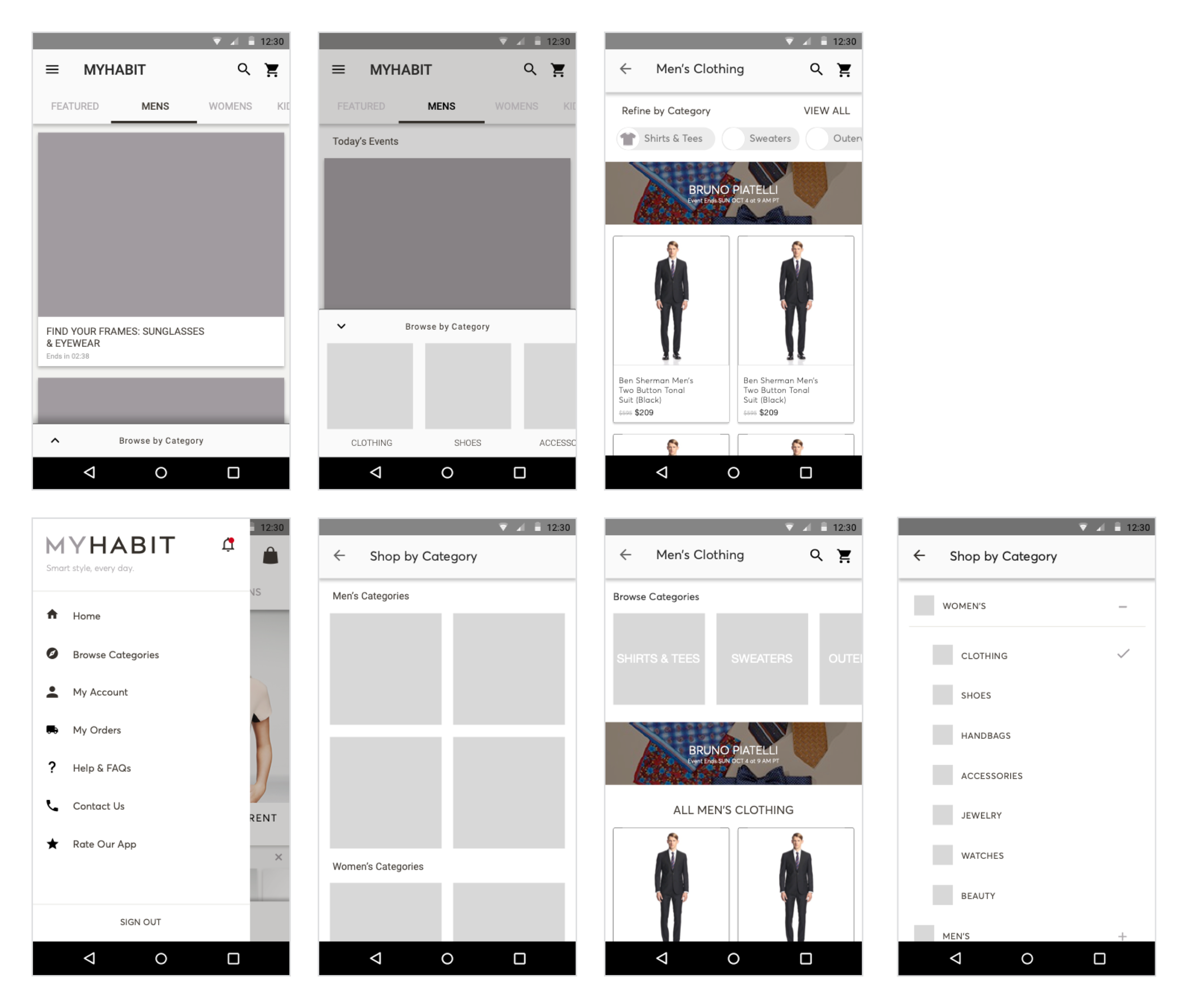
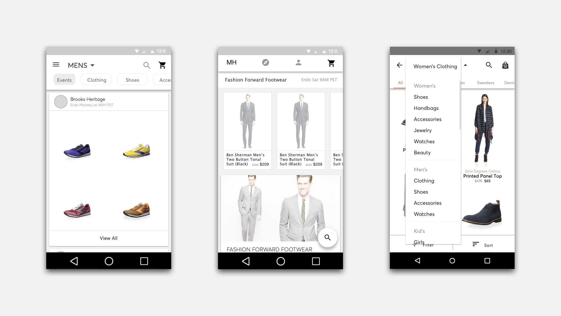
Much of the focus of this stage of design was on how we'd make the browse experience more discoverable and useful. We also aimed to make the experience more connected so that a user's journey didn't end after locating a single event or product they may be interested in as observed in the benchmark study. Many of my initial design approaches dropped the browse experience directly on the home screen, integrating it alongside the Events. I also aimed to fix some of the problems with Events by showing actual products that were available in the Event upfront.
At this stage of the project, our researcher still had not joined the team, so I was in charge of running research as well. I ran a series of RITE studies with customers identified from the earlier study to help refine the concepts and test their usability as I went. We learned quickly that almost all of the initial design approaches allowed customers easier access to browse and search features, but noticed some customers struggling with the concept that not all items were in Events.
EARLY EXPLORATIONS
CHANGING DIRECTION
Adjusting my design approach
With my early findings, I felt confident that I was headed in the right direction, so I held a meeting with business stakeholders to inform them of the direction. During this meeting, I learned that the business team was very nervous about affecting anything on the home screen that focused on Events. Though MyHabit had added many non-Event features since its initial launch, the majority of customers - including browse-based shoppers - shopped using the Events.
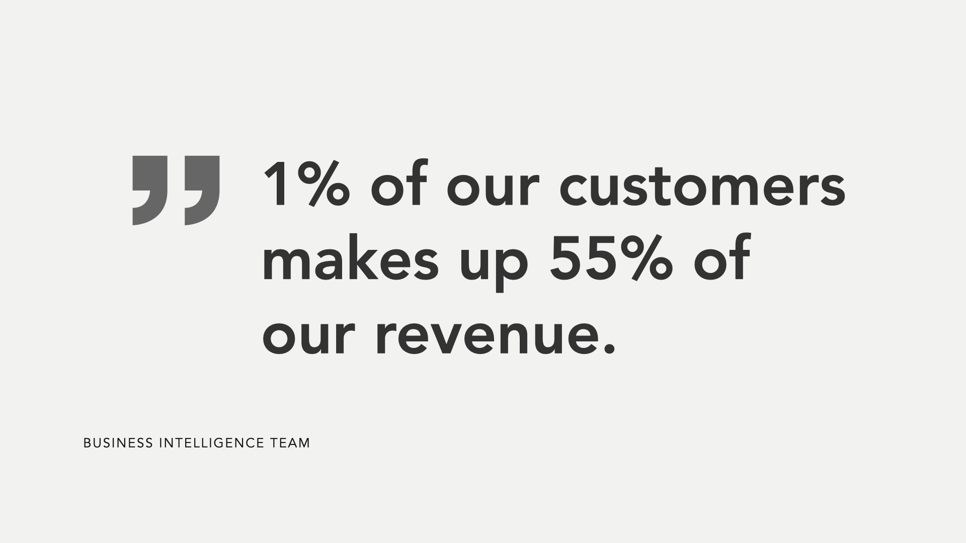
I also learned from this meeting that our top 1% of customers made up 55% of profits and the business could not afford to do anything to disrupt that statistic. The top 1% of customers were made up strictly of Event-based shoppers. None of the features launched prior to this redesign had done anything to shake up the home screen on the website or the apps, so this hadn't been a problem in the past.
With this knowledge in hand, I went back to the drawing board, using a combination of rapid prototyping with Principle and Framer and RITE studies to iterate on new design directions.
WINDOW SHOPPING
Fixing the browse experience
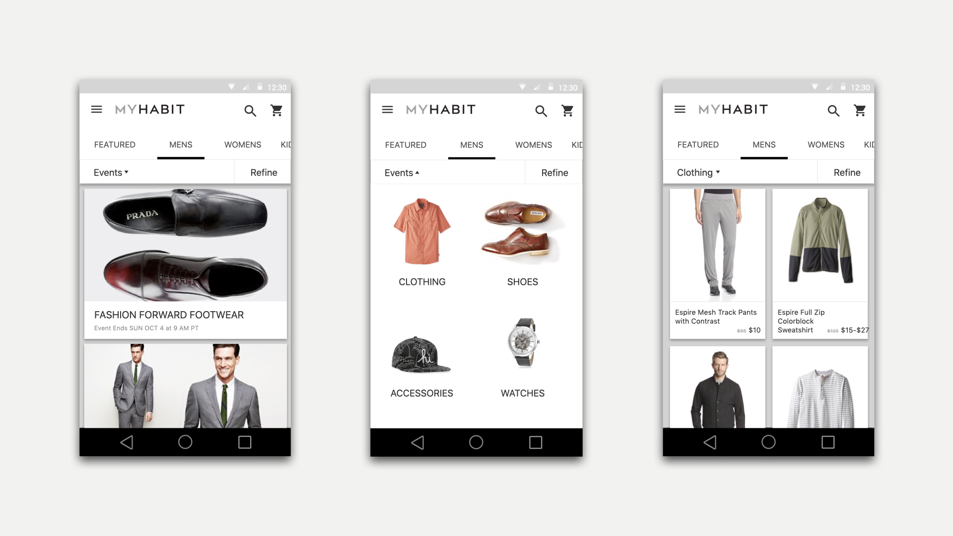
After a few rounds of testing, I understood that I couldn't rely on traditional patterns such as placing the Browse in the menu, because our users were trained to use Events.
I had observed in each of our usability studies that when the browse experience was buried in the menu, users skimmed over it or didn’t even think to look there. They’d instead look at a few top events that caught their eye and leave the app immediately. This posed a challenge for me because, from our gathered customer data, I needed to intercept the browse-oriented users early enough in the app for them to discover that browse existed, but I also couldn’t detract from the event-based experience, because of how valuable that customer constituency was.
INTENTIONAL INTERACTIONS
Optimizing for implicit input
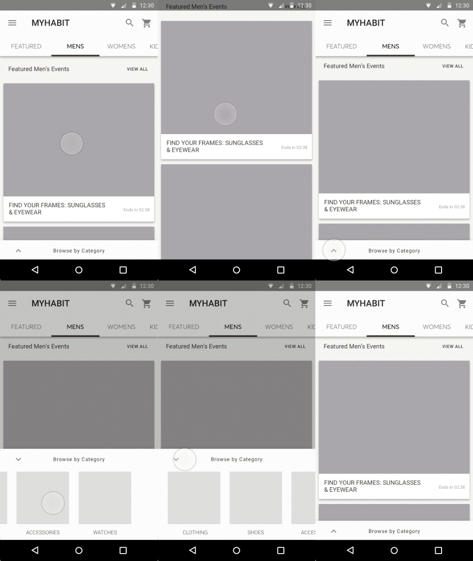
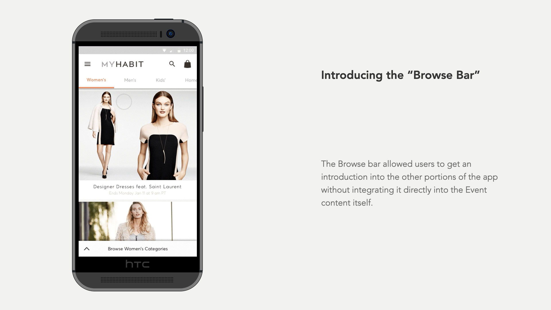
As an additional refinement, I also optimized the browse bar to only display when a department was selected to allow the Featured page to keep its focus on targeted events that had a higher sell-through rate.
I also added intentional interactions to the top navigation and browse bar to disappear when the customer began to scroll and re-appear when the customer scrolled back up or sat idle for 3 or more seconds. These interactions were designed intentionally with the assumption that if a user was scrolling, they had ignored navigation and browse on purpose and are thus, focused on the Events. But if they scrolled back or were idle for a few seconds, they were likely looking for something other than the Events they just scrolled through.
Adding these details helped the customer focus on a few things at a time and eased the final amount of tension with the business team and led to us moving forward with the design.
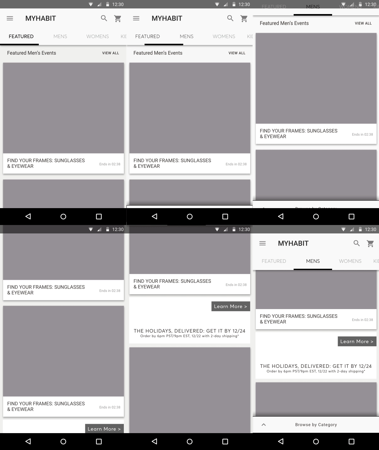
This exploration shows how the Browse bar disappears when the user has decided to scroll and view Events. If the user was idle, or scrolled back upwards, the Browse bar would return, prompting the next interaction from the user.
RESEACH FINDINGS
Validating the Design
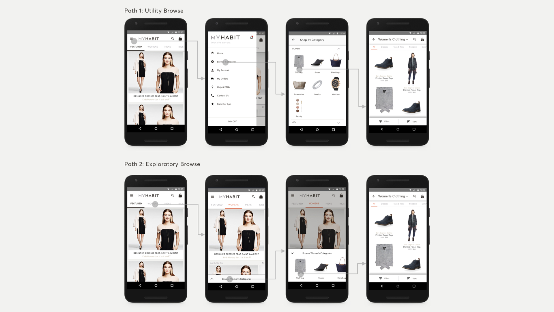
To wrap up the project, our researcher and I conducted another series of RITE tests with Framer and Principle testing the browse bar, deeper levels of browse, and the end-to-end flow of the redesigned checkout experience. We found that users were able to complete all of the tasks with 100% success at a rate that was nearly 3 times faster than the existing application.
Multiple versions of the Browse experience were tested including a version that eliminated browse through the menu, a version that focused on icon-based browse instead of text / image-based browse, and alternate views for product details. In the end, we found that there were multiple types of browse customers who would approach browsing in different ways. We also learned that though customers said they preferred using icons to browse, the task completion rate dropped 60% using icons instead of text. With these findings, we landed on the final direction to hand off to development.
GOING BEYOND BROWSE
Designing the rest of the MyHabit Experience
The rest of the experience was less controversial and was able to draw on many other patterns I had explored early in the process. I focused my efforts on the search and filtering experience, the product detail view, and the cart as each of those pieces of the flow were the most critical for conversion.
In each view, I focused to alleviate usability issues uncovered in the initial benchmark study and standardize the patterns being used across the app. I kept this very low-fidelity, iterating on whiteboards and notebooks with team members.
Once alignment was achieved, I applied the patterns and visual styling from the lightweight design system I had created designing the browse experience to these views to finalize them.
CART & CHECKOUT
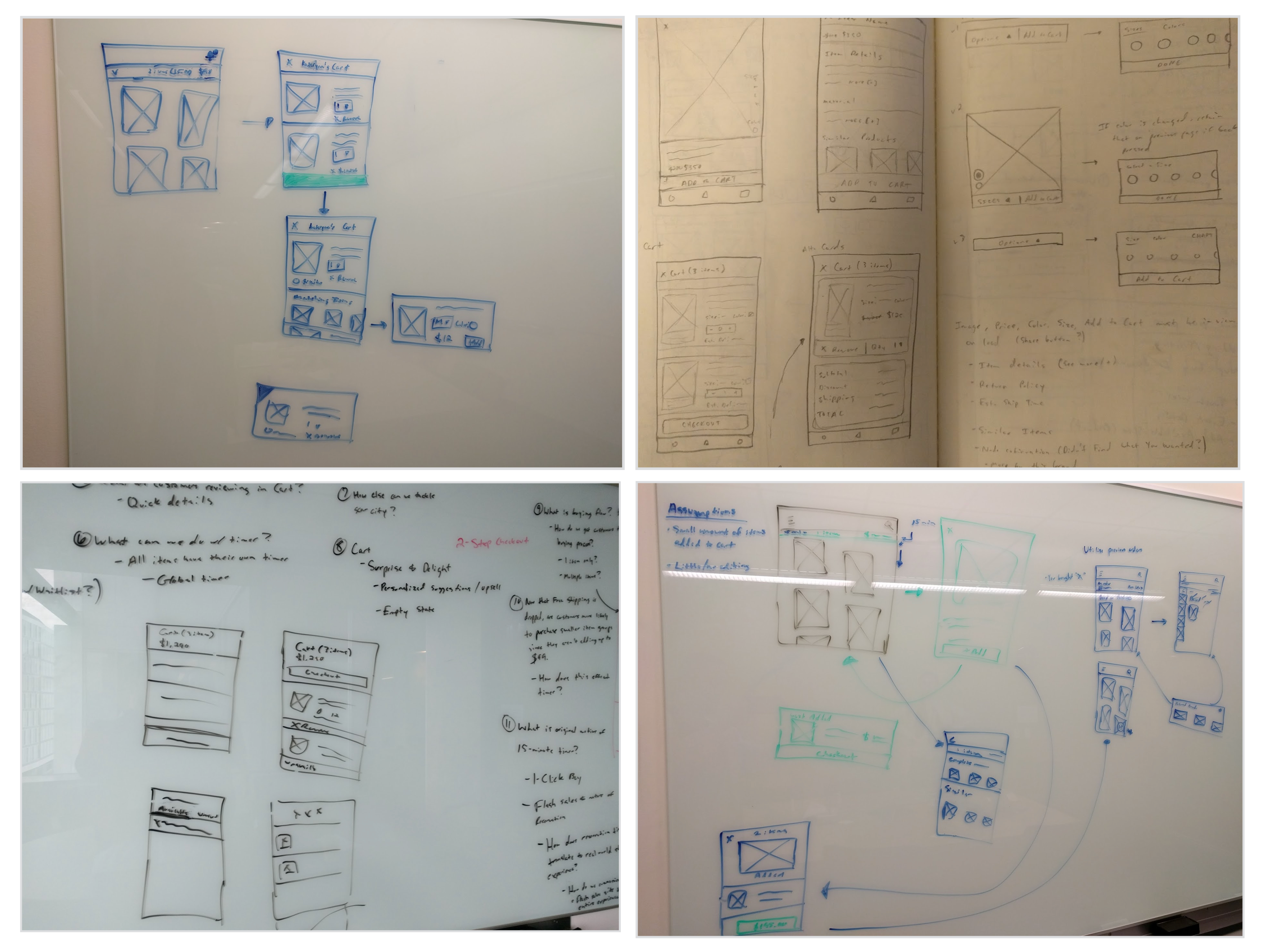
Sketches & flows detailing the Cart & Checkout flows.
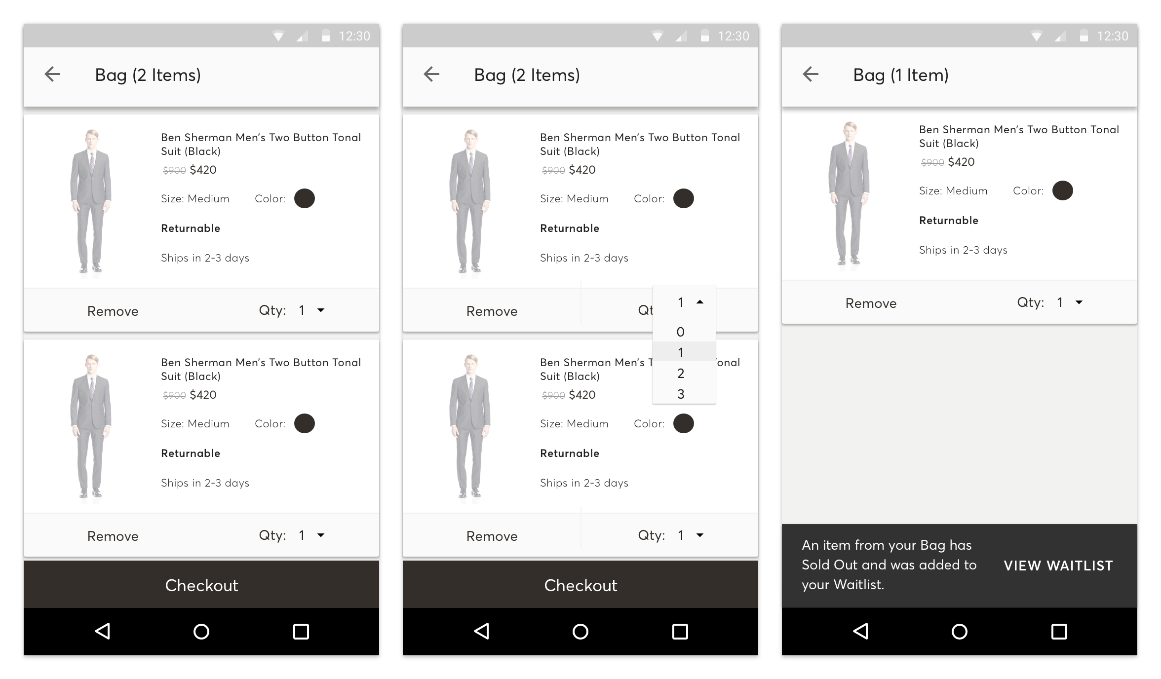
Final Cart & Checkout (Android version)
SEARCH, SORT, & FILTER
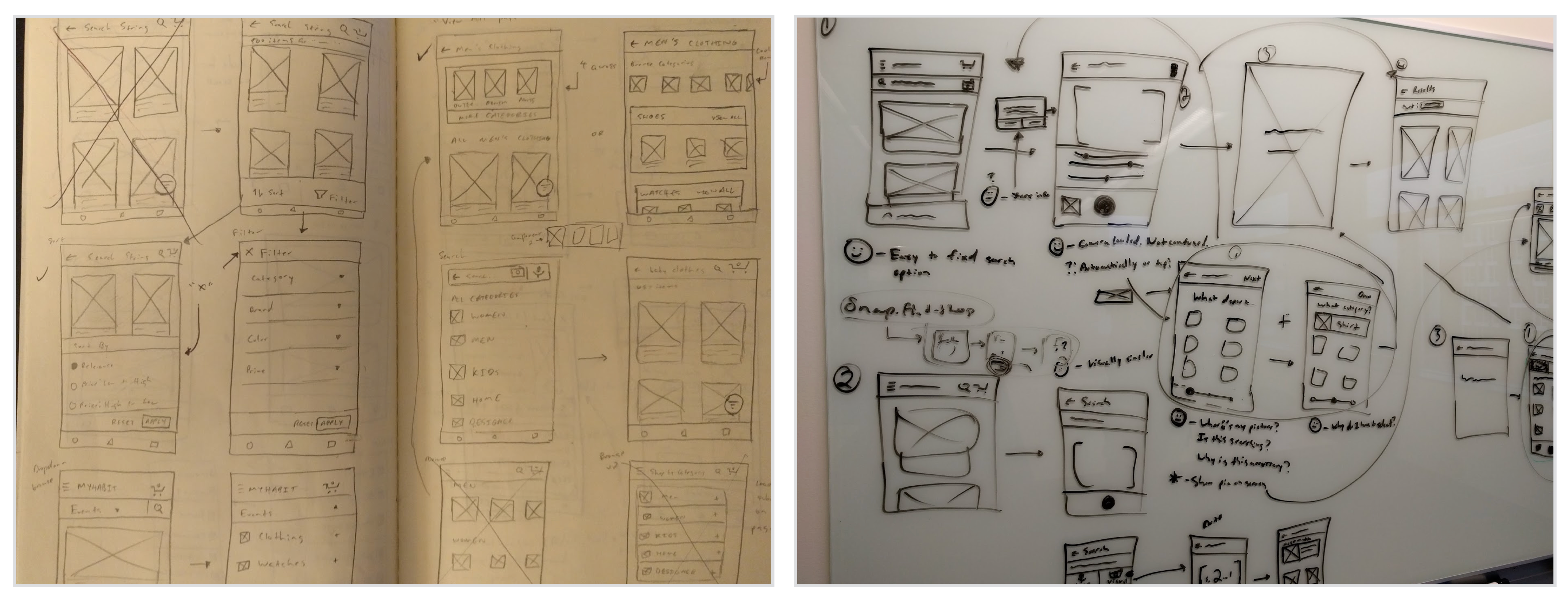

Search, Sort, & Filter explorations & Sketches
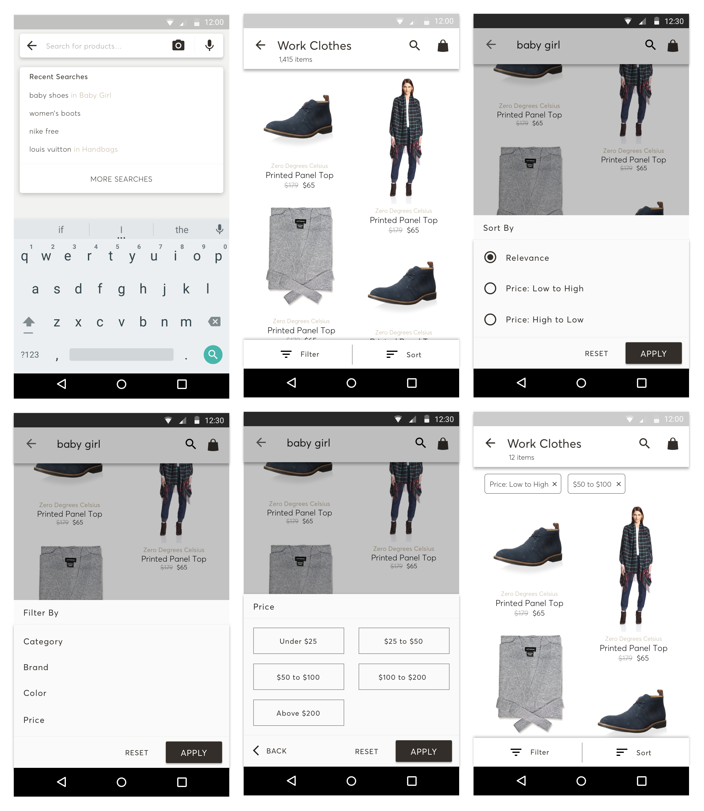
Final Search, Sort, & Filter (Android Version)
BUY-IN & ALIGNMENT
Driving cross-functional alignment
At this point in the project, I was brought in to accelerate and own the iOS and web portions of the project as well. I conducted a series of 3 Google Design Sprints to align with my other design partners on the learnings from the Android design and executions for the other experiences. For a deep dive into the design sprints, check out the MyHabit Design Sprints story.
After receiving the customer feedback and solidifying up pieces of the design direction, I created the final UI to handoff. I flew back to New York to pitch the new direction to the entire business team and reveal the redesign alongside a rebrand of the app. I walked through how the experience would work across the Android and iOS apps as well as the Web experience, which was received positively and with a lot of excitement from the business team.
With the green light from the business team secured, the final design was handed to developers to implement. Many development decisions were influenced based on the structure of several Framer prototypes I had created which helped speed up the early architecture and framework design, which helped us begin testing features more quickly.
Finally, I created a design system of reusable components that helped reduce tech debt and eliminate the need for many UI decisions later into development, allowing the team to focus on the experience and interactions over specific UI elements.
NEW PATTERNS & FEATURES
Creating new opportunities
Once the main features of the app were finalized and bought in on, I focused on solving a few core customer & business problems and proposing these new features. There were 3 specific problems I looked to solve:
- Helping Event shoppers continue to shop through Events when they find one that they like.
- Helping the buyers in the business sell items when they are on their "second run" or more.
- Helping the business advertise to hybrid shoppers who entered the app via an ad and landed outside of the Events page.
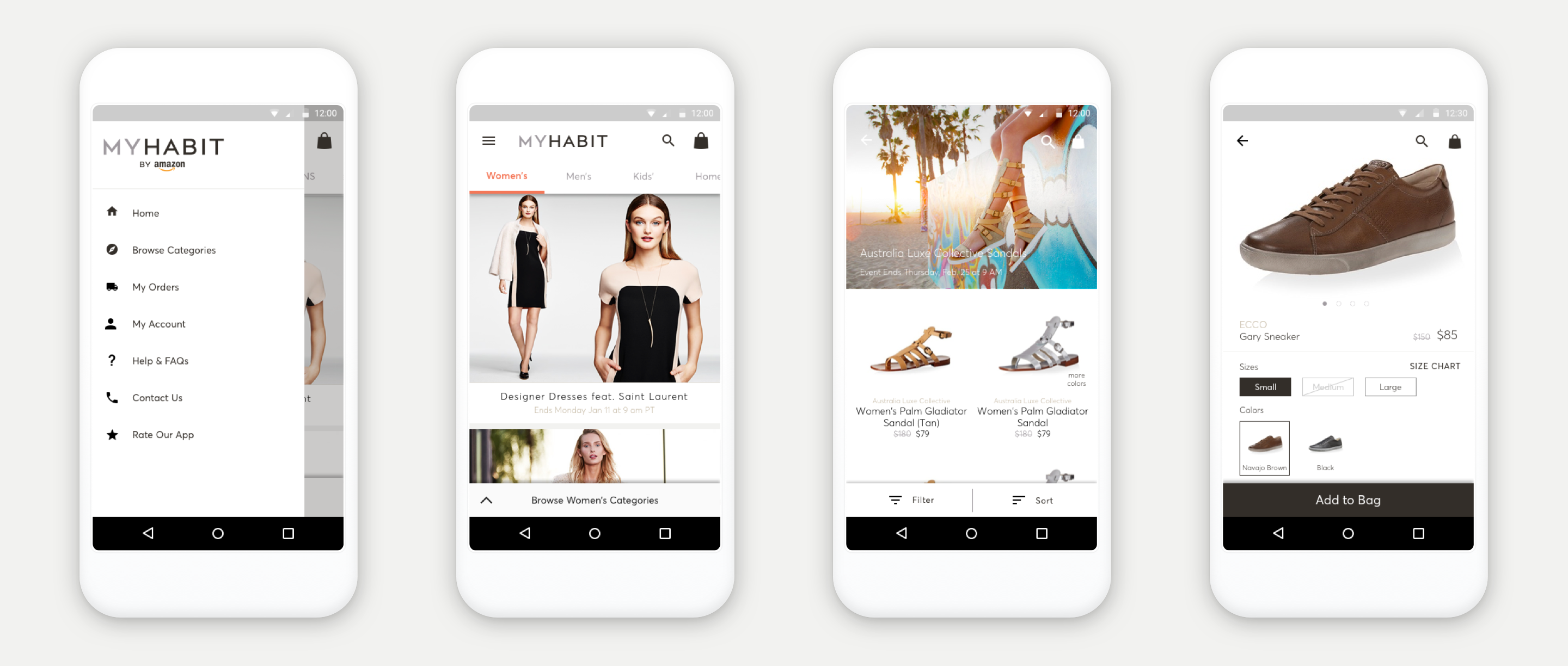
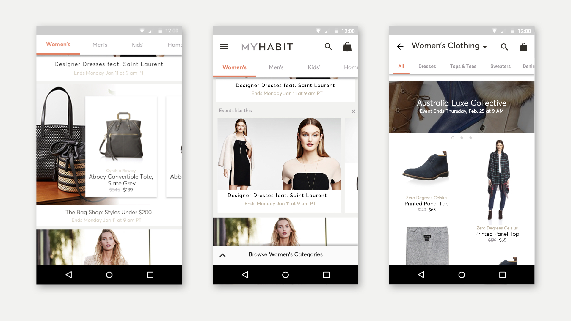
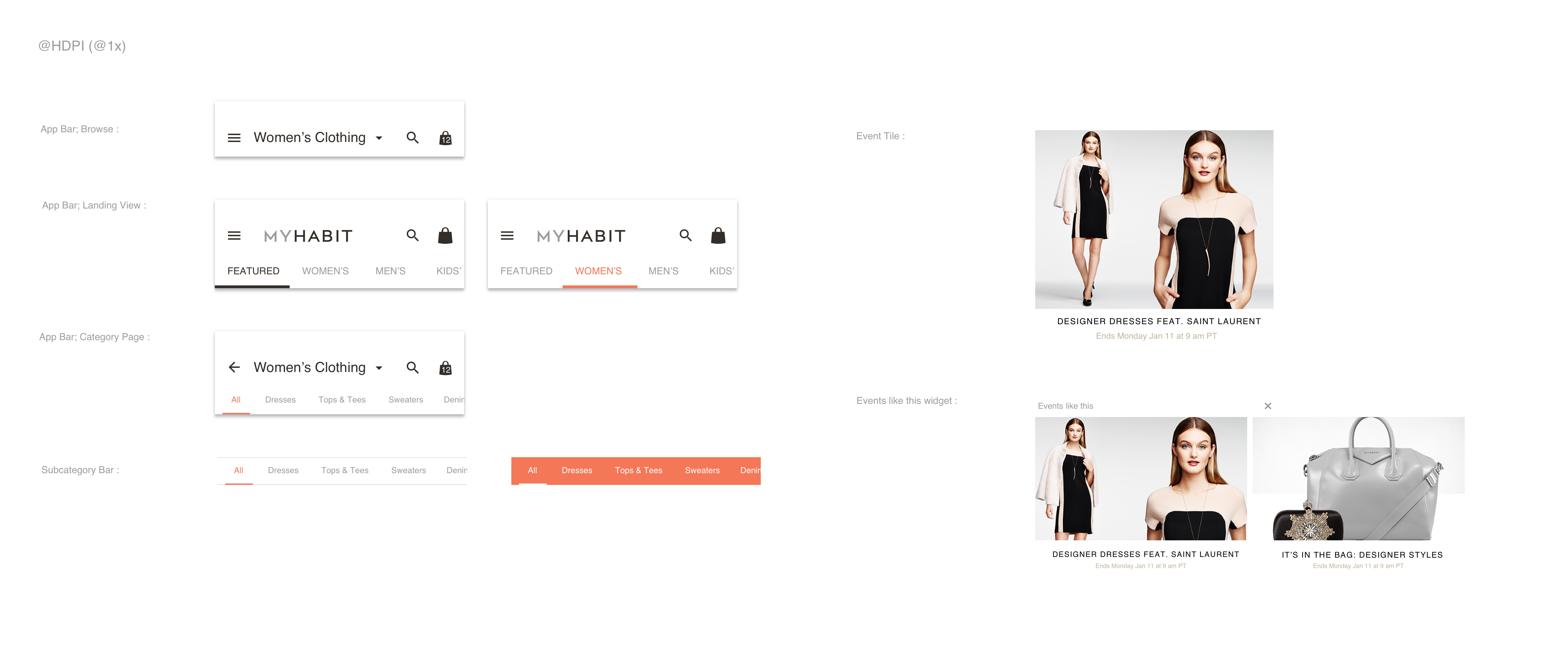
This is an example of a few patterns created for the MyHabit apps.
Exploration of a "Fashion Show" inspired MyHabit Apple TV app (created in Framer).
WRAPPING UP
Impact & Achievements
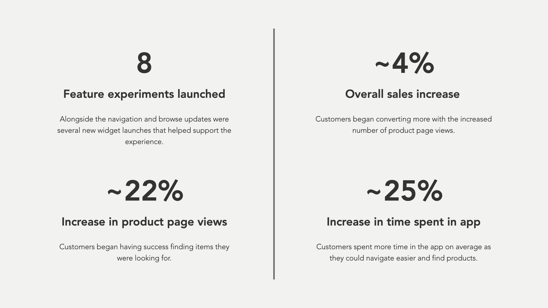
MyHabit unfortunately was shuddered just as the new features for this project began to roll out, but a few features did launch that showed promise for the redesign of the entire experience.
© 2025 Cam Luck. All rights reserved.