Evolving the recipient experience
"Your Orders" is a core experience in the Amazon app, enabling millions of customers to manage every aspect of their post-purchase journey—from tracking packages to initiating returns. As customer expectations evolved, it became clear that the platform, which hadn't been updated in years, needed an overhaul to keep up with Amazon’s growth and customer demands.
This project aimed to modernize the "Your Orders" experience, enhance operational transparency, and address common pain points, ultimately delivering a smoother, more informative recipient journey.
THE CHALLENGE
Modernize the delivery experience
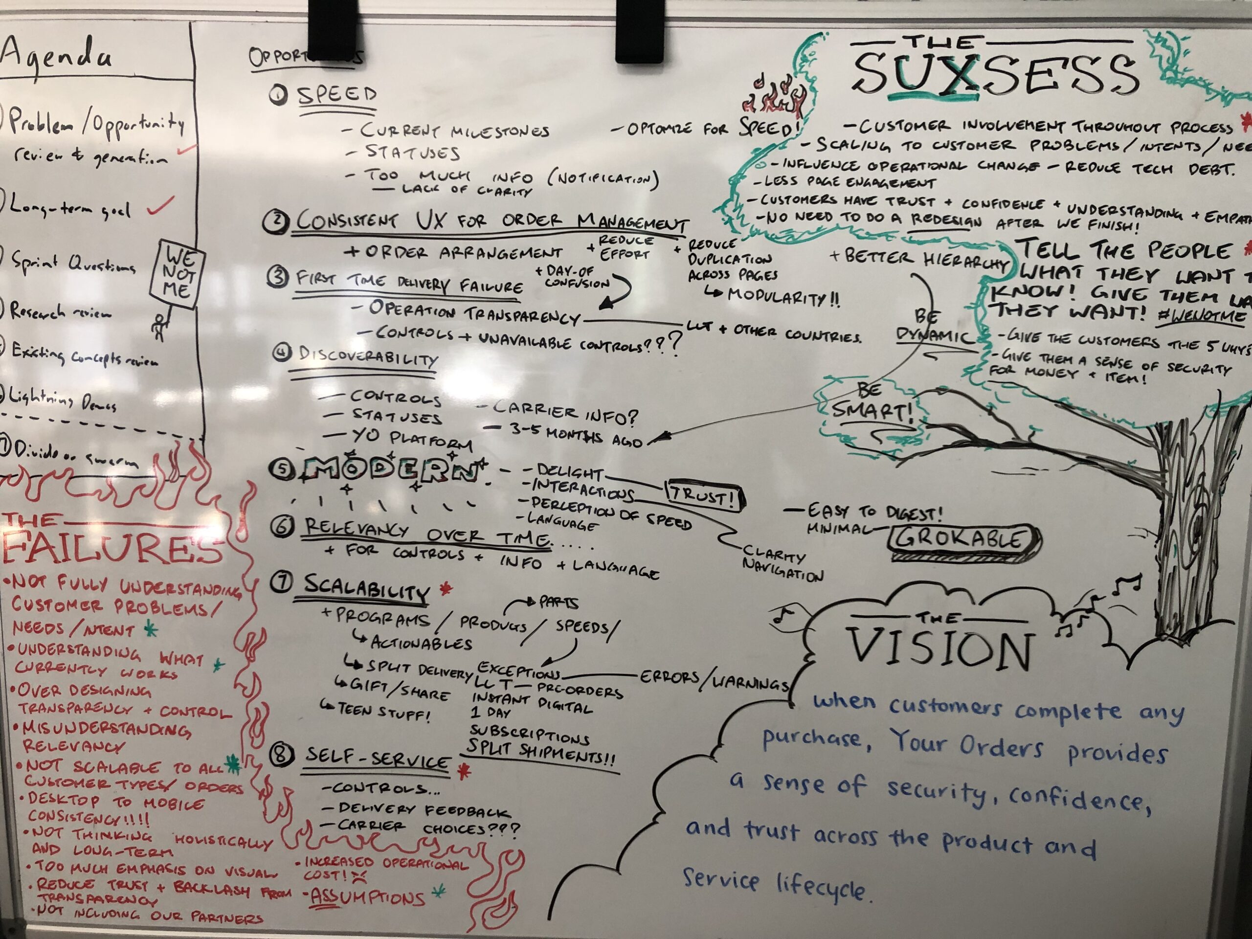
The challenge was to redesign the "Your Orders" experience to align with Amazon's evolving customer expectations and logistical demands. With the app being central to understanding order status and providing access to post-purchase support, our team set out to tackle several critical issues:
- Reduce First-Time Delivery Failures: Streamline the experience to minimize instances where customers miss deliveries.
- Enhance Operational Transparency: Make it easier for customers to understand the current status of their orders and any logistical complexities.
- Increase Visibility of Controls: Ensure self-service options are intuitive and easy to access, reducing reliance on customer support.
- Modernize the Interface: Update the UI and interactions to reflect Amazon’s current design standards and customer expectations.
Goals
To meet these challenges, we established the following goals:
- Reduce First-Time Delivery Failures: Improve the clarity and visibility of order statuses and delivery instructions to help customers receive their packages on the first attempt.
- Operational Transparency: Provide clear, detailed information on package locations, delivery timings, and any logistical updates.
- Increase Visibility of Controls: Elevate self-service features such as tracking, rescheduling, and returns, making them easy to find and use.
- Modernize the Interface: Update the visual design for a more contemporary look and feel, consistent with Amazon's current design standards.
- Scalability: Ensure the design supports Amazon’s growing range of products and delivery options, preparing the platform for future enhancements.
- Create Delight: Introduce elements that provide a satisfying user experience, making the recipient journey feel effortless and enjoyable.
- Reduce Navigational Effort: Minimize the number of taps required to find key information, helping customers reach their desired actions quickly.
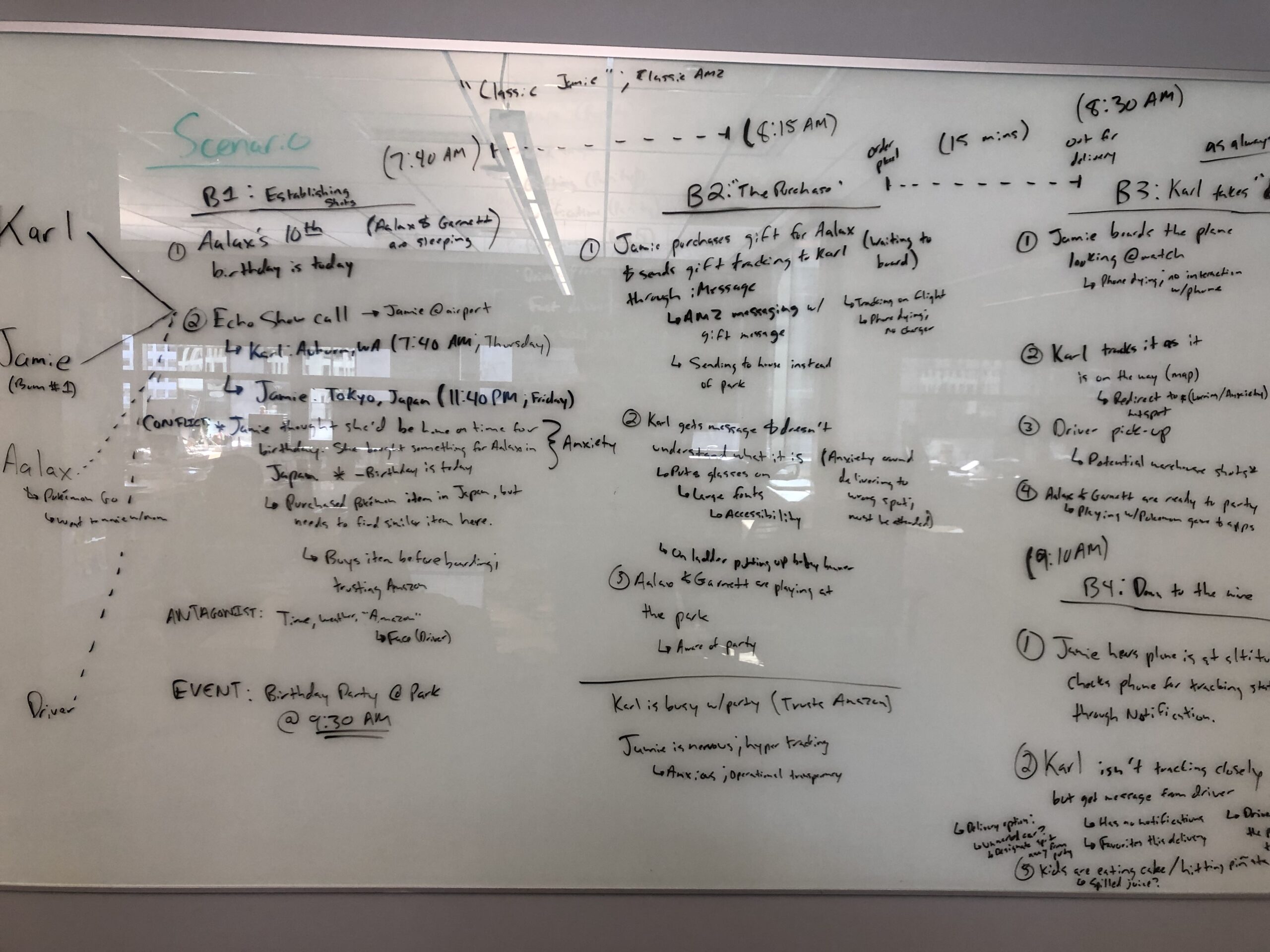
- Reduce Customer Anxiety: Design for a transparent experience that anticipates customer concerns and provides proactive updates to instill confidence.
My role
As the Lead Designer & Manager for the "Your Orders" redesign, I managed a cross-functional team to reimagine Amazon's recipient experience from the ground up. Leading a team of five designers, two researchers, and a UX writer, I was responsible for guiding every aspect of the design process while serving as the primary liaison with our Product Management (PM) Director and VP of Product. My role extended beyond design, as I worked to build buy-in across the organization, securing alignment from senior leadership and advocating for the resources needed to execute this ambitious project.
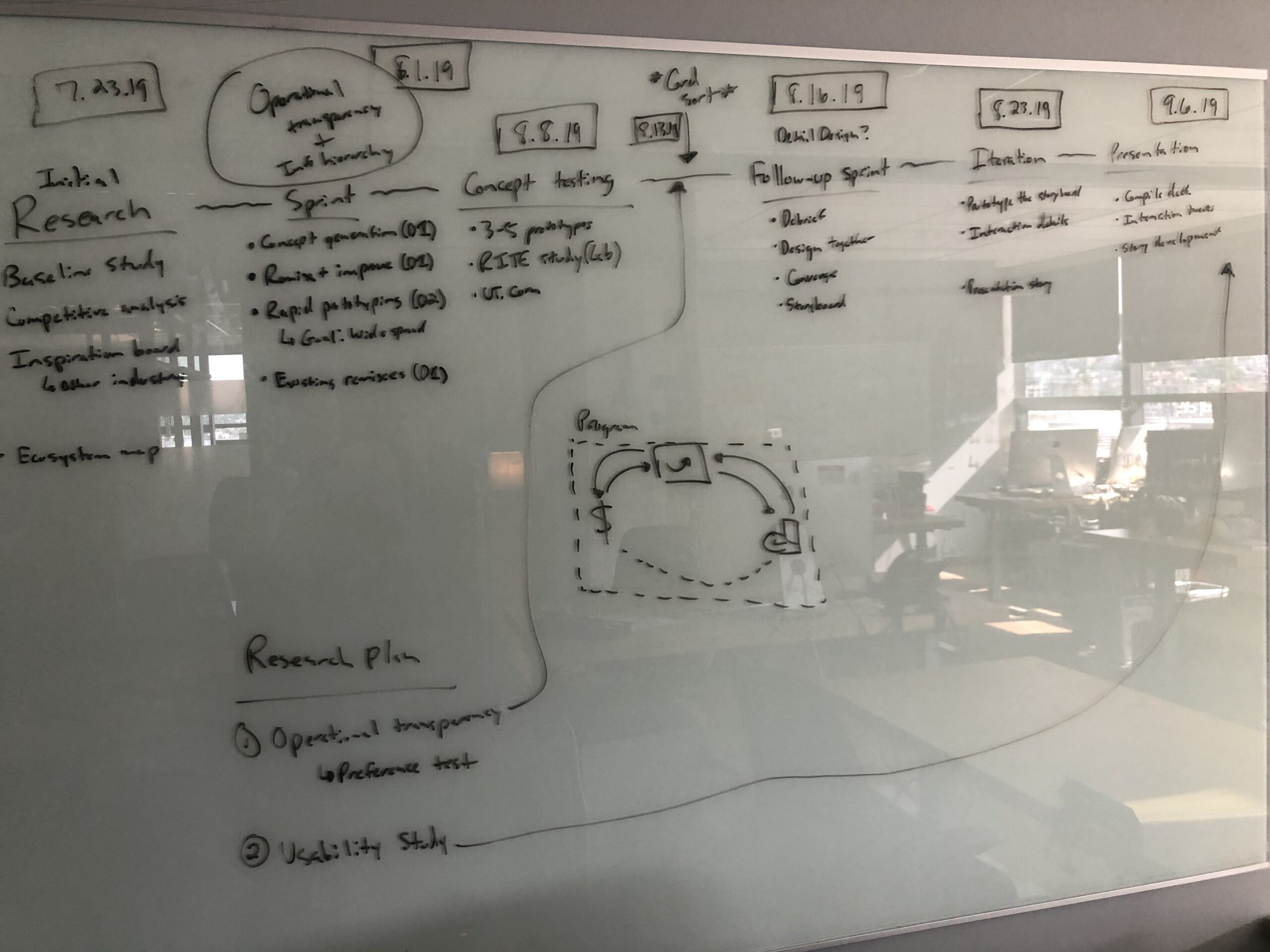
To drive the redesign forward, I organized and facilitated a series of design sprints, fostering rapid ideation and iteration within our team. I led the creation of high-fidelity prototypes, which we used to conduct user testing and validate our concepts. From these insights, I spearheaded the development of a convergent design concept, translating our findings into a future-proof roadmap that would guide Amazon’s "Your Orders" platform for years to come.
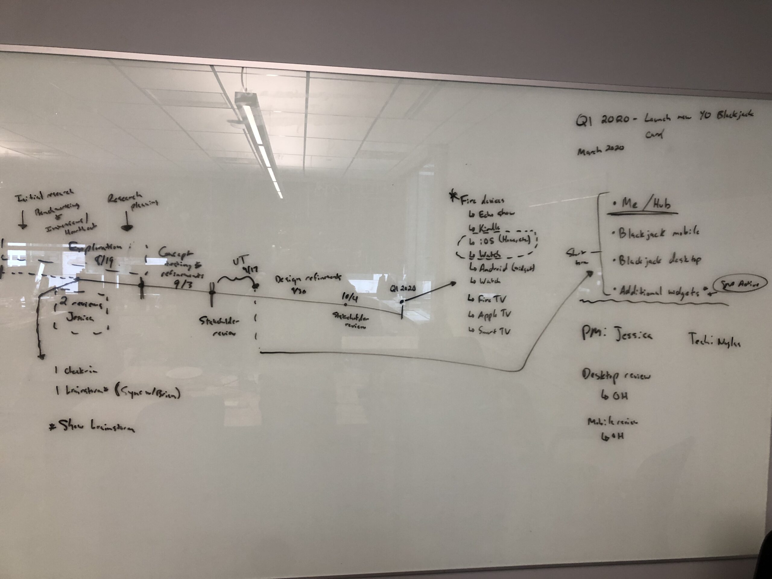
Despite the project's scale, our team completed this end-to-end redesign within three months. The roadmap and framework we established have since influenced ongoing feature releases within the platform, ensuring that the foundational work we delivered continues to enhance Amazon's recipient experience well beyond the initial launch.
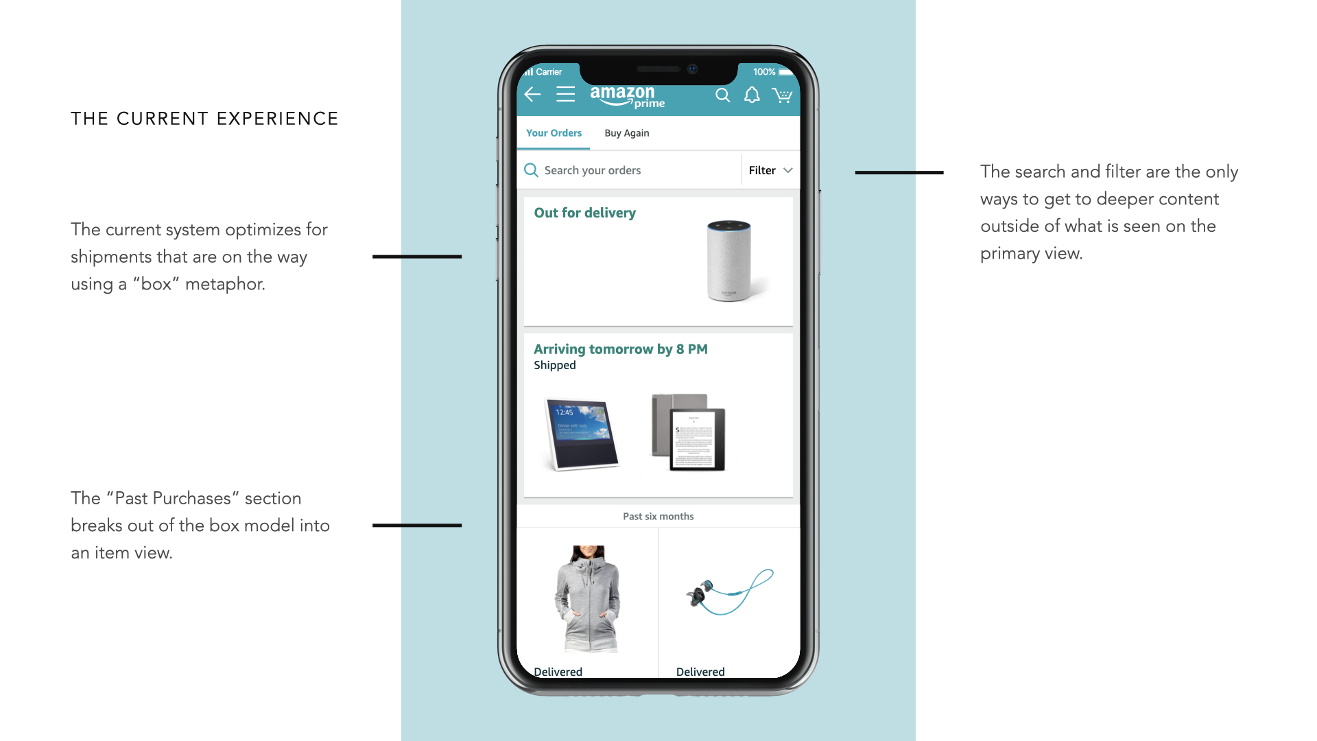
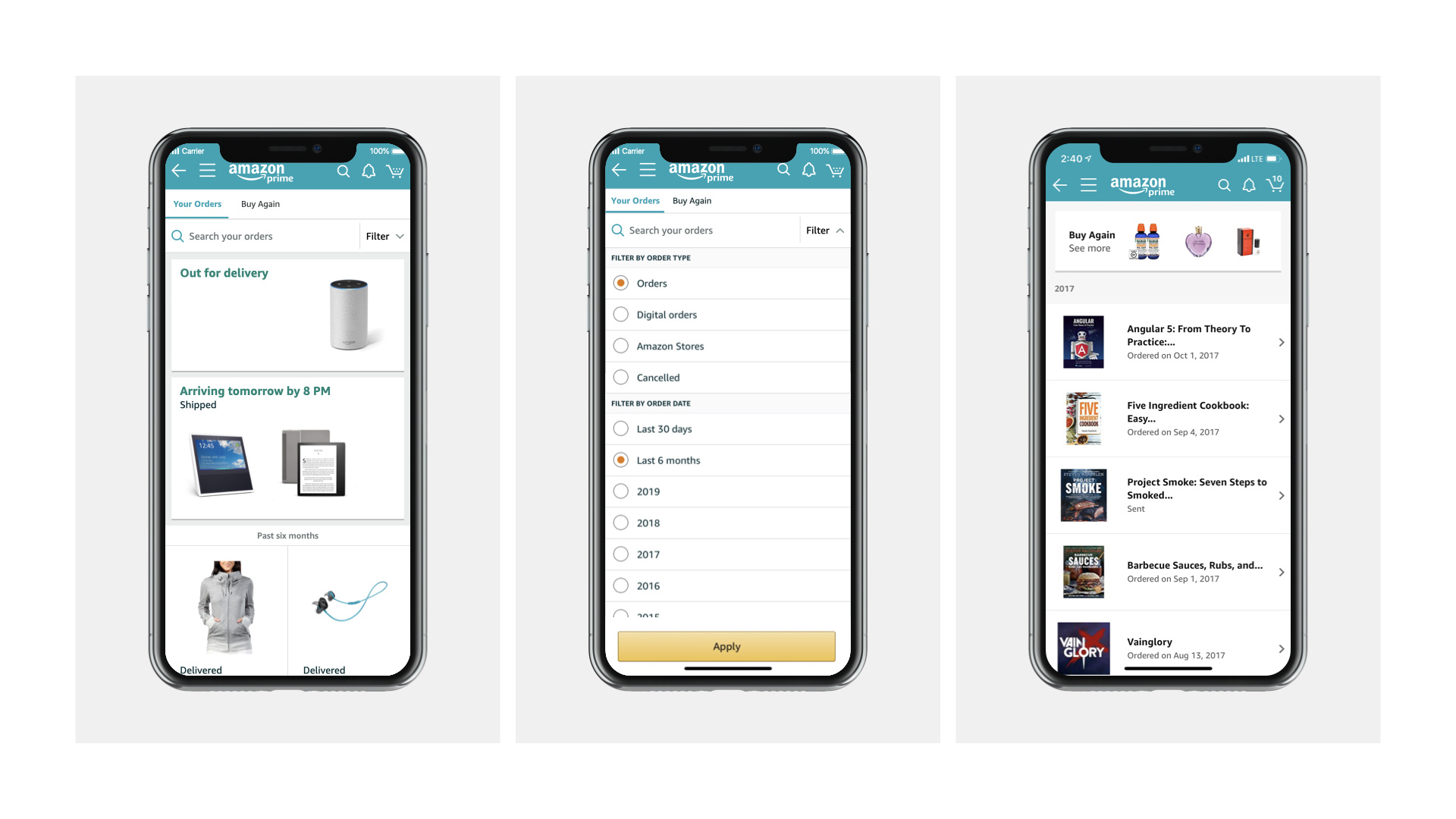
EXISTING APP
GETTING STARTED
Building on the shoulders of giants
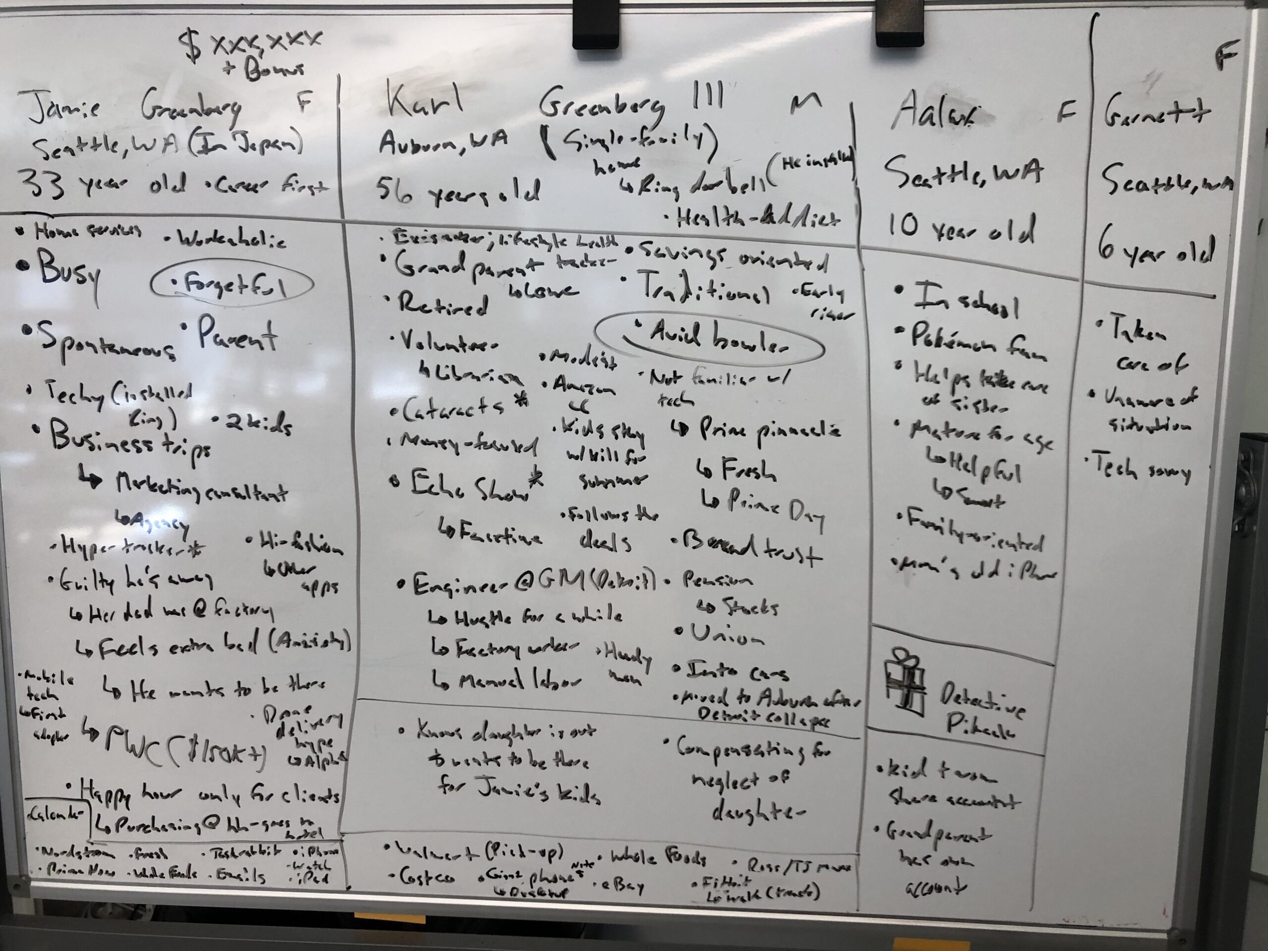
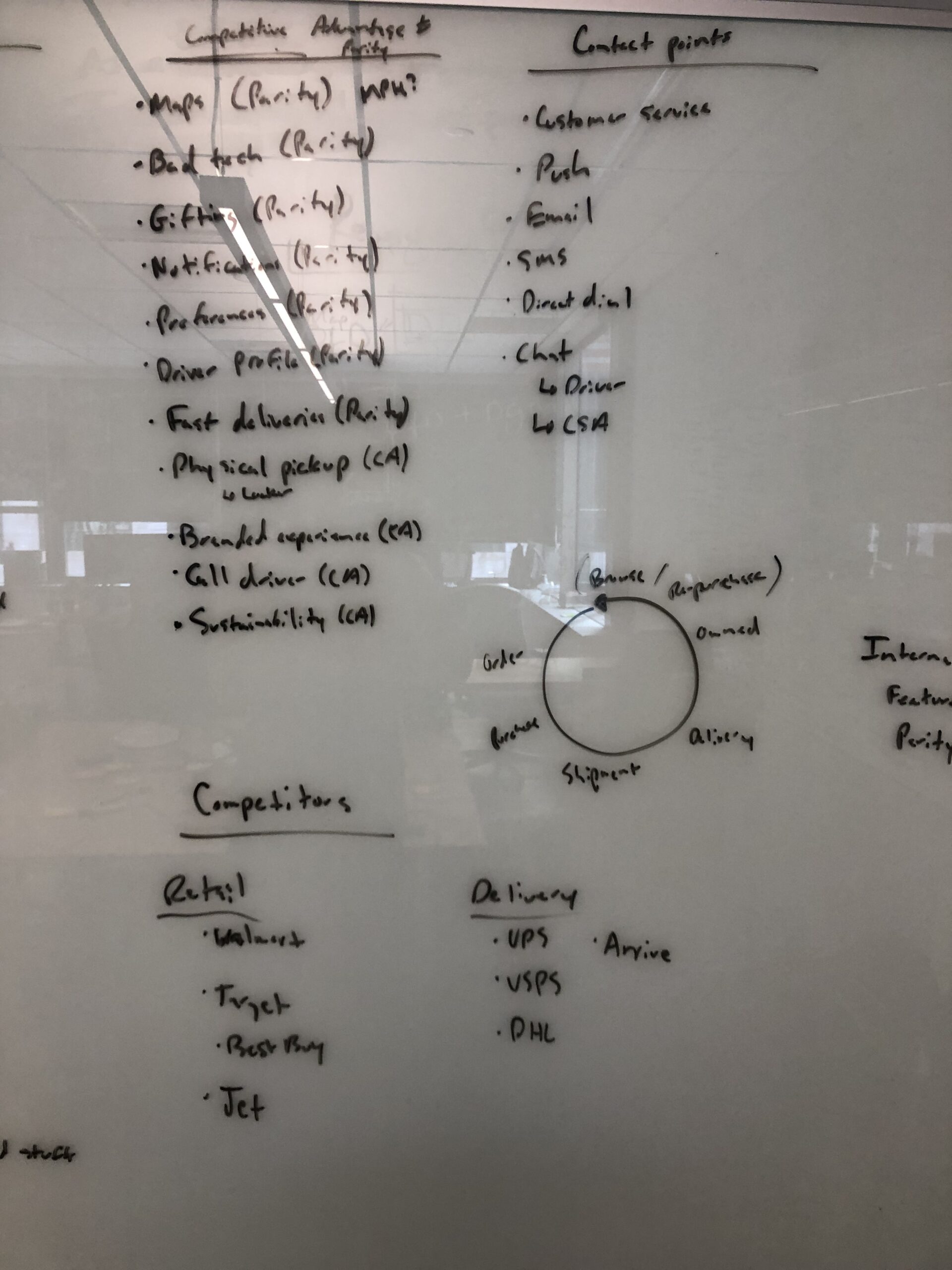
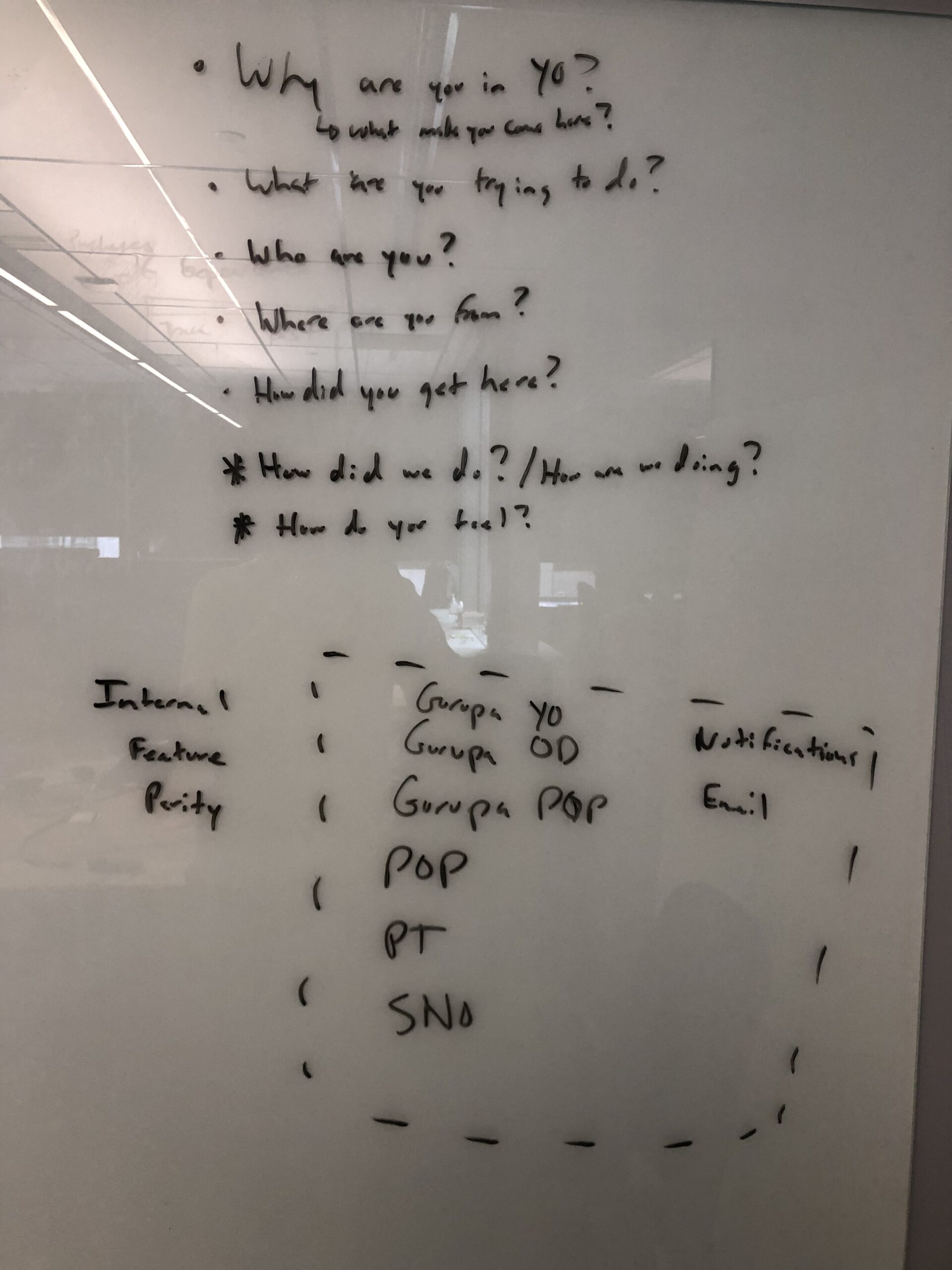
At the outset of the "Your Orders" redesign, I guided the team to ground our efforts in five years' worth of Amazon’s historical data. Although our Product Managers initially proposed running new discovery research, I saw an opportunity to harness the valuable insights already available across Amazon's internal wikis, customer service documentation, and research archives. By conducting an extensive literature review, our team was able to identify longstanding, critical pain points in the "Your Orders" experience that hadn’t been prioritized in previous updates.
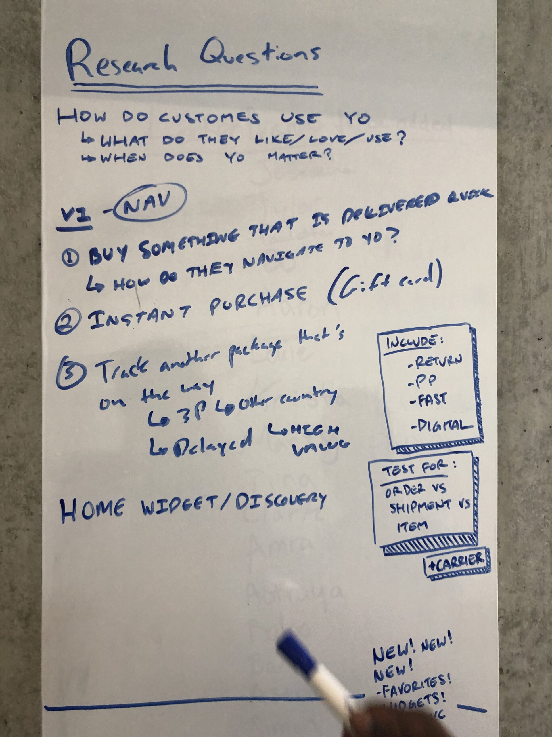
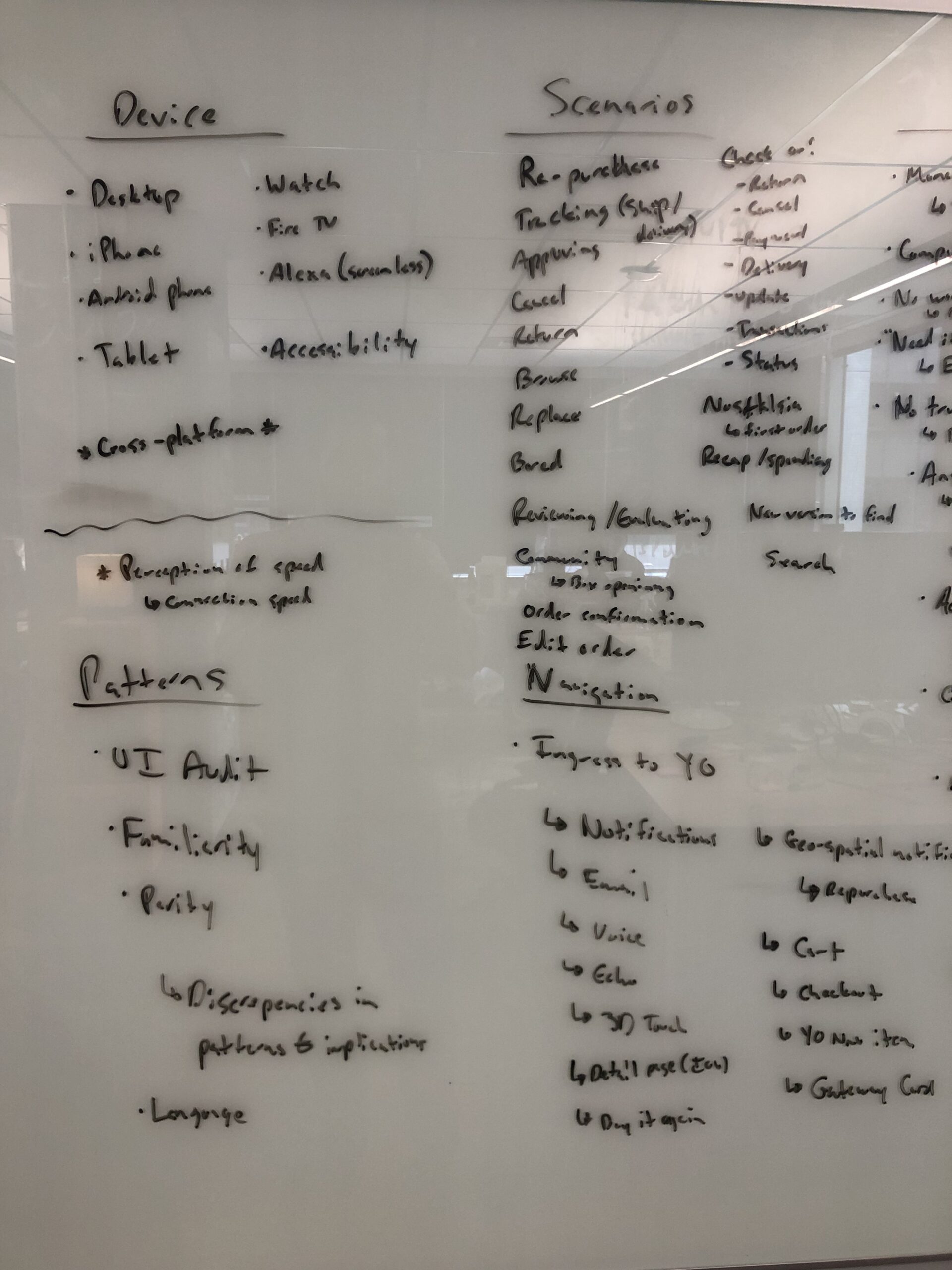
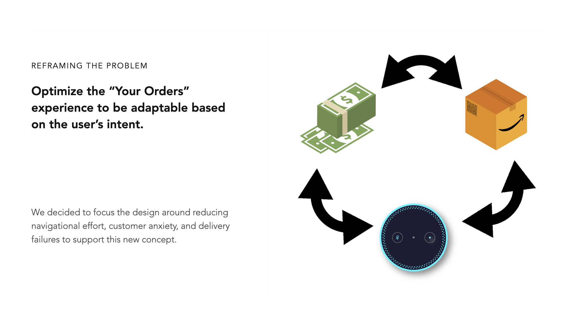
Through this review, we learned that our PMs’ initial hypothesis—that the Your Orders feature was primarily used for shipment tracking—was only part of the story. Customer needs extended well beyond tracking, encompassing broader concerns like managing spending, understanding delivery timelines, and knowing what actions could be taken with an order at each stage of the fulfillment process. This understanding led us to reframe the project’s core goal: rather than focusing solely on tracking, we aimed to Optimize Your Orders to adapt to diverse customer intents.
KEY FINDINGS
From the data, we uncovered several core customer insights that shaped our design priorities:
- Spending Transparency: Many customers were anxious about when and how much they had spent and sought clarity on when payments were processed.
- Delivery Timing for Events: There was significant worry around timing, especially when purchases were made for events like birthdays or holidays.
- Actionable Options at Each Order Stage: Customers were often unclear about what they could or couldn’t do at different stages of the delivery process. For instance, they struggled to distinguish options between canceling an entire order or just an item and needed clearer guidance on available actions based on order status.
Many other findings were also found related to interesting cases such as overseas purchasing and customs, exception cases, and more that were factored into the redesign framework.
RAPID EXPERIMENTATION & TESTING
Sprinting to Success
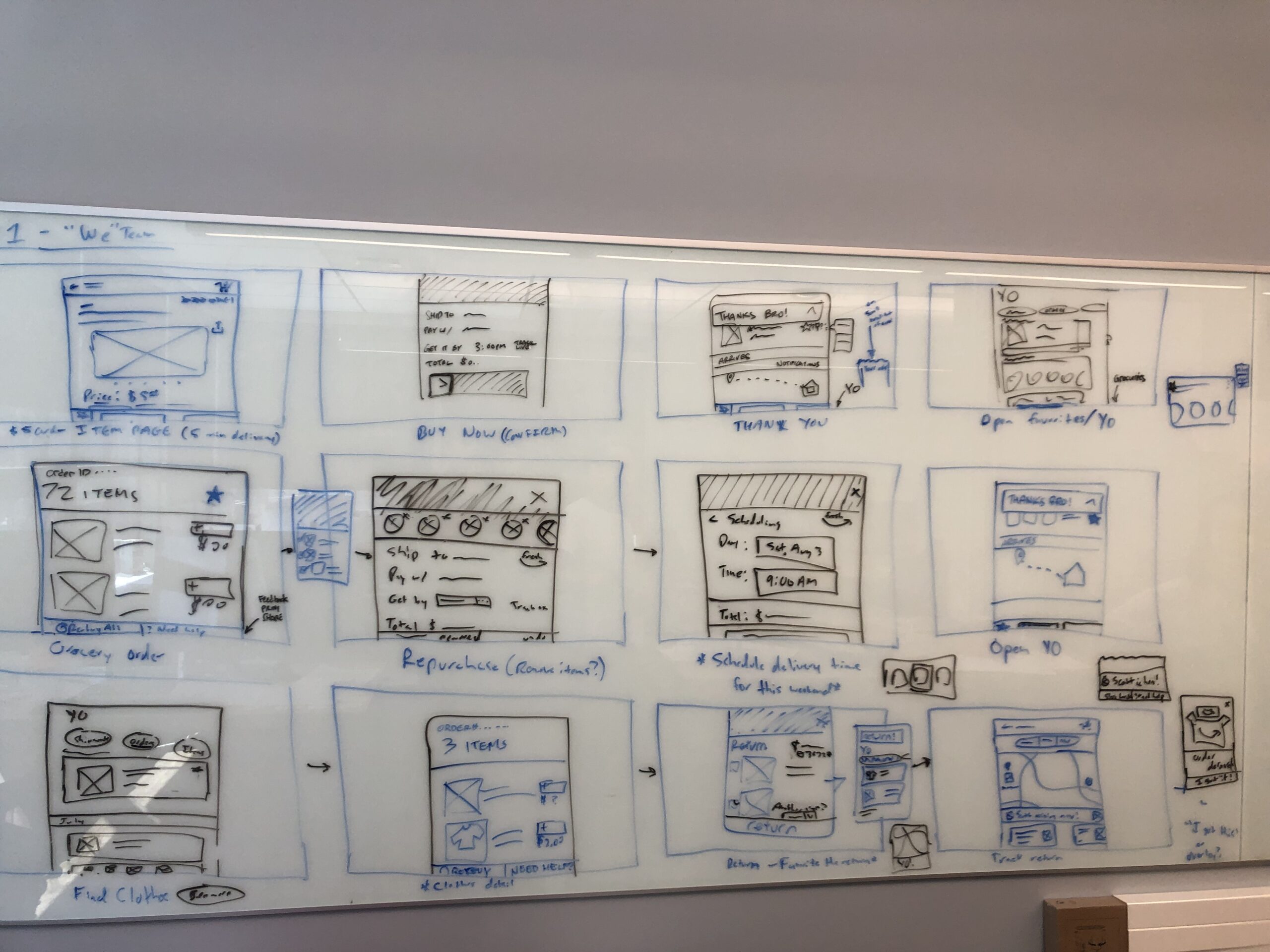
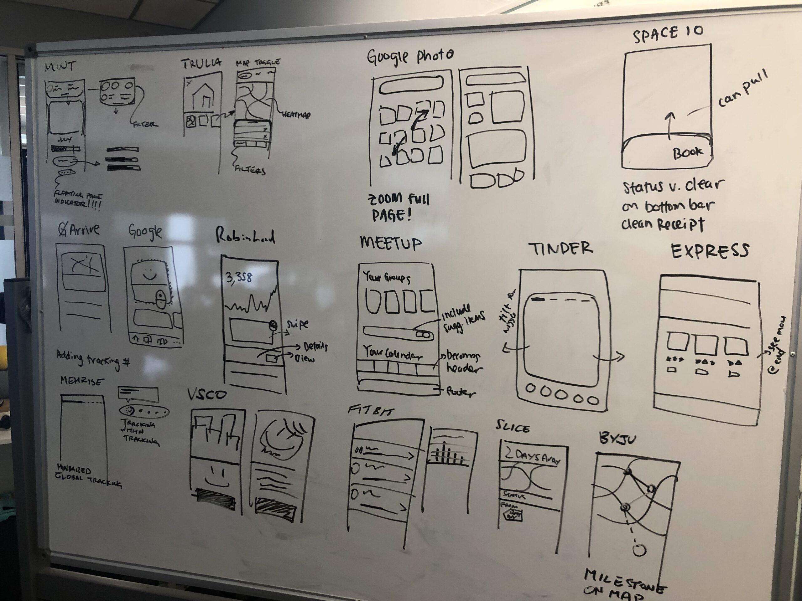
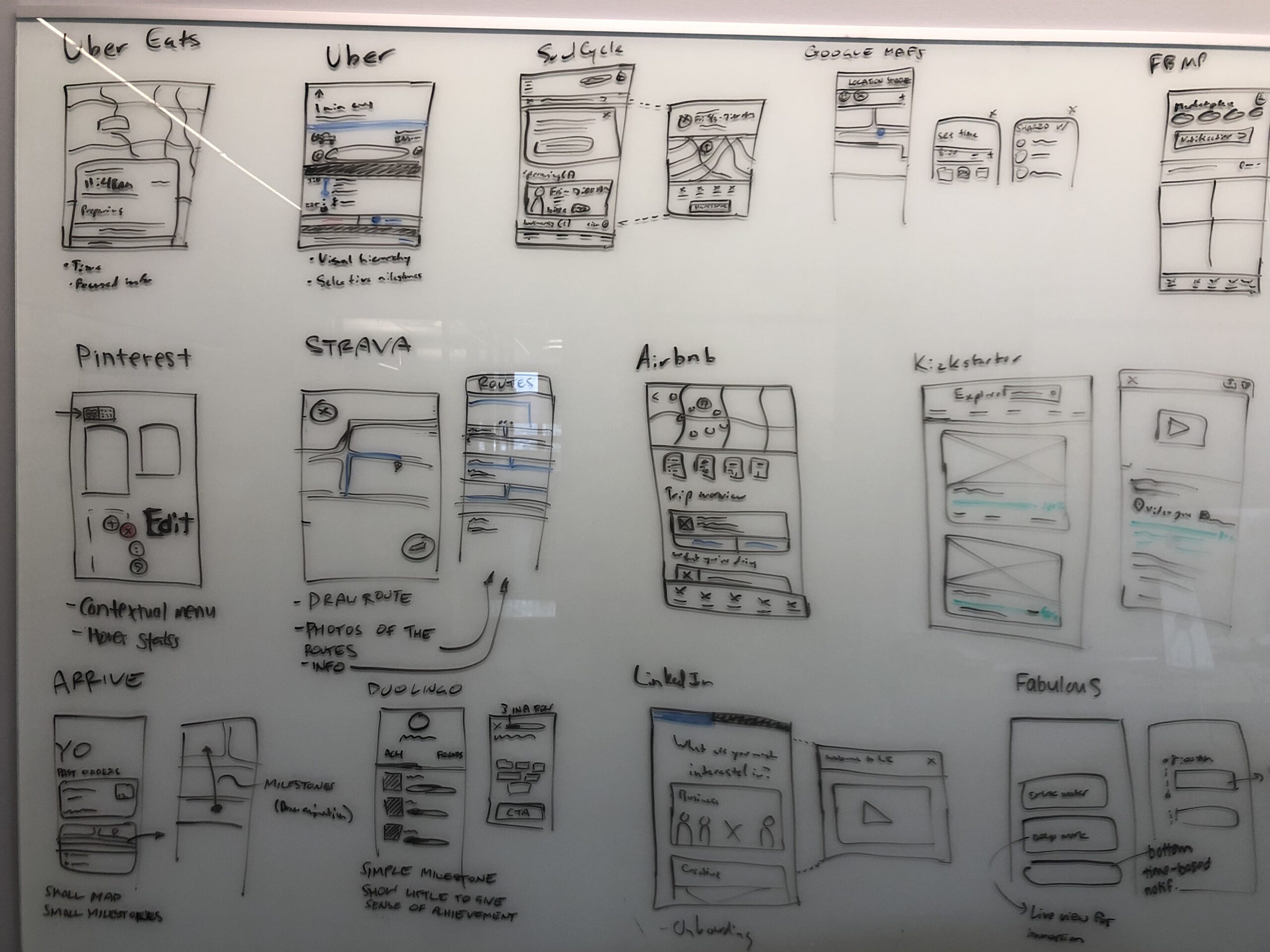
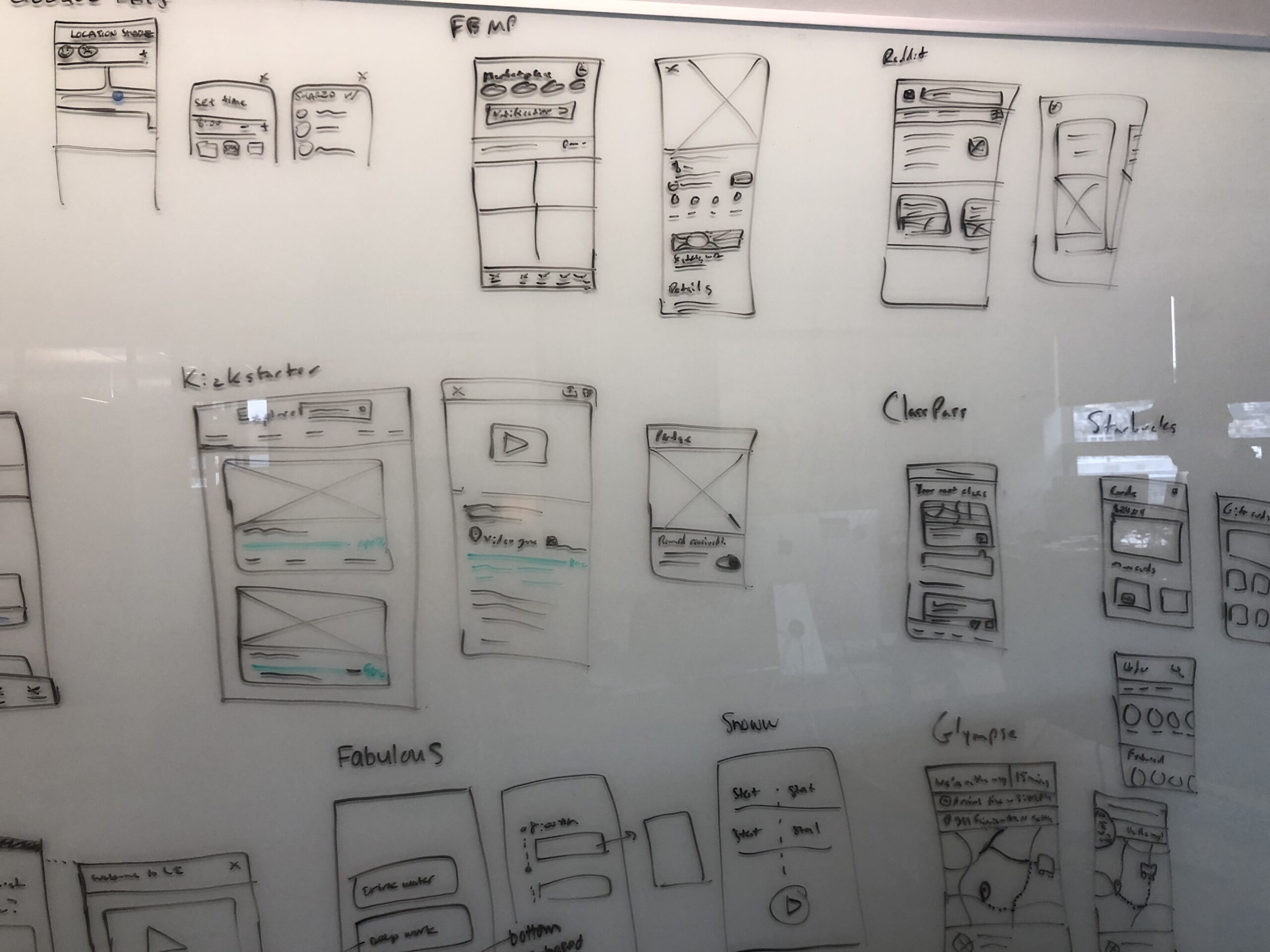
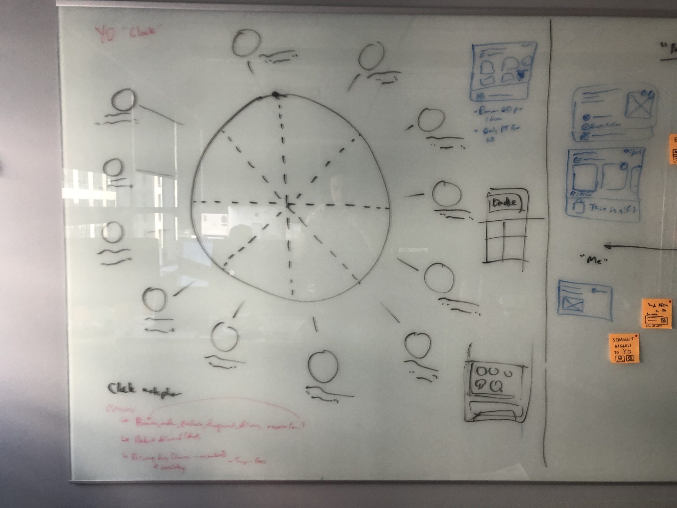
To address the core goals and pain points identified in our literature review, I led the team through a series of intensive Google Design Sprints. Our objective was to generate a wide range of divergent concepts that could effectively tackle the issues of navigational effort, customer anxiety, and delivery failures. These sprints were structured to rapidly ideate, prototype, and test solutions that could reimagine the "Your Orders" experience with fresh perspectives.
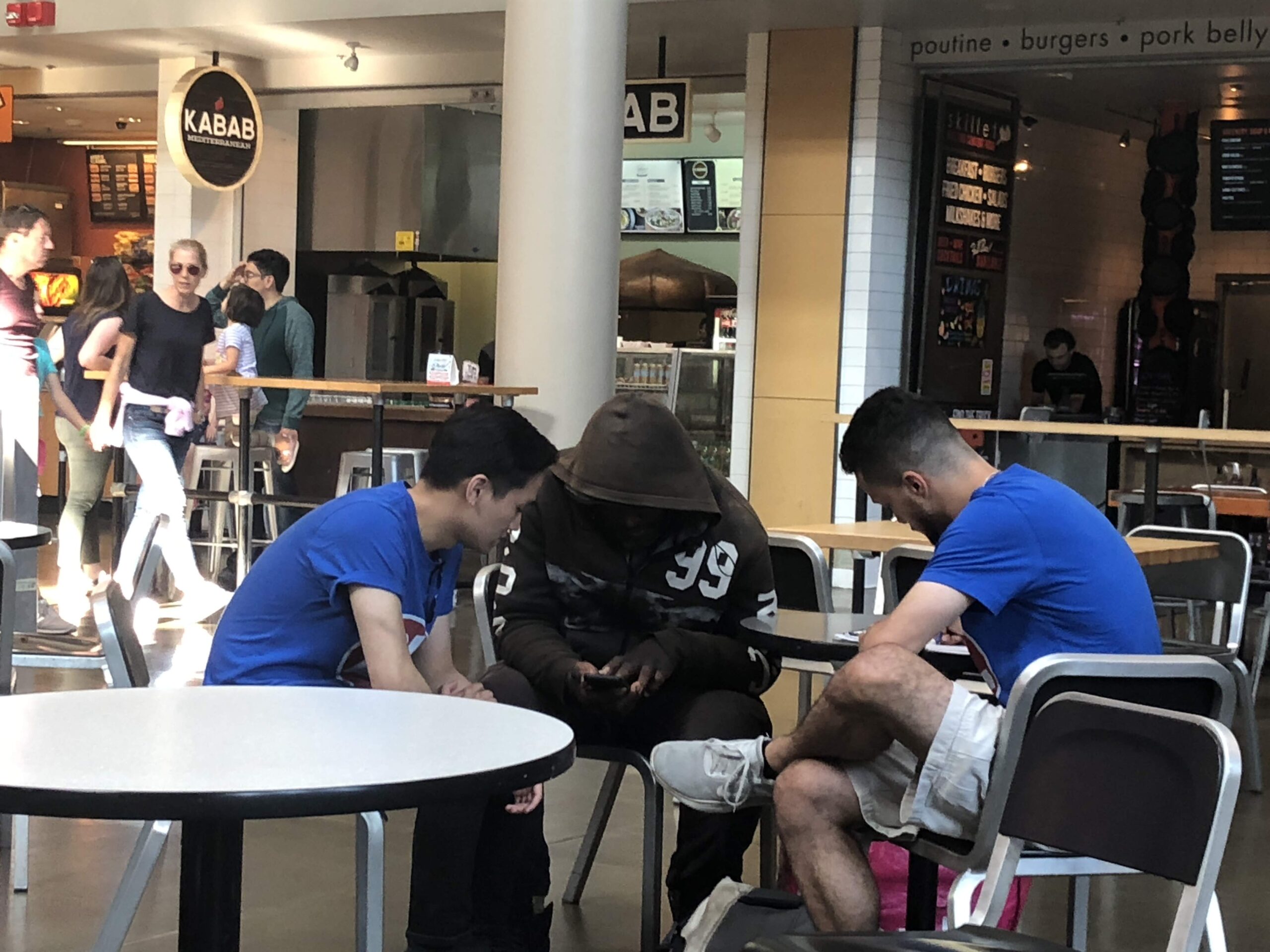
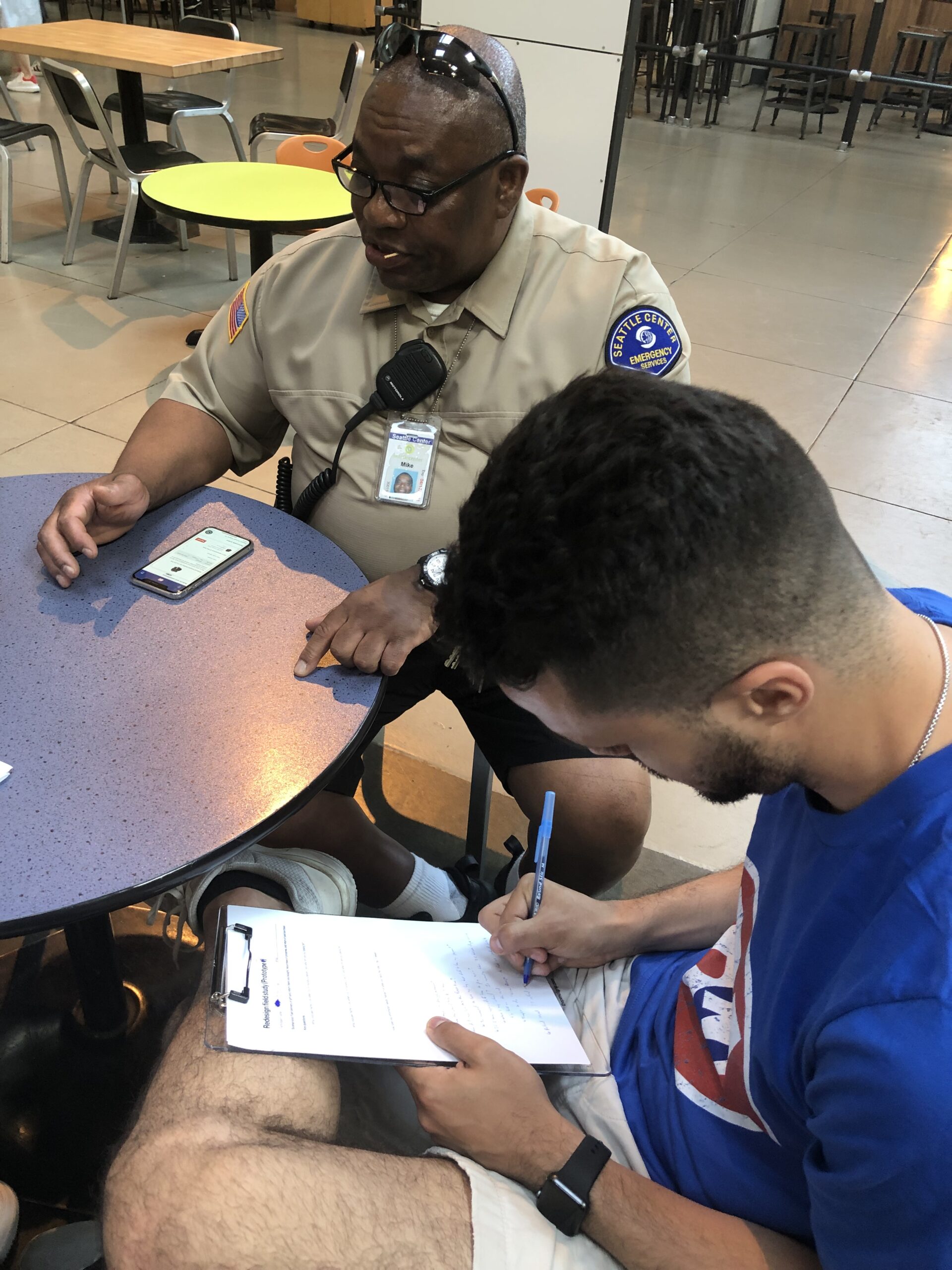
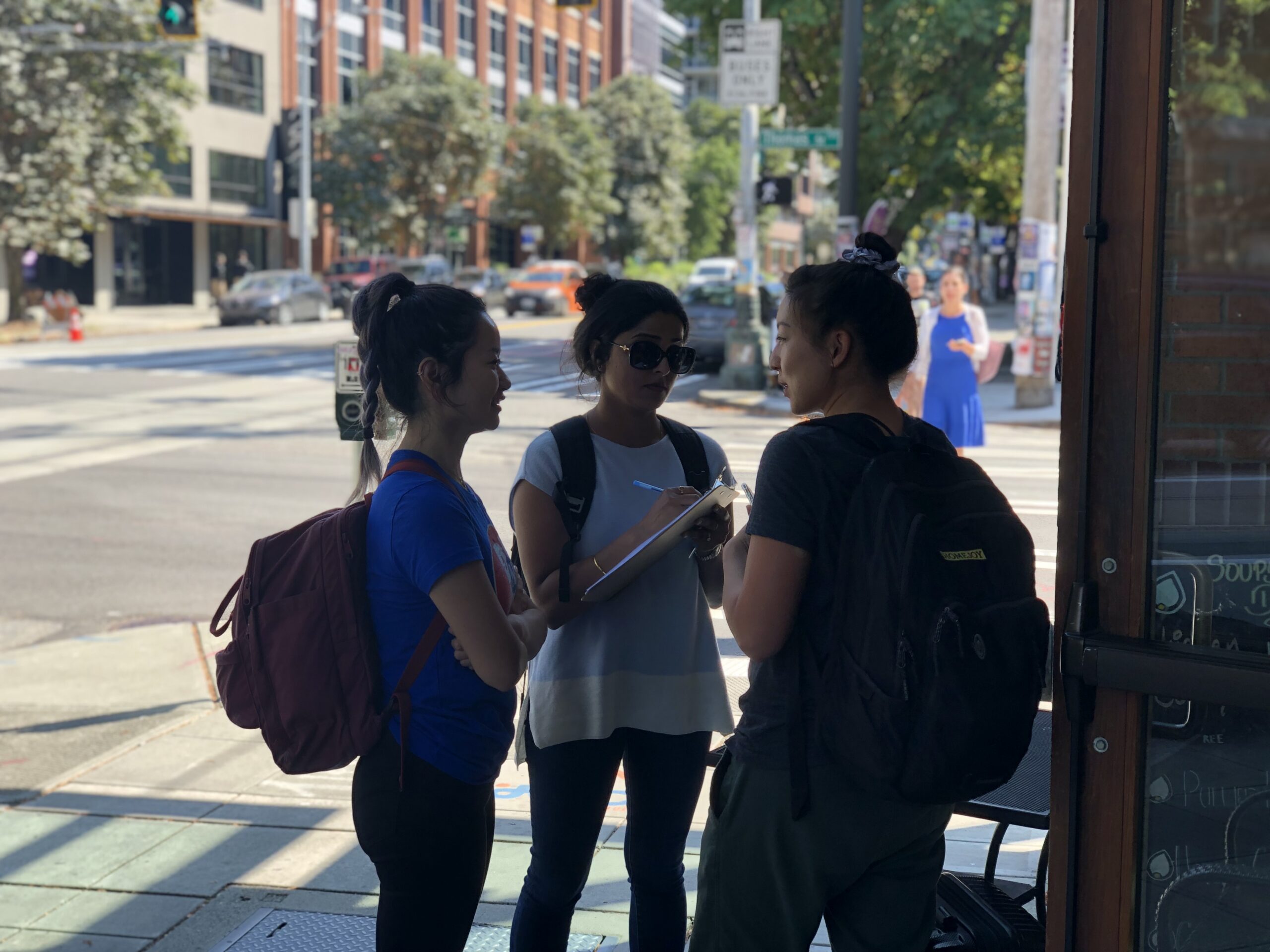
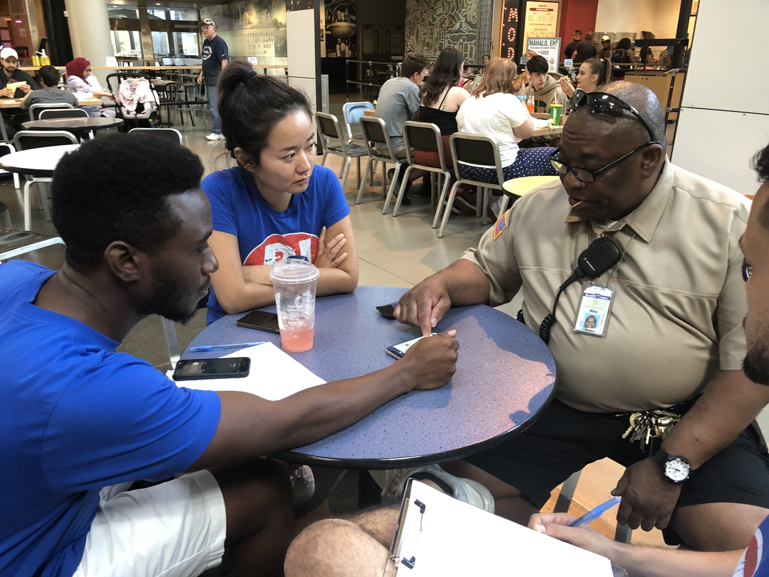
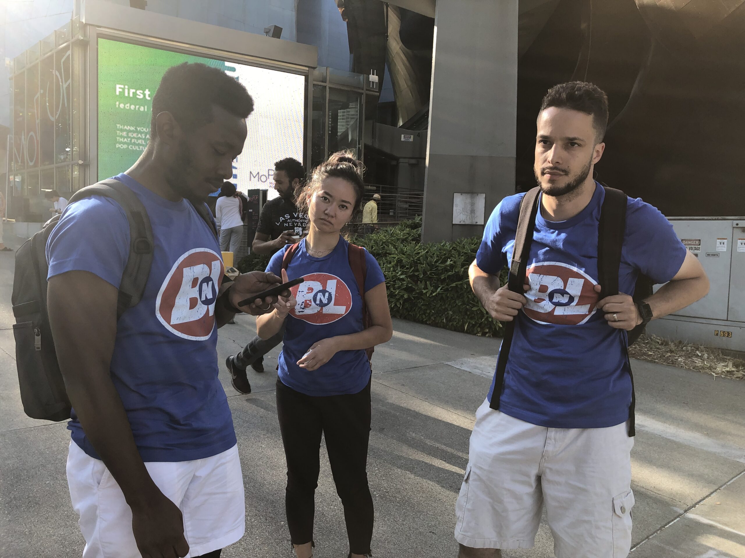
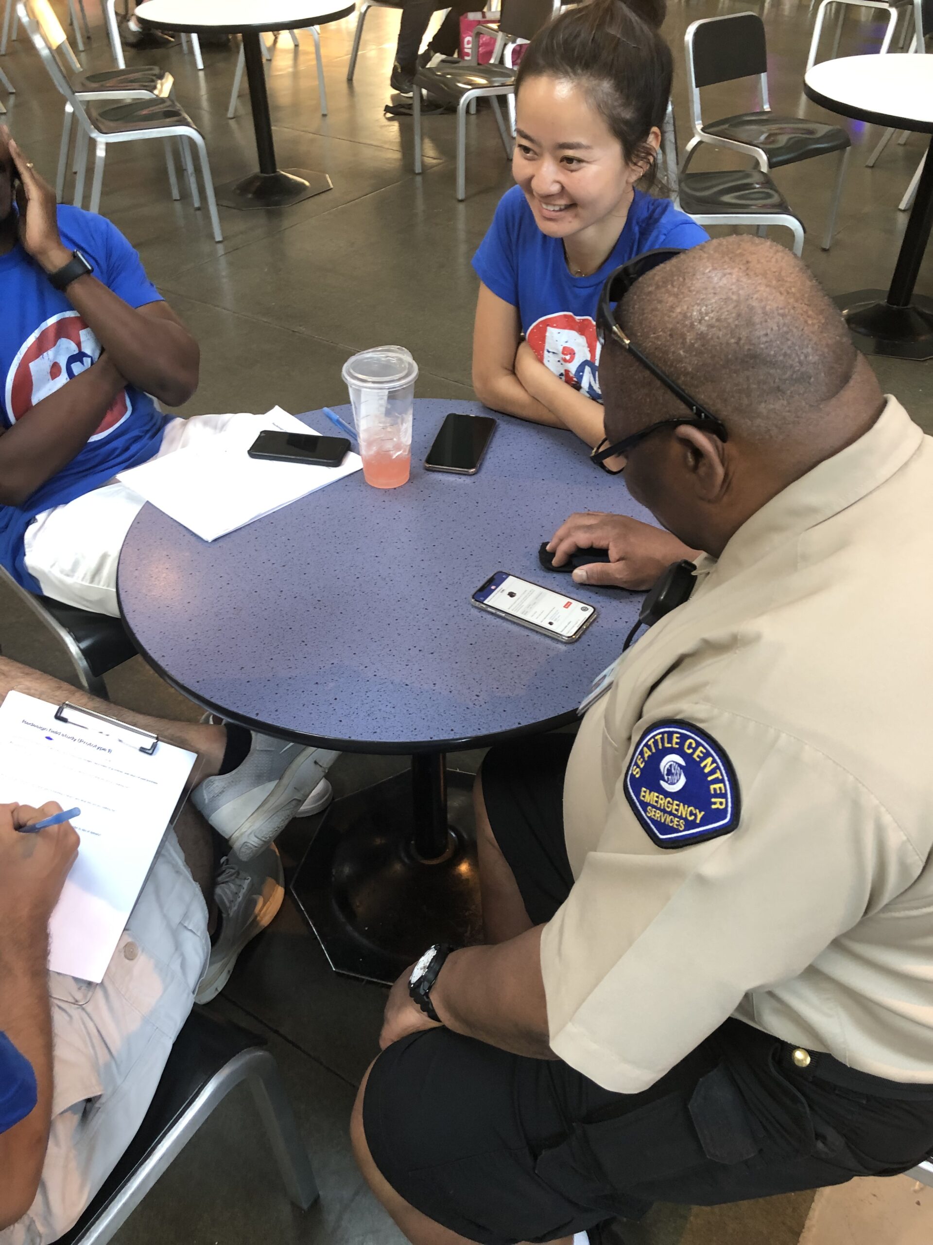
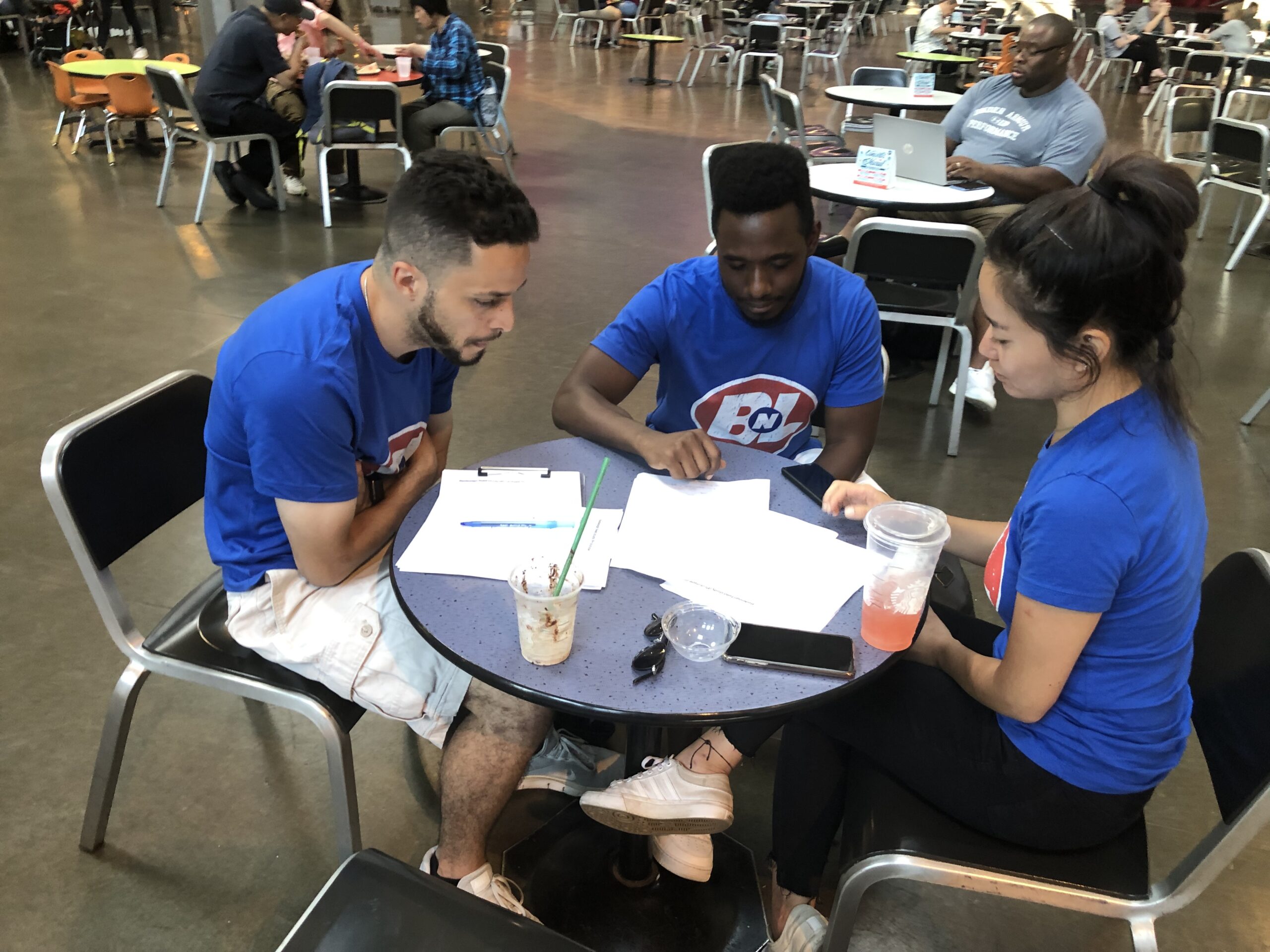
For the testing phase, we employed guerrilla testing tactics at Seattle’s iconic Space Needle. Here, we gathered feedback on our prototypes and compared them with the existing Amazon app, framing each concept within our fake brand to gain honest input. This strategy provided valuable insights into how users perceived the new concepts in a neutral context, and helped us identify which design elements best addressed customer needs without the influence of pre-existing brand expectations.
INTRODUCING BNL
Buy 'N Large
To minimize brand bias in user feedback, we created a fictional brand identity to test our concepts. This approach allowed us to present and evaluate new ideas without the influence of Amazon’s established reputation, enabling us to obtain unbiased and authentic responses to the user experience itself.
The fake brand is a brand from the Pixar universe - which our entire team loved. Using the brand was a fun way to unite and inspire team culture during the sprint.

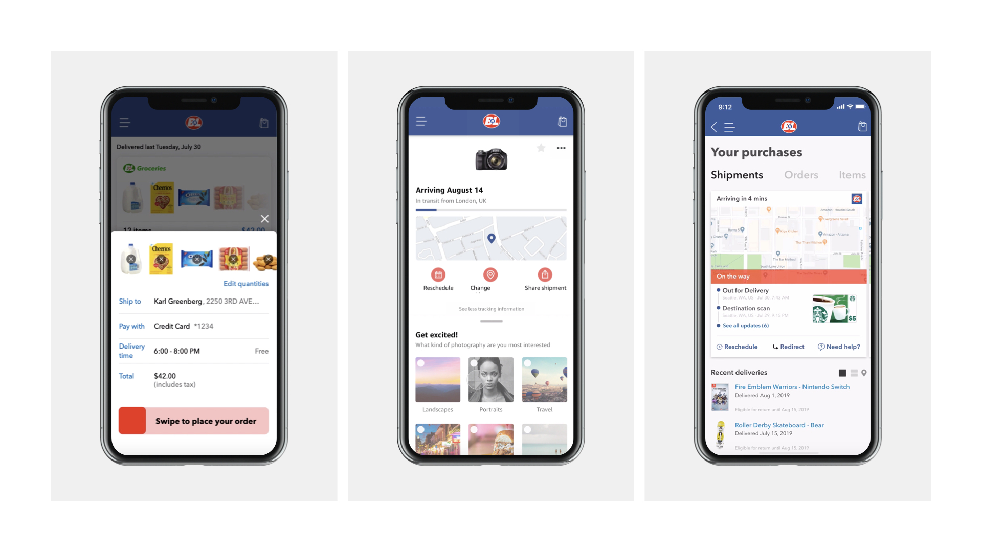
DIVERGENT PROTOTYPES
TREATMENT 1
The Single-Page Experience
Focus on single-page tracking experience, simplified repurchasing, and quick self-service actions.
TREATMENT 2
The Amazon Assistant
Focus on smart exceptions, intent-driven detail view, and chatbot-centered self-service controls.
TREATMENT 3
The Swipe & Go
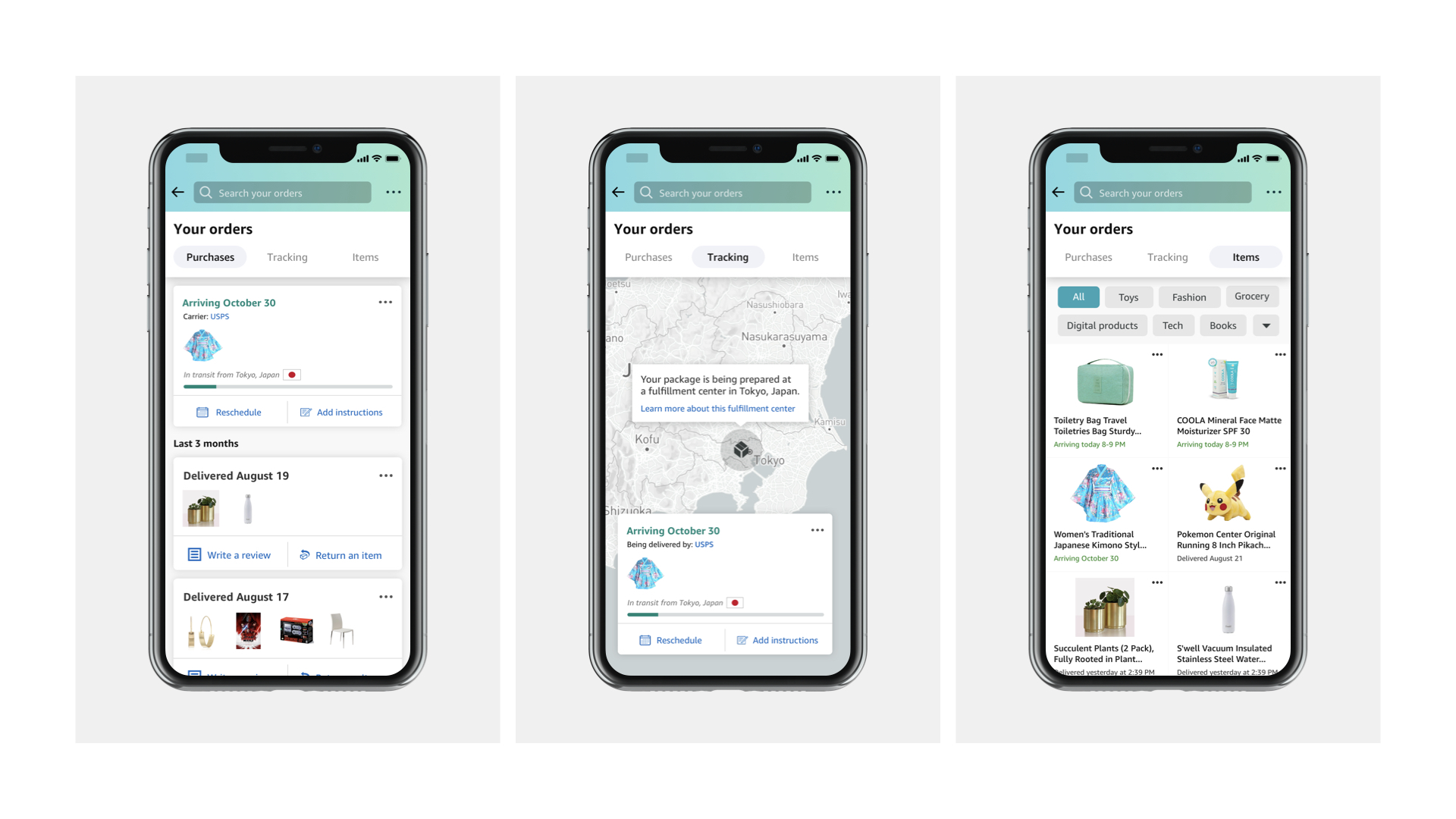
Focus on intent-driven navigation, removal of redundant information resulting in a single "detail" page, and dense informational cards with maps.
CONVERGENT DIRECTION
Establishing the North Star
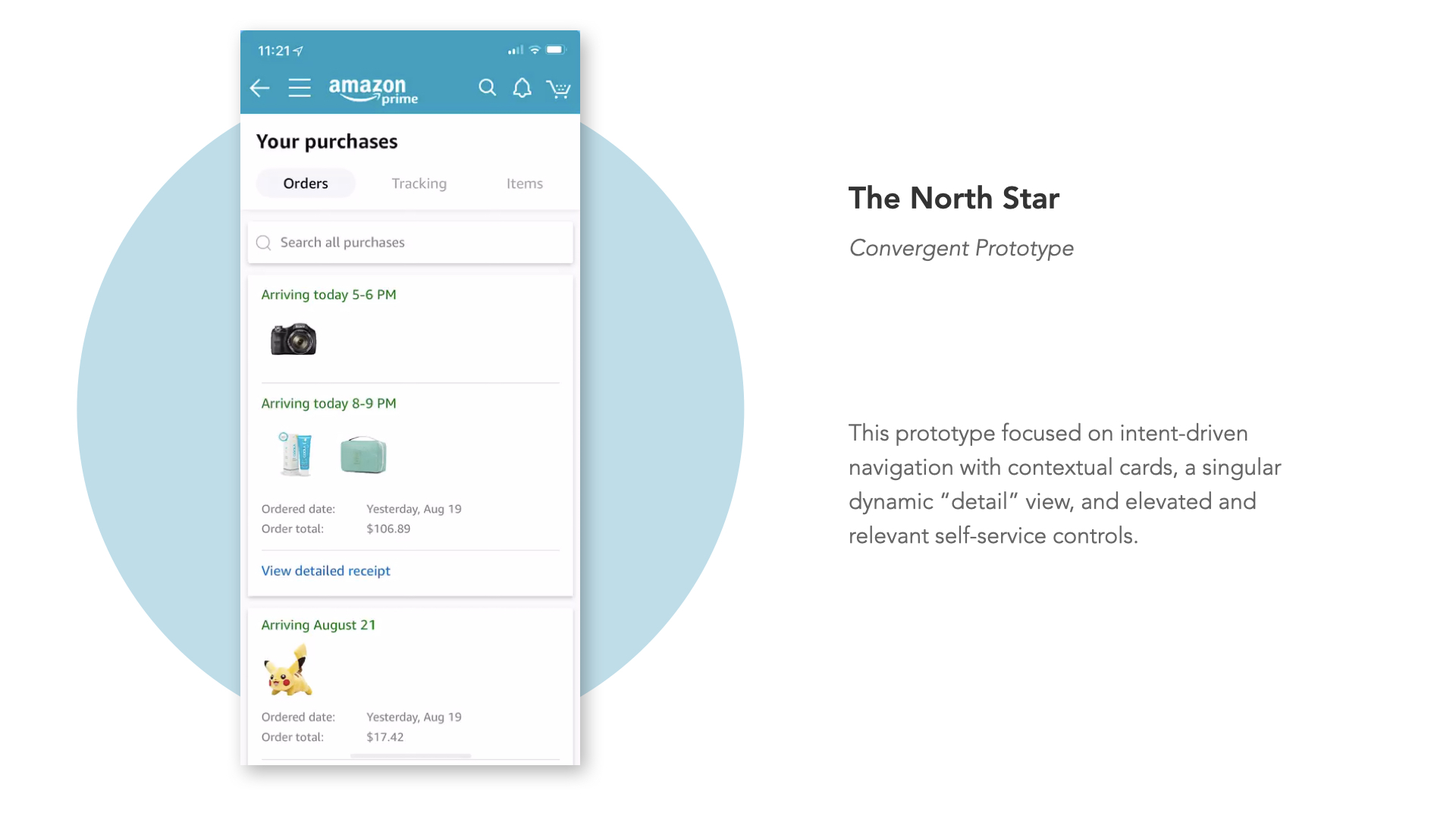
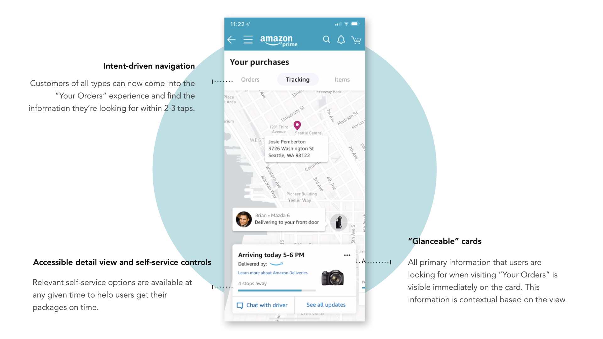
From the divergent testing phase, our team identified key elements from each prototype that resonated strongly with users. Leveraging these insights, we combined the most successful aspects of each "BnL" prototype to create a unified, directional concept. This convergent prototype was rebranded to align with Amazon’s colors and style, ensuring a cohesive experience within the existing app ecosystem.
The new design prioritized intent-driven navigation, allowing users to easily switch between shipment tracking, order details, and individual item views based on their current needs. At the heart of this approach was a dynamic detail view that adapted based on the order and item status (e.g., shipped, returned, processing). This adaptable display presented users with relevant information at each stage, simplifying interactions and reducing the need to navigate through multiple screens.
Additionally, we elevated all self-service controls, making it immediately clear what actions were available at each point in the order, shipment, and item lifecycle. By clarifying options and empowering users with accessible controls, we addressed key user pain points, reducing confusion and minimizing the risk of first-time delivery failures.
BUY-IN & ALIGNMENT
Driving cross-functional alignment
To ensure the success and long-term viability of the "Your Orders" redesign, I ran weekly meetings with the product management team to provide updates, align on the direction, and outline new concepts and roadmap priorities. I worked closely with our PM Director to clarify the strategic path forward, defining an immediate roadmap while engaging with engineering leadership to identify backend requirements for future capabilities.
The existing backend infrastructure posed a challenge, as it lacked robust concepts for individual items or even complete orders. To support our new user-focused features—such as differentiating orders from shipments, providing digital receipts, and making individual items more accessible outside the order view—we needed significant updates to the backend architecture.
I helped drive alignment not only within our own engineering teams but also across four other organizations within Amazon. Through collaborative sessions and strategic discussions, we secured cross-functional commitments to redesign the backend infrastructure, ensuring it could support the Your Orders enhancements that would continue to deliver user value over the coming years.
VALIDATION & INITIAL LAUNCH
Launch & Learn
Following the initial launch, we closely monitored customer feedback and usage data to identify opportunities for ongoing refinement. We launched a version of the app specifically designed to clarify the concept of shipments and detail their contents. This update significantly enhanced user understanding of what to expect with each delivery.
Additionally, we elevated key controls within the app to empower users in managing their shipments and reducing the likelihood of failed deliveries. New features included the ability to contact drivers directly, access clearer shipment statuses, and receive proactive updates throughout the delivery process. This focus on transparency and user control not only improved the overall experience but also fostered greater confidence in the delivery system among users.


DESIGNING FOR THE FUTURE
To infinity & beyond...
Alongside the initial launch, I continued working to establish the future vision of Your Orders and designing key flows & experiences that would set the recipient experience apart from other competitors for years to come.
The "Your Orders" redesign established a flexible foundation designed to scale with Amazon’s growing service offerings and changing customer expectations. The restructured backend architecture and intent-driven navigation system now enable the seamless addition of new features and services. Over time, this framework has allowed Amazon to introduce enhancements aligned with the evolving recipient journey, ensuring the "Your Orders" experience can support the needs of millions of customers for years to come.
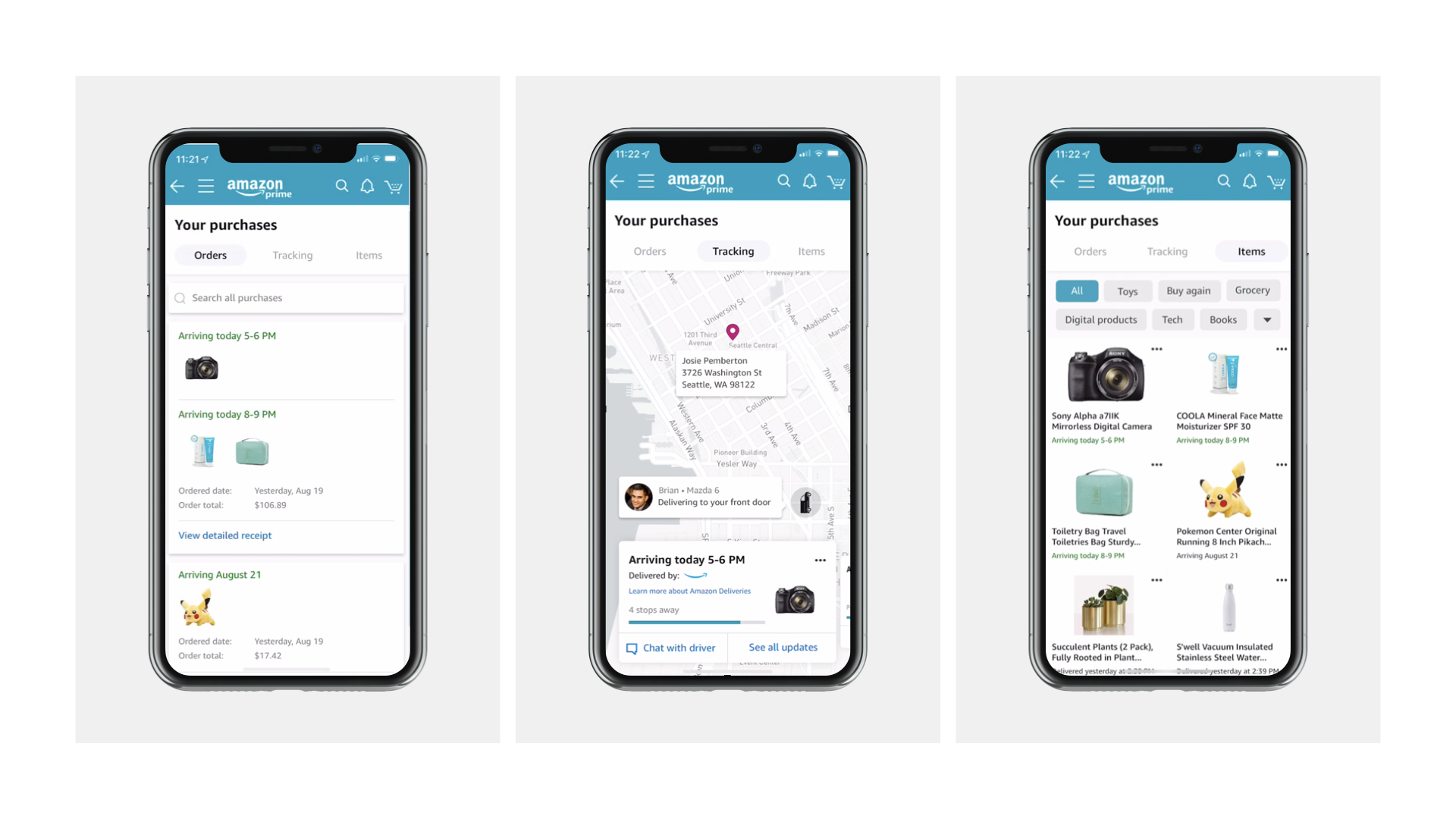
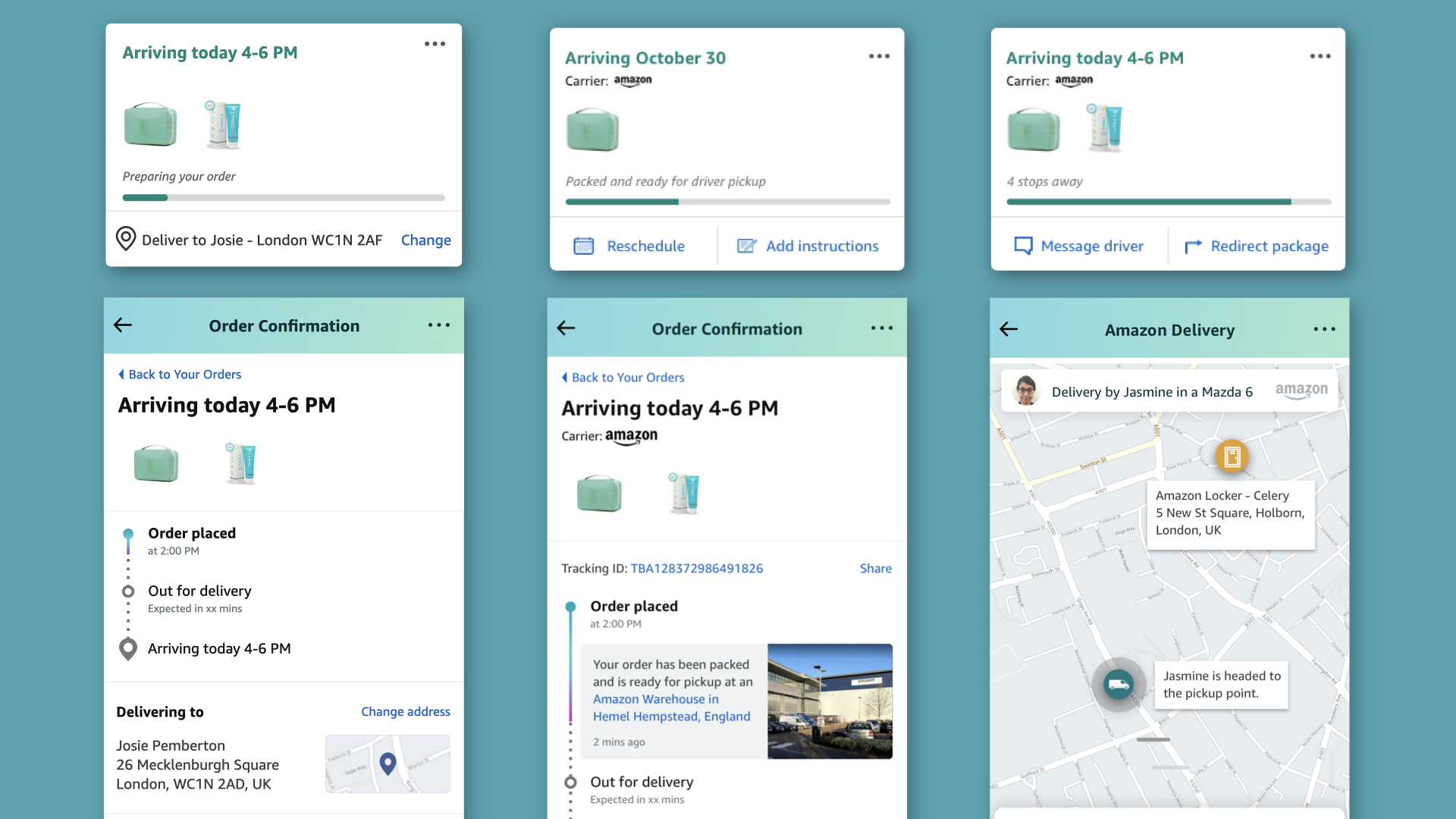
Dynamic Card & Order Page Framework
WRAPPING UP
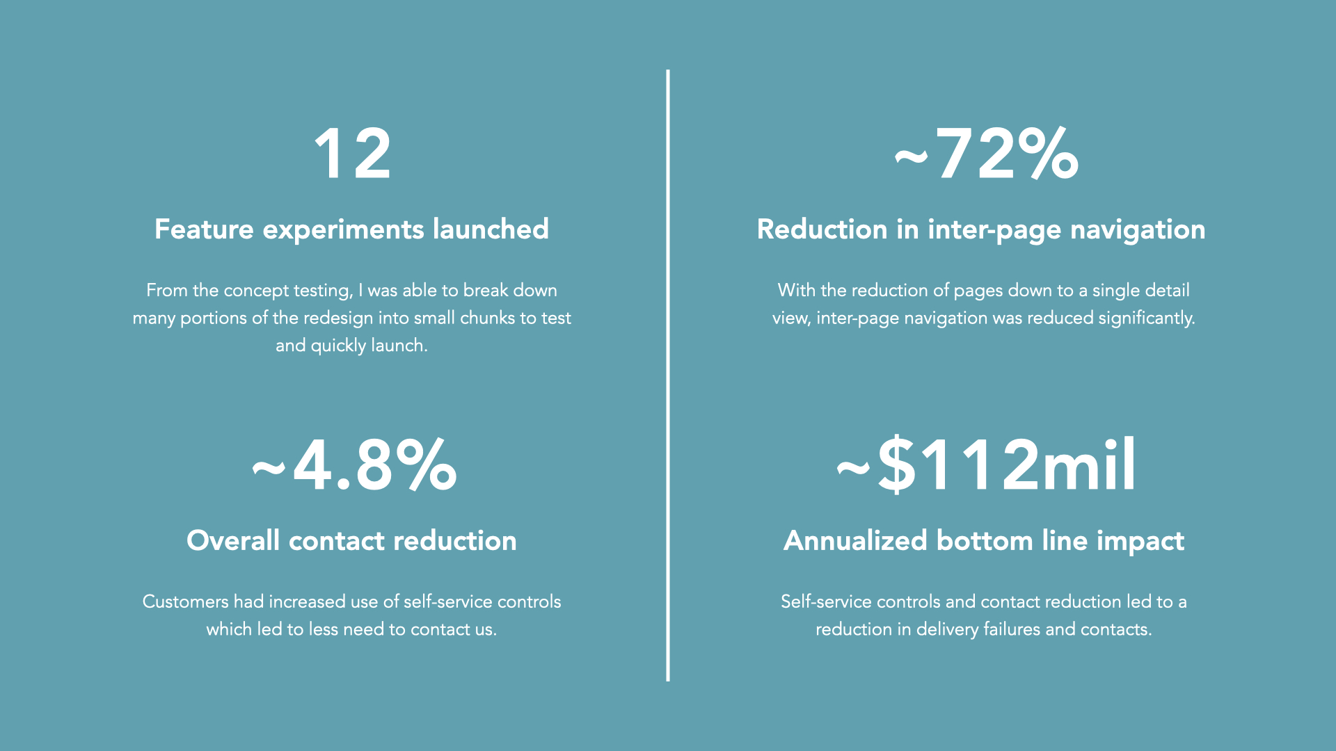
Impact & Achievements
© 2025 Cam Luck. All rights reserved.
