Healthcare for everyone in 60 seconds or less.
Amazon Care was created to provide a complete telehealth solution for Amazon employees, offering a unique blend of virtual and in-home care options. The project’s core mission was to design a system that simplified access to healthcare while ensuring patients received the appropriate level of care for their needs.
Given the complexity of telehealth delivery, our redesign centered on a scalable, patient-centered experience across multiple platforms: the main Amazon Care app for patients, a web app for clinicians, and a mobile app for nurses to deliver mobile care.
THE CHALLENGE
Simplify patient connection
At the end of 2019, Amazon Care had just launched its telehealth app to Amazon employees via an internal beta to very positive feedback. The app was simple, but effective, allowing users to quickly connect to a doctor or nurse for medical help.
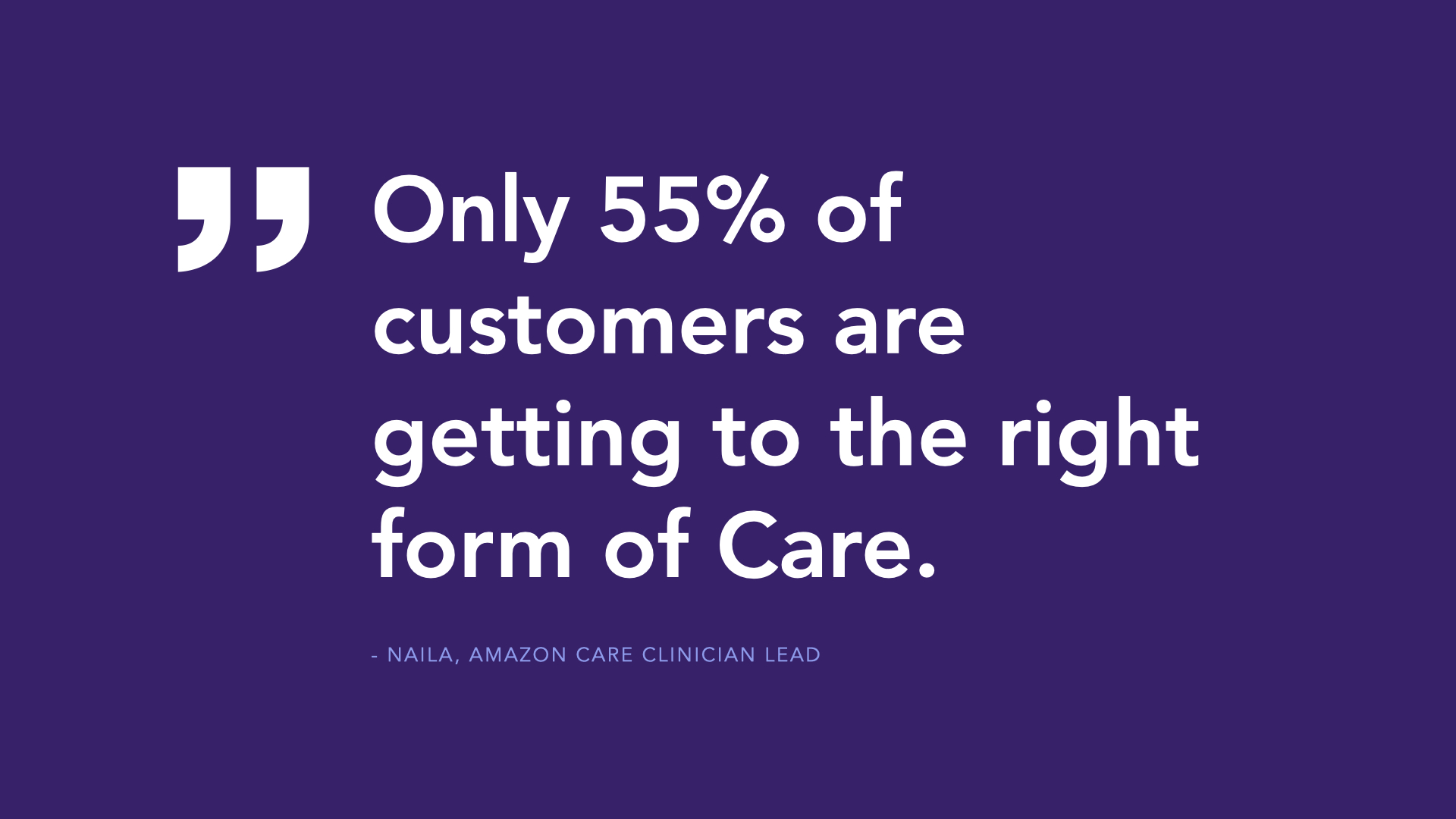
Users had their choice of connecting via a Video Call or Chat to receive Care, but what lay behind those buttons was unclear and led to costly problems for the user and the business.
The original Amazon Care platform required a significant overhaul to achieve three key objectives:
- Reduce Friction in Patient Routing: Patients were often routed incorrectly between chat and video call services, leading to inefficiencies and decreased satisfaction.
- Empower Clinicians and Nurses: The platform needed tools that could support real-time decision-making and facilitate seamless in-person visits.
- Harness AI for Accurate Care Matching: Ensure patients were directed to the correct level of care through a robust AI system that could adapt to various clinical scenarios.
Goals
To meet these challenges, our team established the following core goals:
- Streamline Patient Routing: Improve the AI-driven patient routing experience to connect patients with the right services on the first attempt.
- Increase Operational Transparency: Develop tools for clinicians to monitor patient status and update care plans in real time.
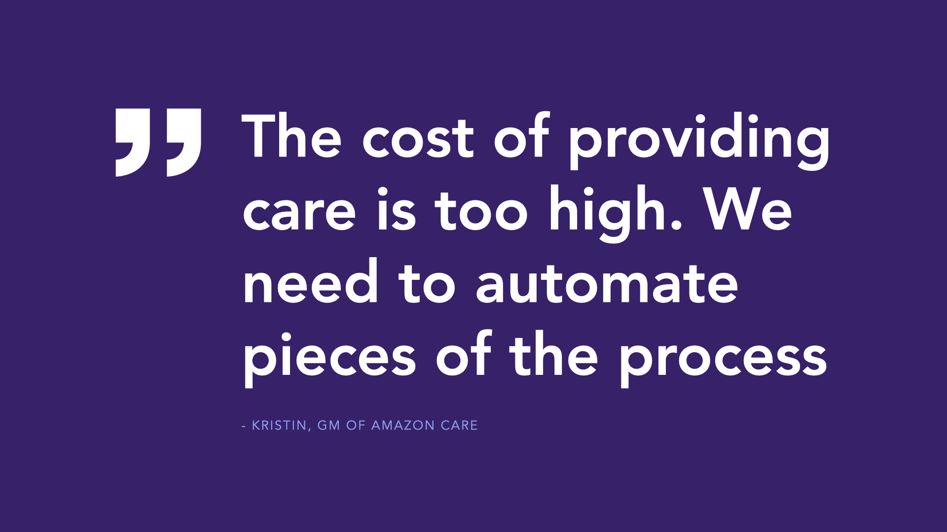
- Reduce cost of providing care: Decrease operational costs of providing care due to regrettable transfers and misused clinician time.
- Elevate User Experience: Build a scalable, intuitive interface that aligned across all three platforms while offering a consistent user experience.
My role
As UX Manager & Lead Designer, I managed a cross-functional team, including two researchers, five designers, two brand designers, a content writer, and two front-end engineers. We worked across three platforms—the primary Amazon Care app, a connected web app for clinicians, and a mobile app for nurses. My role involved coordinating design strategy, aligning team priorities, and serving as the core liaison with our PM Director and engineering leads. I regularly pitched concepts to senior leadership, aligning stakeholders and advocating for the necessary resources to bring our vision to life.
A key technical aspect of my role was re-training the platform’s AI system to route patients more accurately. Leveraging my technical expertise, I collaborated closely with clinicians to analyze the routing data, directly edited the database based on clinical input, and developed mathematical formulas to optimize patient routing. This work led to a new AI-based routing system that I patented, one of five patents I received at Amazon.
GETTING STARTED
Identifying Core Issues
The project began via an ask from our Product Director to look into what was causing high costs in the platform. I led the team in an analysis of Amazon Care’s quantitative usage data, a series of qualitative interviews, and a mapping out common misroutes and identifying areas for improvement within the app.
Within just a few weeks, I isolated three core issues that were driving up costs. Alongside these, we discovered critical usability issues that further exacerbated the problem, setting the stage for a targeted redesign to improve user experience and operational efficiency.
EXISTING APP
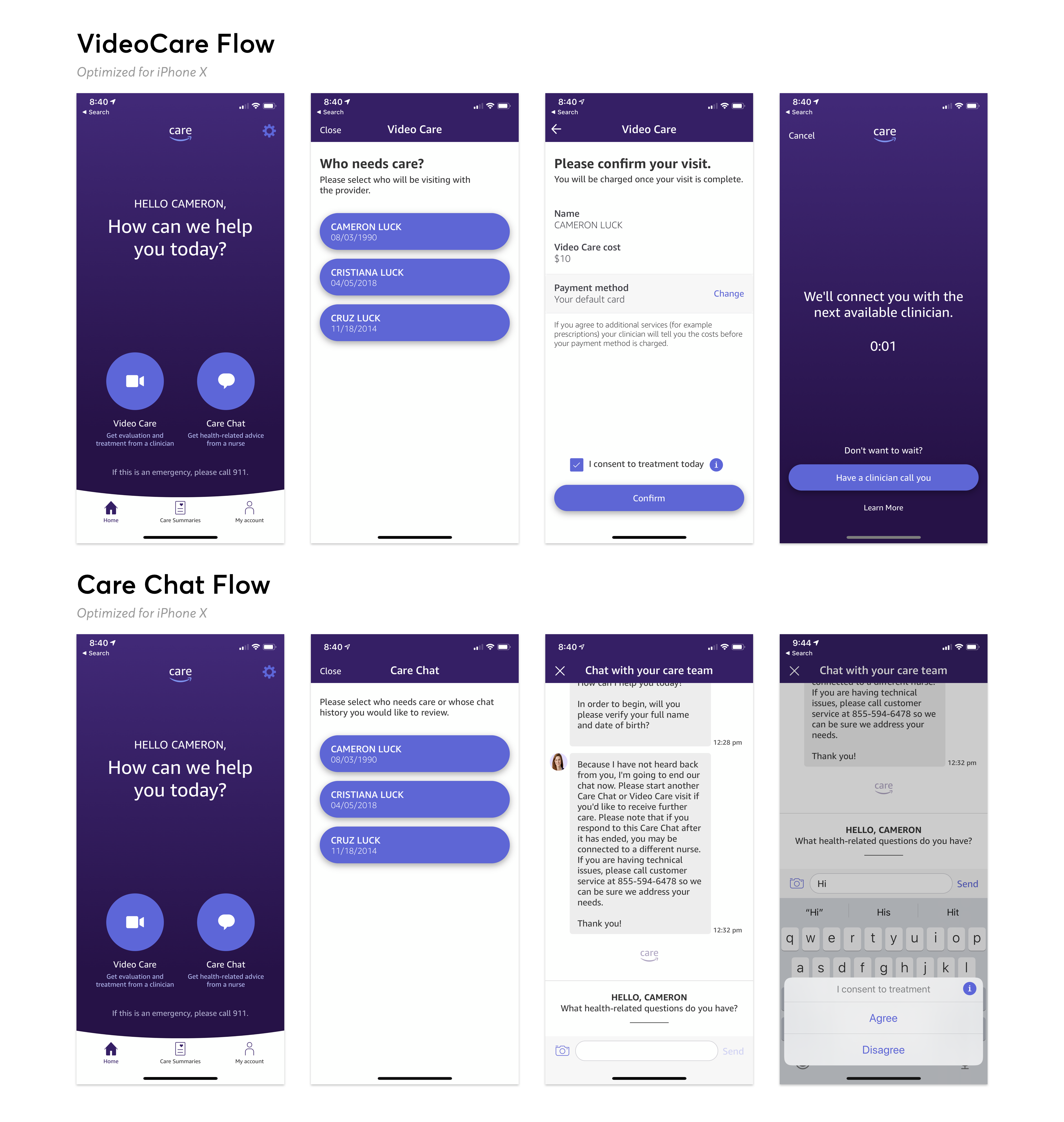
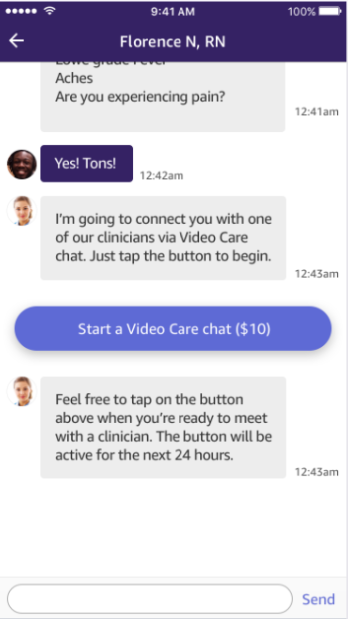
Frequent transfers
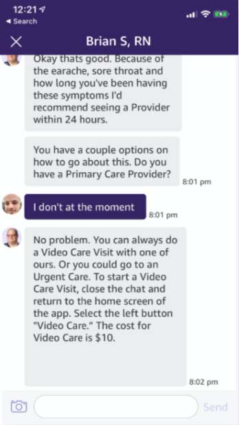
Many customers started with chat and were transferred to video after a long chat.
This was the most negatively reported aspect of the app.
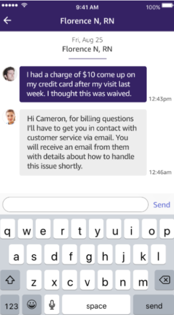
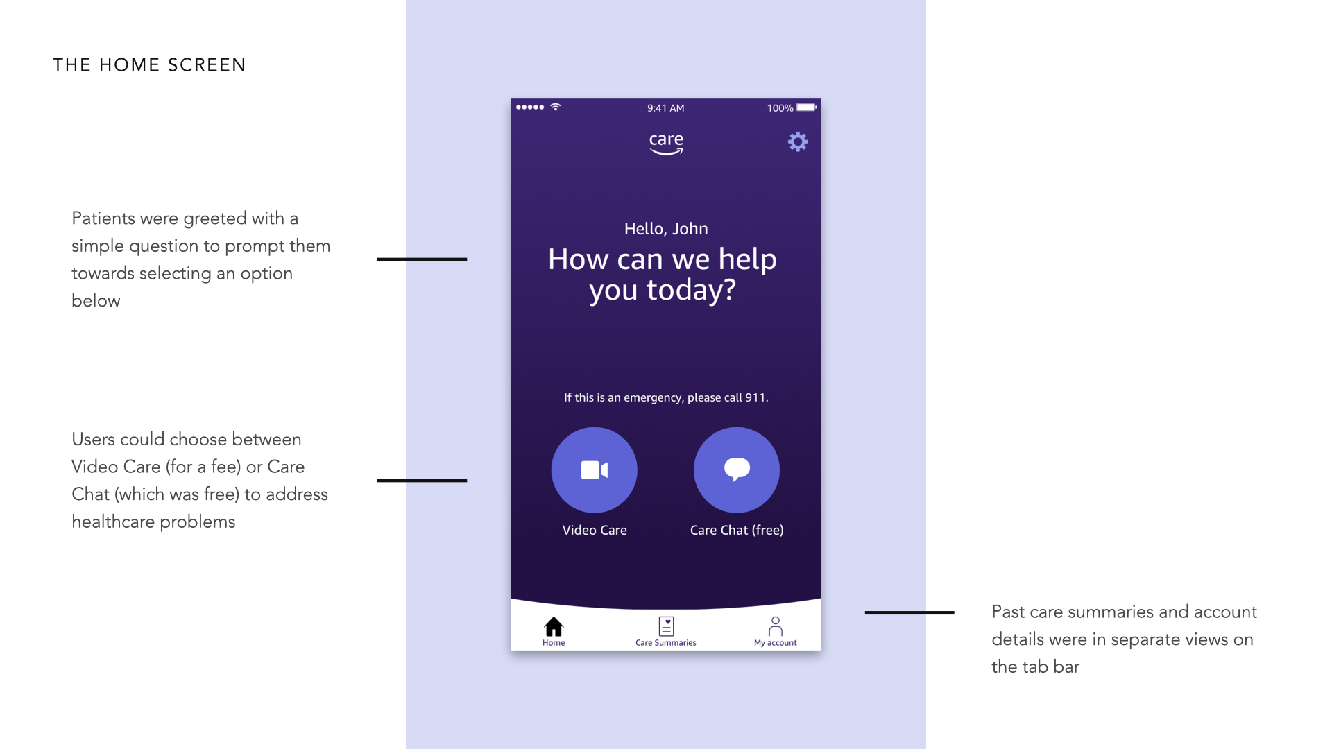
Unclear user input
Due to the nature of the home screen, it was unclear what services were offered and what patients could use the channels for.
Patients were frequently asking customer service questions to nurses due to the “How can we help you today?” text.
Unable to fully resolve
Customers expected they would only be connected with someone who could solve their problem.
Nurses can’t legally help with all problems, which led to the transfer issue, but for many other problems, Amazon Care couldn’t solve them and would need to refer patients to primary care or emergency services.
No sense of urgency
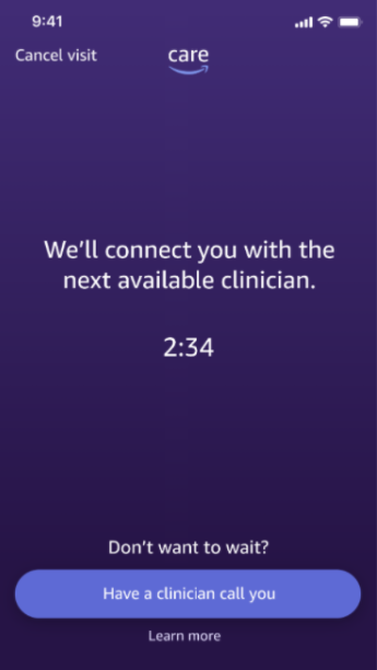
Patients had no way of clearly expressing their urgency or acuity of their symptoms, which could increase wait times for people needing to see a doctor or nurse immediately.
This led to frequent drop-offs as wait times were unclear for patients and clinicians could not accurately determine who needed to be seen first.
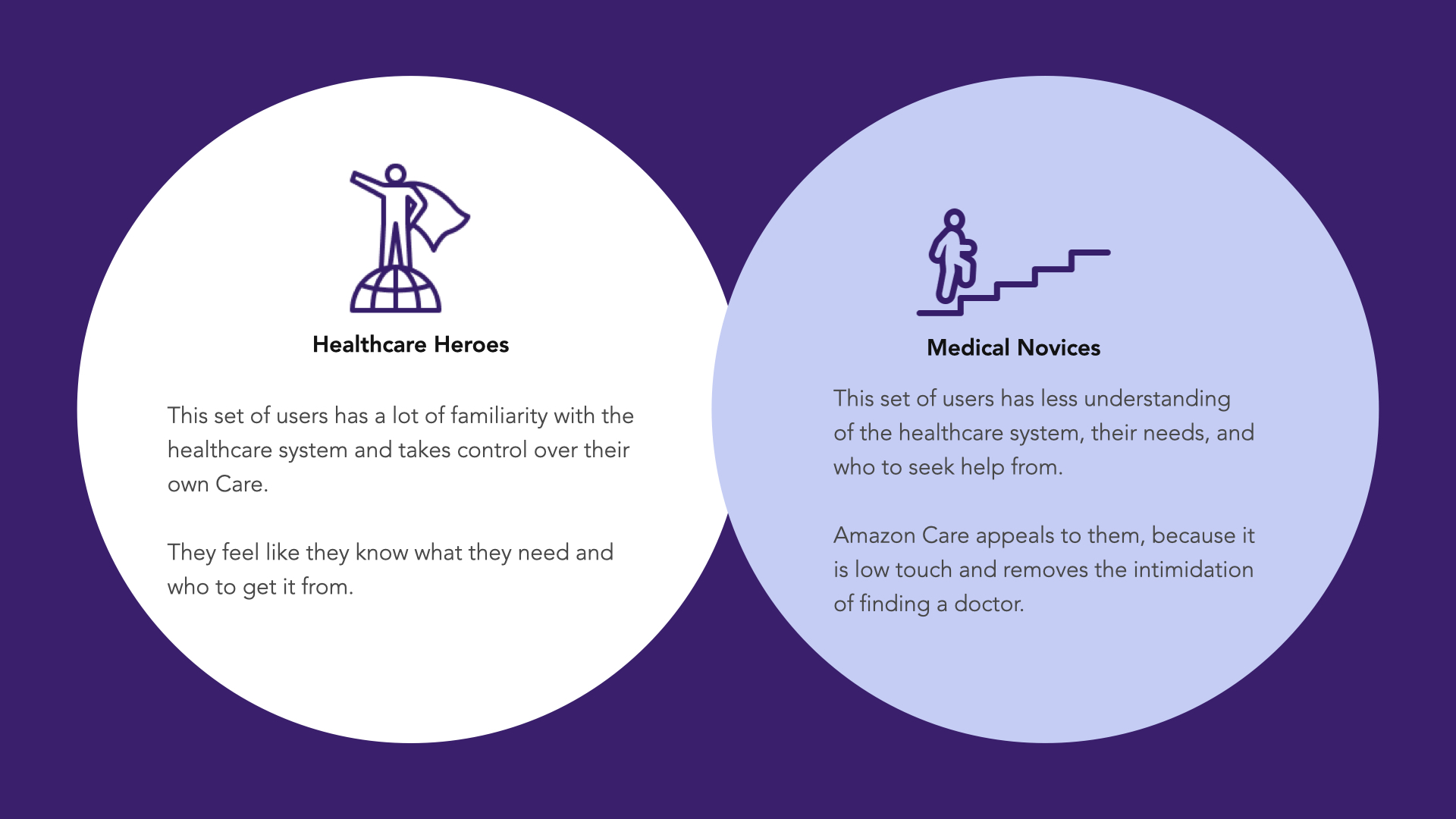
CUSTOMER PERSONAS
THE KICKER
An Interesting Acquisition
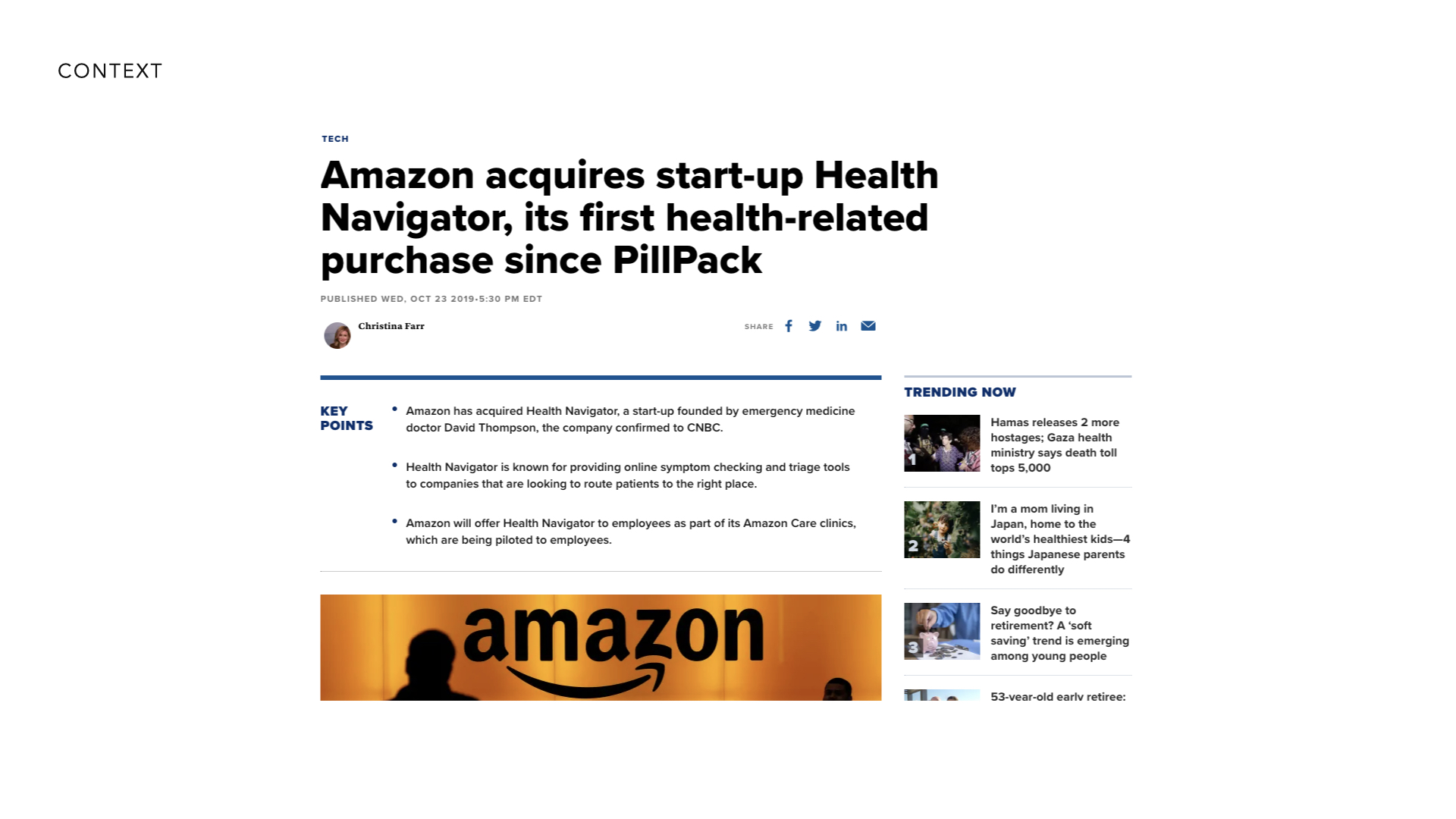
AI startup HealthNavigator was acquired by the leadership team as a way to help reduce our costs internally by integrating the AI to help solve low-level care needs and appropriately route users to the right form of care. Integrating the AI was a different story as the AI was a decision-tree based chatbot with over 50+ questions per session to evaluate symptoms, decide the proper person to talk to, and provide low level informaion and articles to the end user when applicable.
DESIGN SPRINT
Creating a Patient-Centered AI Experience
In this sprint, our cross-functional team—consisting of UX designers, researchers, engineers, and healthcare professionals—collaborated through brainstorming sessions, user journey mapping, and prototype development. We worked closely to build empathy for the patient experience, incorporating insights from healthcare providers to balance user needs with operational feasibility.
To fully explore potential solutions, we developed and tested several divergent prototypes that explored different approaches to key hypotheses - with a primary goal to test the variations of the chatbot experience and prove or disprove hypotheses from the team. The primary goal was to test the amount of questions end users would be ok with when looking for care and seeing if we could provide a simplified version of the experience that provided a caring hand while guiding you to the right person.
In addition, we focused on smaller details in the flow as well, desiging alternate versions of core elements such as:
- Symptom-Based Routing Model: This prototype introduced a streamlined flow that guided users to the correct care option based on primary symptoms entered at the start.
- Provider Choice Interface: A more open-ended option where users could choose a provider type, with tooltips explaining each option to increase clarity and confidence.
- Urgency Selector: An interface allowing users to indicate symptom severity on a simple scale, enabling better prioritization in the care process.
Each prototype was tested with a group of target users to gather real-time feedback on usability, clarity, and emotional resonance. By capturing initial reactions, we could quickly identify which features were most effective in guiding users and simplifying the experience.
DIVERGENT PROTOTYPING & TESTING
Evaluating the Bot Experience
Initial prototyping & testing was focused specifically on testing the early hypotheses of our PM & design teams to stress test the number of questions the patient would be willing to go through for appropriate care.
Within the week, 2 hi-fidelity prototypes were generated to evaluate the chatbot experience. One was more true to form, blending our existing chat feature with the HealthNavigator Q&A chatbot experience and passing off to a nurse or doctor when applicable while the other was a very distinct experience with a reduced number of questions and an empathetic bot system providing caring messages to help support the user.
As part of the concept testing, many "micro-concepts" emerged in each prototype that were tested for initial customer response. This testing focused primarily on the bot being used primarily for triage and having some form of personality, delivering questions in a Q&A style with varied response patterns and UI treatments. The primary focus areas were the following:
- Presenting the bot as a more human personality vs. a more subdued personality Leaning into the bot showing empathy vs. being more calculated
- Presenting the bot via chat vs. via its own UI
- Customer input via quick actions vs. free text input
- Multi-symptom input upfront vs. single symptom deep dive + discovery Allowing customers to escalate to a human vs. not being able to
- Presenting the Care Assistant as the primary ingress into Care
- Visible ingress vs. invisible ingress
- Transparent handoff to a human vs. lack thereof
- 3-7 Questions needed for routing to a human Allowing customers to rate the bot
TREATMENT 1
Chatbot (AKA "Sheet")
Primary focus was to integrate the full chat experience into the current chat experience while exploring a more evolved home page that provided more care details.
TREATMENT 2
Quick Routing (AKA "Pill")
Primary focus was on an intake wizard with quick routing, reducing the number of user inputs before getting to care.
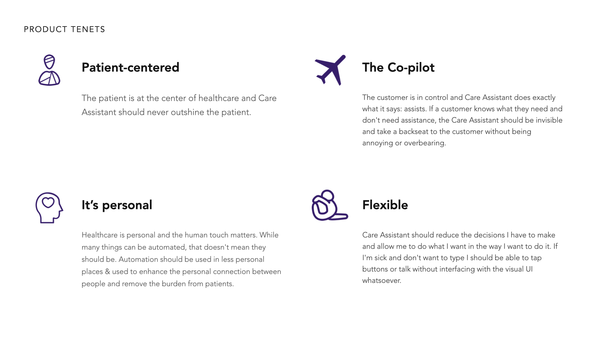
After completion of the study, I was clear on which direction to go and documented all of the findings & recommmendations prior to evolving the design to its next steps. These were documented on the internal project wiki for the entire organization to see. Since the project was very high profile, many questions and ideas came in from people from all over the org based on the study information.
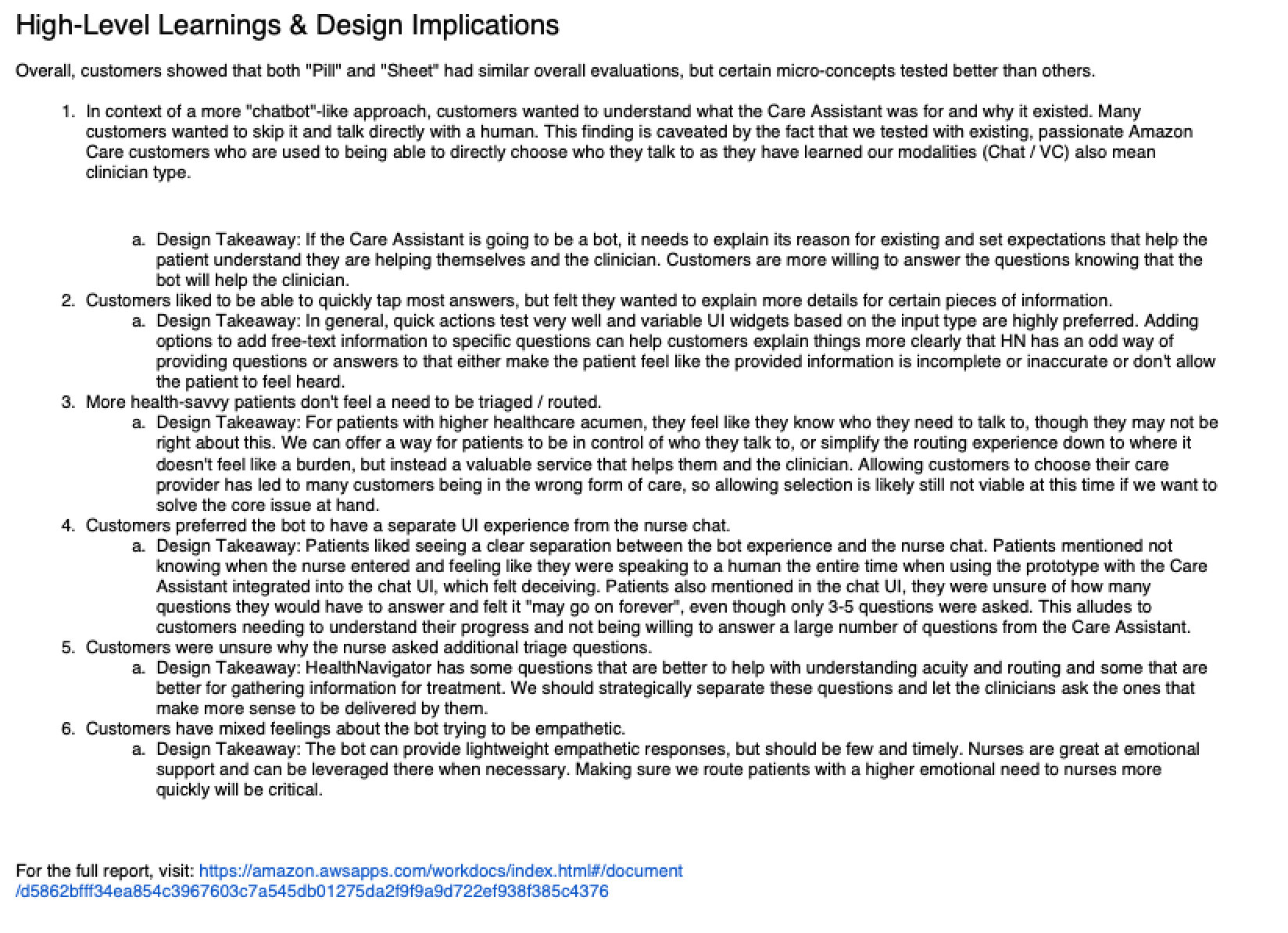

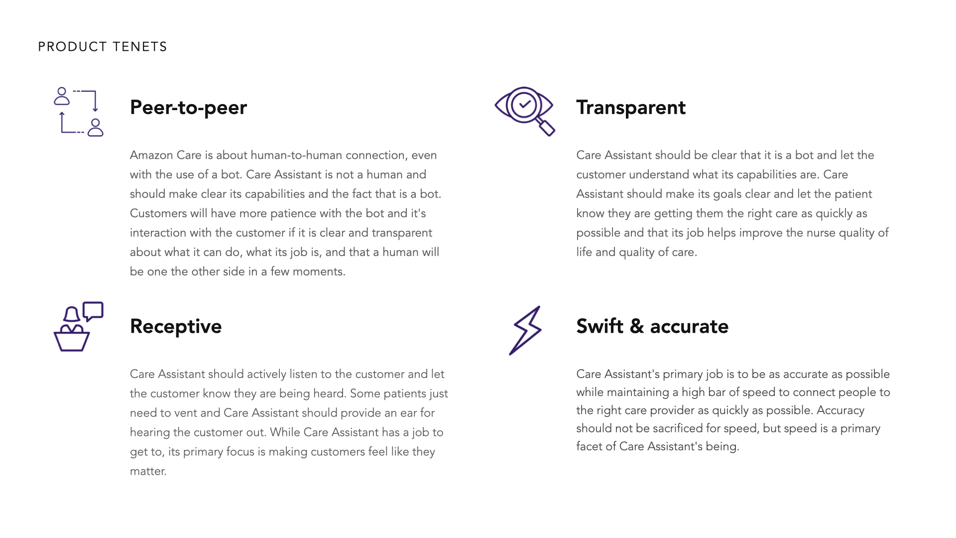
I also led the creation of Product Tenets with the cross-functional team to guide our decision-making for how we were designing the Care Assistant based on the data we had learned from our testing and end users. These aligned the team on how to think about the product and make decisions effecively to guide us forward together towards a common goal.
DIVING DEEP INTO THE DATA
Retraining the AI
After the first round of testing, it was clear we needed to narrow down to a simpler form of asking questions and routing the user, but the exact implimentation was unclear due to a lack of understanding of what could be done with the HealthNavigator data. Prior to the second round of testing, I sat down with our Eng & Data Scientists to get access to the data and dove deep into how the software worked.
HealthNavigator was designed to be used by clinicians in a doctor's office who could take time, prep your chart, and come and see you after several minutes of waiting, but we didn't have that liberty with a telehealth application. After analyzing the data through some trial & error tests and tweaking data points, I was able to reverse engineer how the main calculations worked and rewrote the primary algortihm behind HealthNavigator to be more applicable for a telehealth scenario than a hospital one.
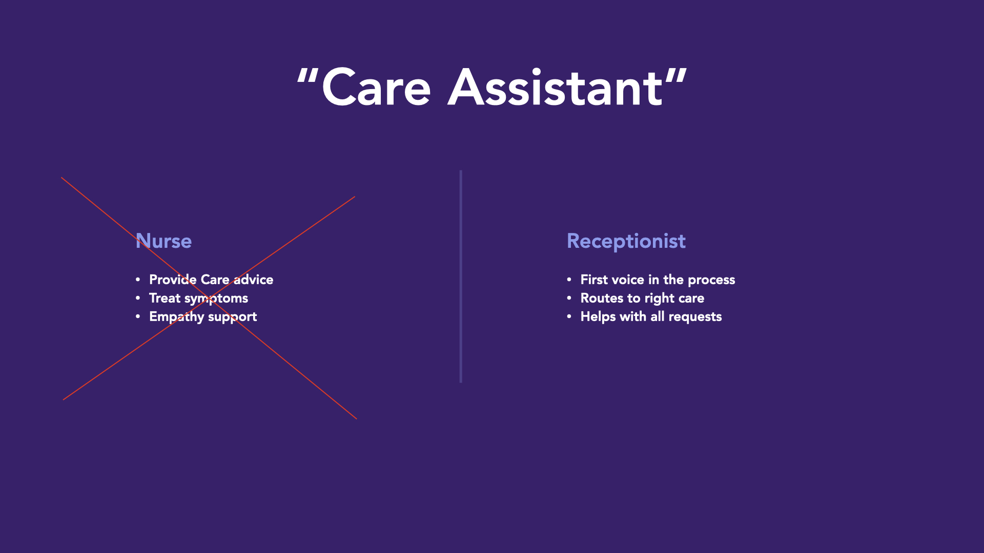
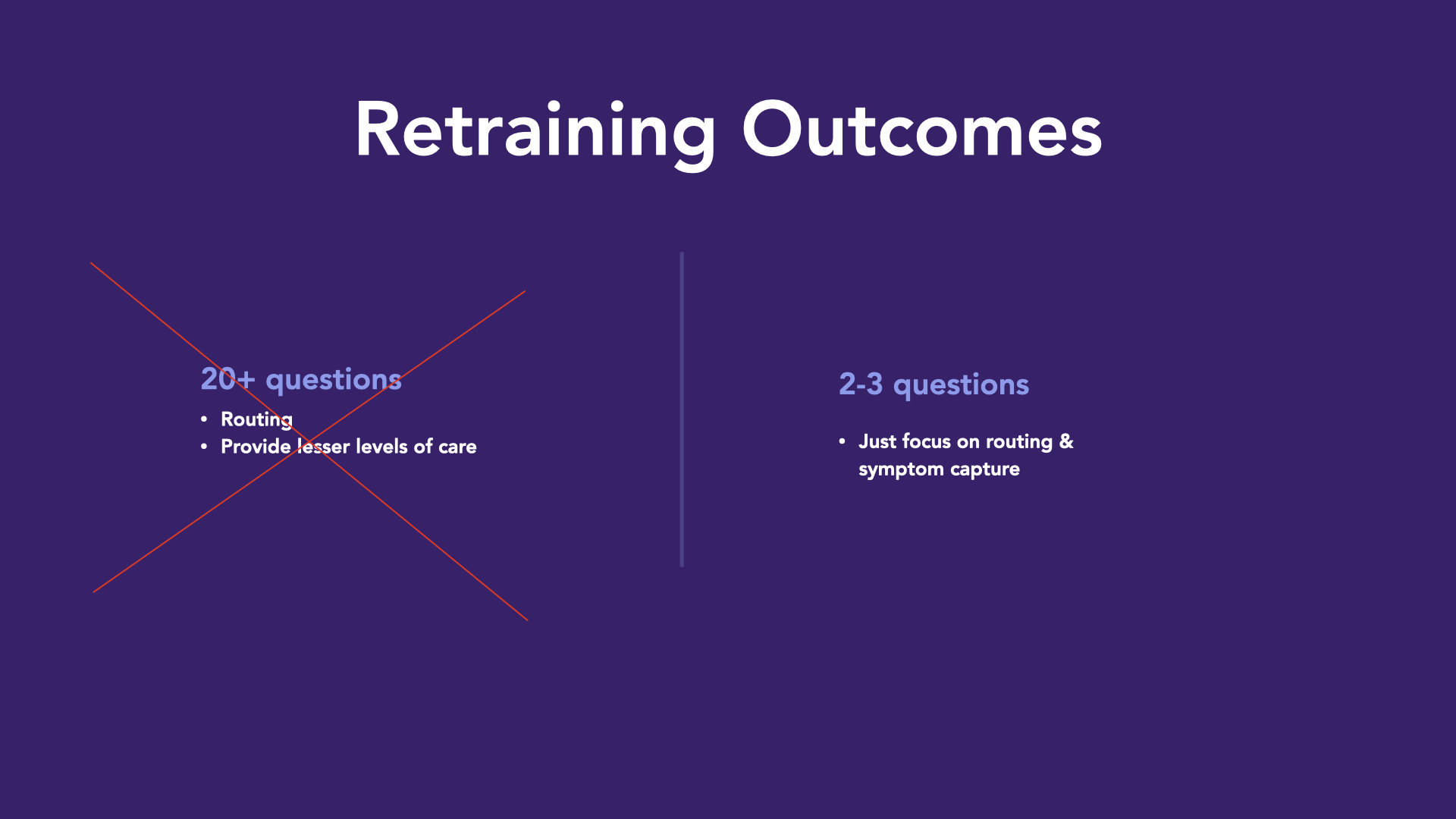
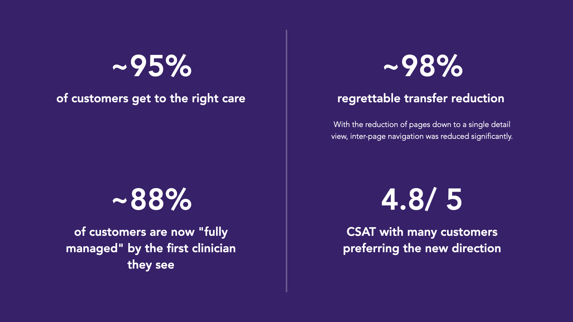
I then worked directly with the clinicians and nurses we had hired to run the telehealth platfor mon Care to categorize the data and adjust accuity ratings, urgency details, etc based on their specific use cases. After this was done, I remapped all of the data back into the database and handed it to the eng team to begin prototyping some Uis with. Through this evaluation, I was able to make thre algorithm respoind with 95% accuracy in routing in 2-3 questions depedning on the symptoms provided. This shifted the mental model of the Care Assistant from a patient providing smart assistant to that of a receptionist - which was more acceptable to the clinicians as it didn't overlap with their role, and provided them help to help them focus on high-value care & supporting patients with empathy rather than asking mundane, non-human questions that detracted from the care giving.
This new method of inputs opened up a world of new possibilities for how the user interface could work, so it was back to the drawing board for me and the design team.
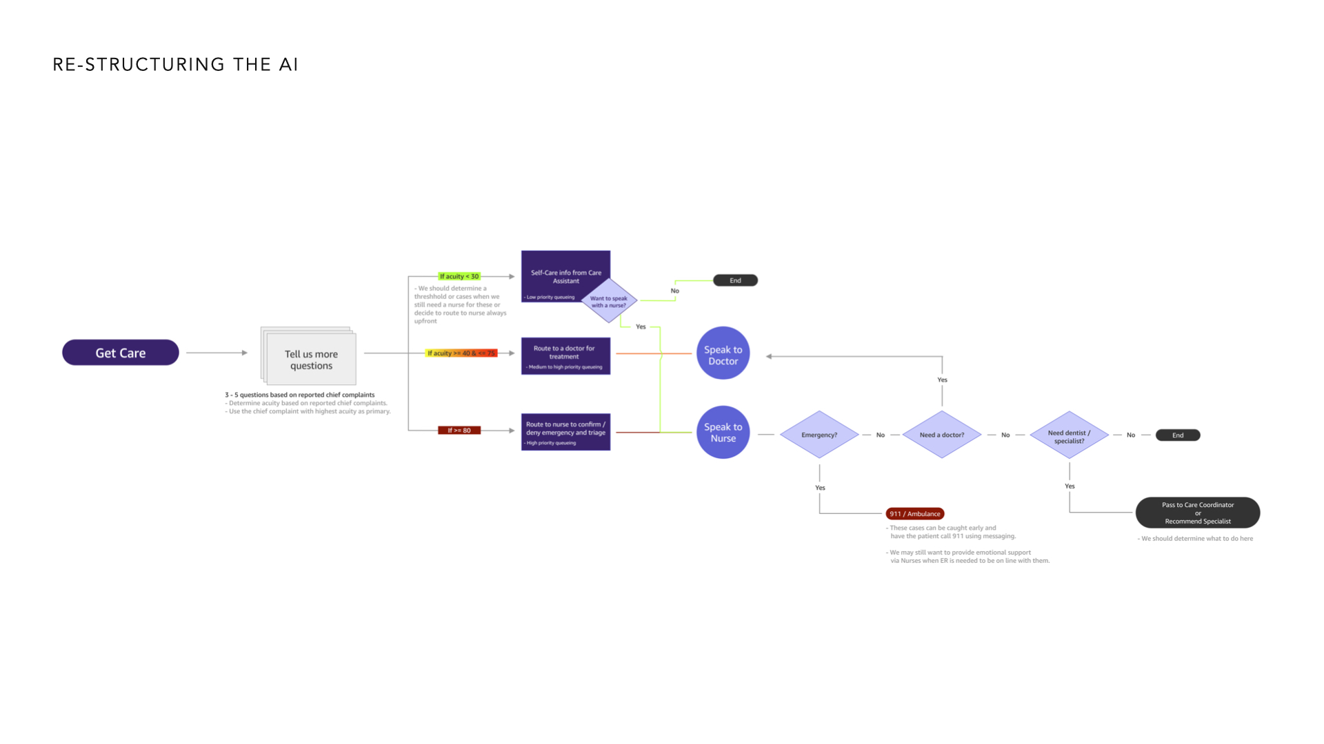
Full algorithm and data is obfuscated
DIVERGENT PROTOTYPING & TESTING - ROUND 2
Designing "the Receptionist"
After the first round of testing, it was clear we needed to narrow down to a simpler form of asking questions and routing the user, but the exact implimentation was unclear due to a lack of understanding of what could be done with the HealthNavigator data. Prior to the second round of testing, I sat down with our Eng & Data Scientists to get access to the data and dove deep into how the software worked.
HealthNavigator was designed to be used by clinicians in a doctor's office who could take time, prep your chart, and come and see you after several minutes of waiting, but we didn't have that liberty with a telehealth application. After analyzing the data through some trial & error tests and tweaking data points, I was able to reverse engineer how the main calculations worked and rewrote the primary algortihm behind HealthNavigator to be more applicable for a telehealth scenario than a hospital one.
I then worked directly with the clinicians and nurses we had hired to run the telehealth platfor mon Care to categorize the data and adjust accuity ratings, urgency details, etc based on their specific use cases. After this was done, I remapped all of the data back into the database and handed it to the eng team to begin prototyping some Uis with. Through this evaluation, I was able to make thre algorithm respoind with 95% accuracy in routing in 2-3 questions depedning on the symptoms provided. This shifted the mental model of the Care Assistant from a patient providing smart assistant to that of a receptionist - which was more acceptable to the clinicians as it didn't overlap with their role, and provided them help to help them focus on high-value care & supporting patients with empathy rather than asking mundane, non-human questions that detracted from the care giving.
This new method of inputs opened up a world of new possibilities for how the user interface could work, so it was back to the drawing board for me and the design team.
TREATMENT 1
Symptom Cards
This concept focused on a set of interaction patterns that pushed the patient's symptoms together into cards to hand over to the clinician and provided choice of care while providing a clear recommendation to which form of care to use.
TREATMENT 2
Continuous Care Chat
This concept focused on exploring what would happen if the Care Assistant could first gather core questions to route you, but then gather additional information that would be automatically given to your clinician when they connect to accelerate your care. Additional questions were option, but promised faster resolution.
TREATMENT 3
Clearly Acute
This concept focused on building a sentence out of your symptoms with clear acuity revealed to the patient based on their symptoms.
STAKEHOLDER ALIGNMENT
Pitching "the Receptionist"
To this point, our leadership was under the impression that the HealthNavigator data could not be edited or changed to make the interface more flexible - thinking that all 20+ questions must be present for the appropriate accuracy to be showcased. Prior to moving forward, I aligned stakeholders on the new demo showcasing the 95% routing accuracy within 2-3 questions & showcased the convergent directional wireframes based on the findings of both studies.
THE VISION
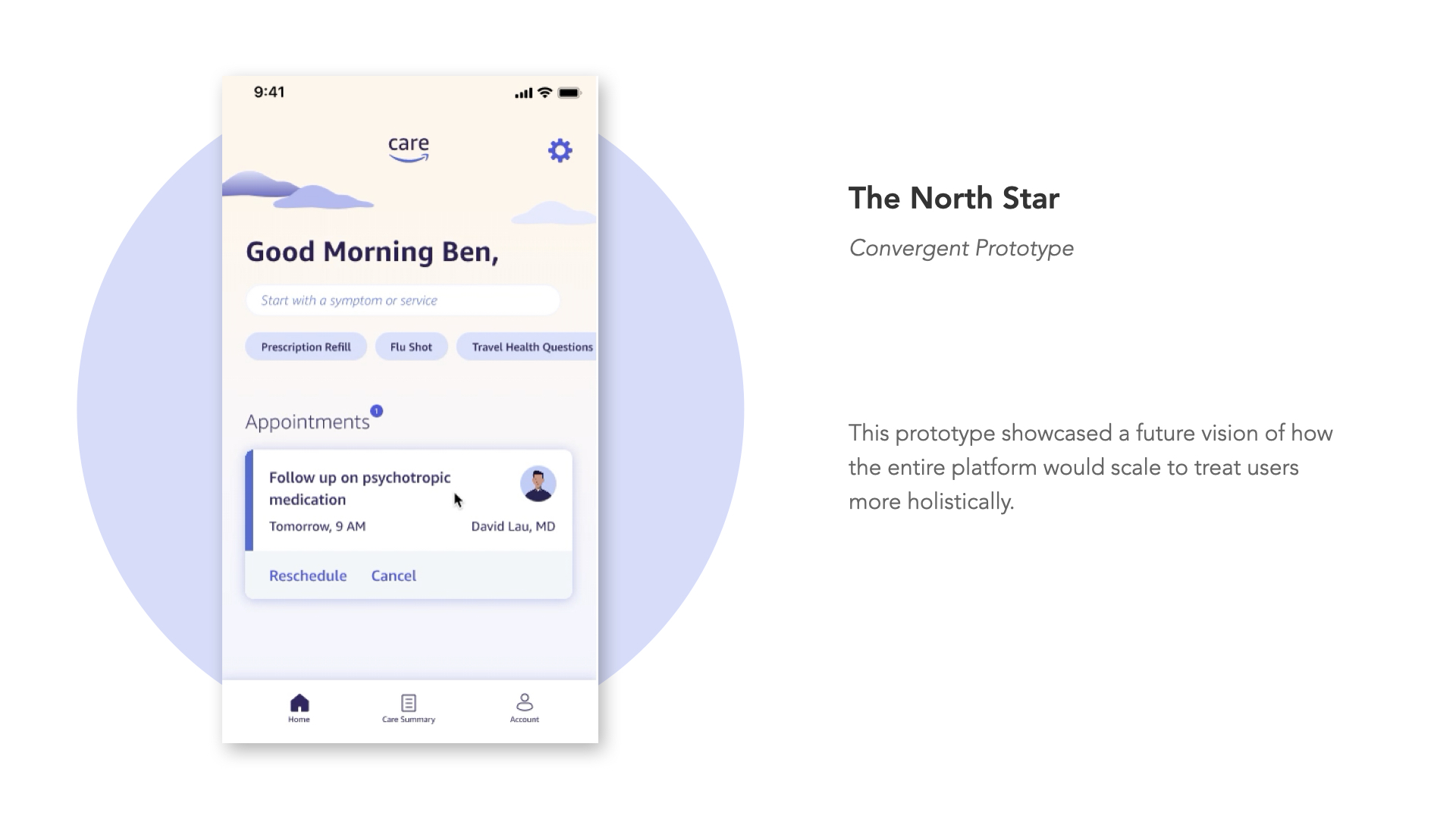
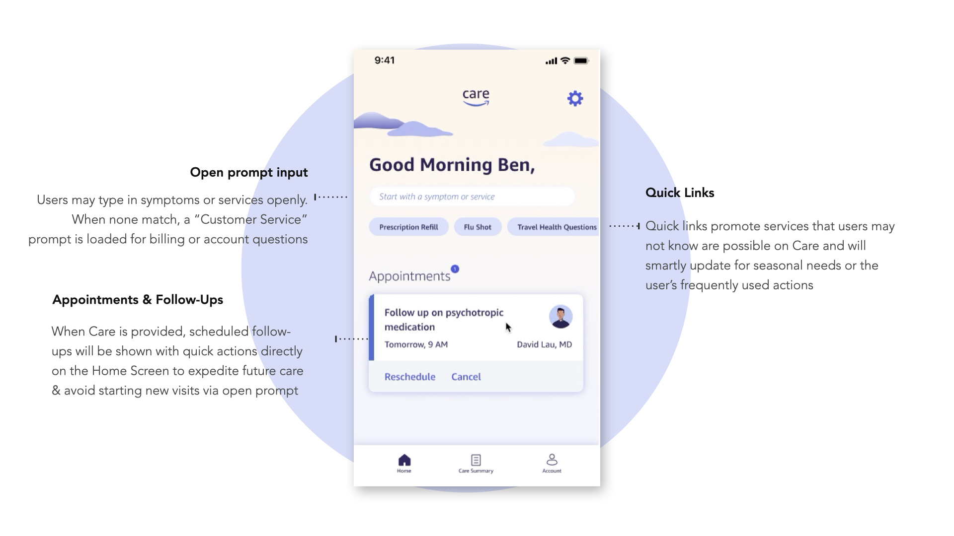
Setting the North Star
After aligning stakeholders on the new direction and getting the green light from our leadership team, I partnered closely with our brand design & visual team to explore redesigning other key elements of the experience such as the Home page and some of our other core patterns.
These explorations pushed on the future of Amazon Care and provided a vision to scale the product to long after the initial launch of the Care Assistant feature.
Amazon Care - Vision Video
PREPAR FOR LAUNCH
Polishing the Rough Edges
Prior to launch, there a few outstanding elements we wanted to polish out. Through a series of RITE studies conducted over the course of 3 days, I was able to rapidly iterate on the prototype with my team, evaluate new UI treatments on small elements, and polish out the final design.
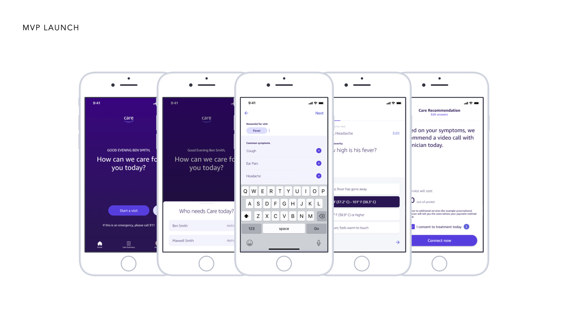
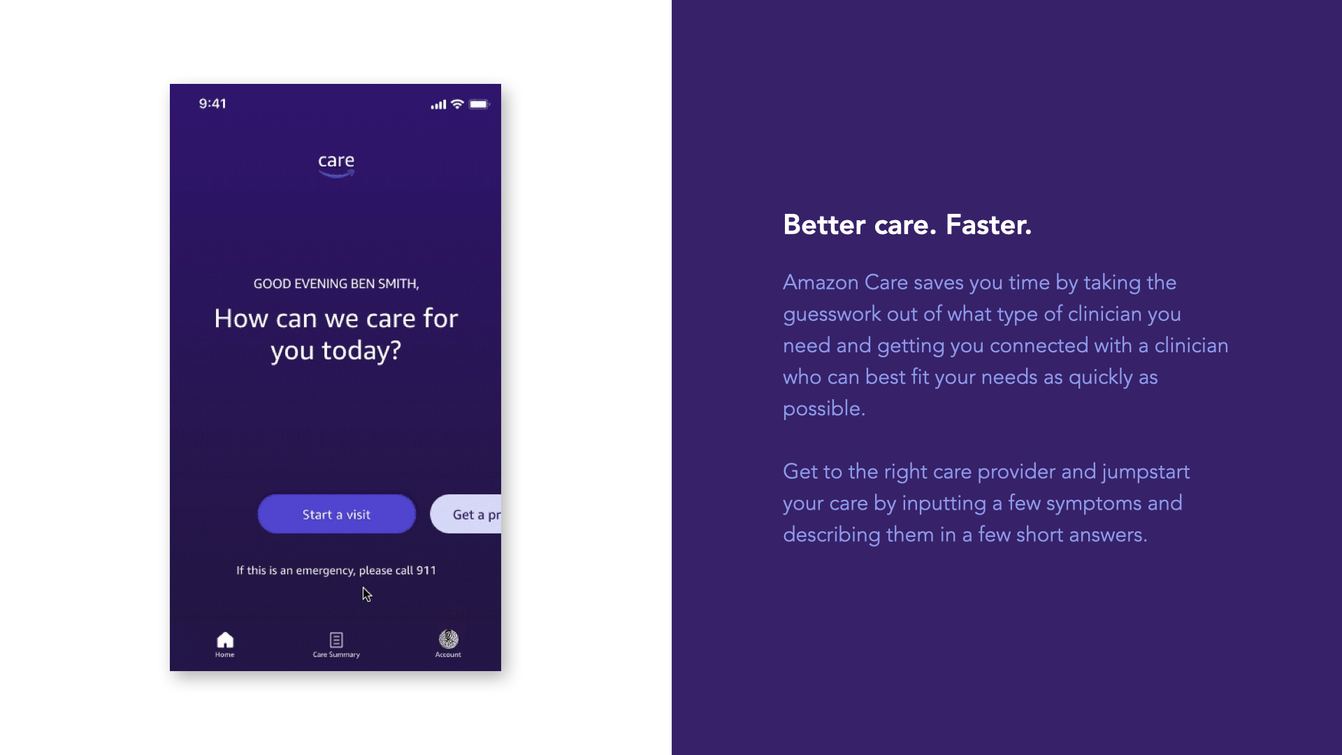
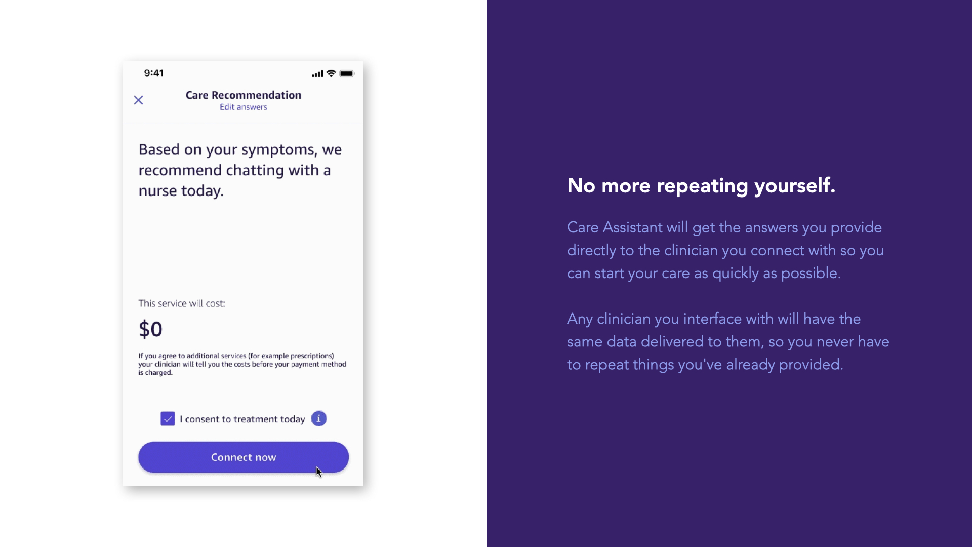
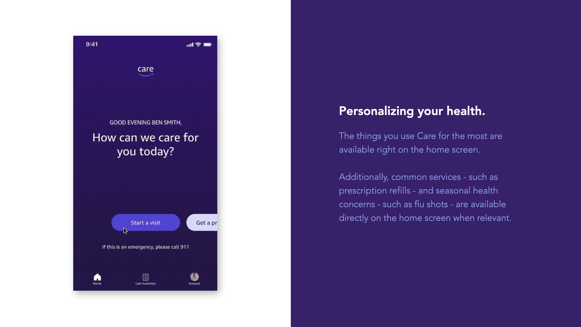
After just 3 months of time, we were able to establish the direction for the Care Assistant and begin showcasing a new direction for all of Amazon Care - leading to the generation of several new roadmap items for the consumer app, clinician app, and nurse delivery app as well as the development of the Amazon Care design system (see below). The final launch consisted of our new UI elements, an overhauled symptom input UI, a reworked home page, and a new Care recommendation screen with a way to override the recommendation if need be.
Amazon Care Design System documentation
WRAPPING UP
Impact & Achievements
© 2025 Cam Luck. All rights reserved.